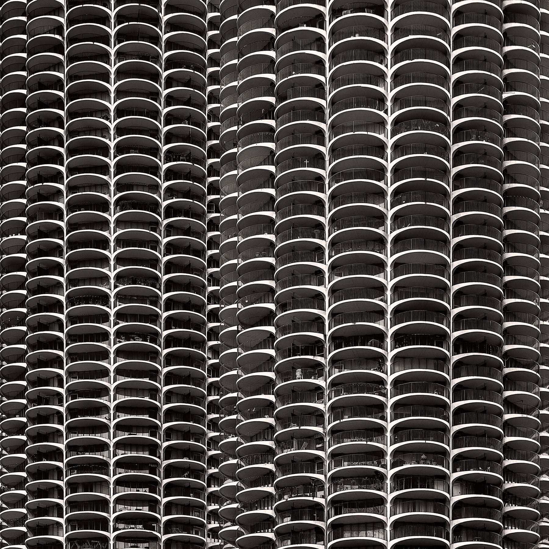
Marina City From Wabash Avenue Bridge
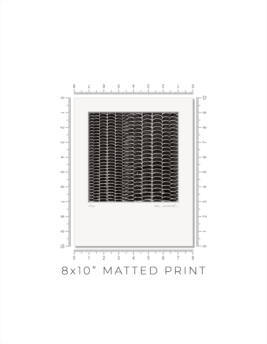
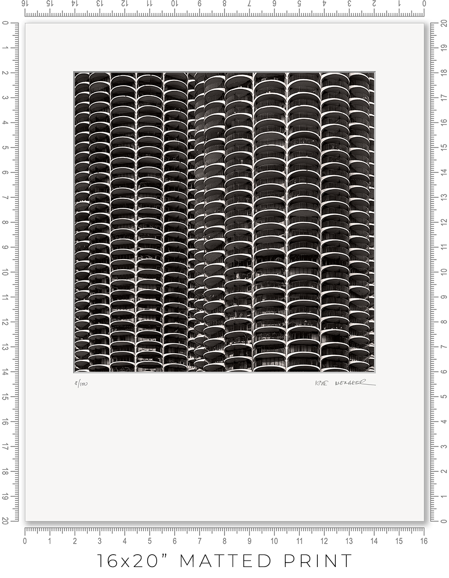
Matted prints are a great option if you want to choose your own frame. They come in two sizes: 8x10" and 16x20". These are standard frame sizes. You may easily find these frames at any retail shop.
One thing you need to know about frames. Those cheap, thin frames with swivel locks and kickstands will not work. They are designed for simple photo prints or diplomas. The matted print will be too thick for these frames. Find a decent frame that is at least 1" deep.
I make every print myself in my studio. No photo lab. No outsourcing. Every print is handmade.
I print on metallic photo paper. It is the perfect paper for black-and-white architectural photography. It adds a distinctive pearlescent, three-dimensional sheen to the prints.
For mats, I use 4-ply Crescent Arctic White matboard. It is off-white, traditional, and restrained. Not bright white, which is too bright and overwhelms the image. This matboard is the archival standard for conservation framing.
I mount prints on 3/16" Bainbridge foamcore. It is acid-free, clay-coated, rigid, and lightweight. It is ideal for archival print mounting.
The print is permanently sealed between the mat and the mounting board. It is intentional. A hinge mount leaves the print too loose. Also, it causes the print to bulge in the middle. A sealed mount keeps the print flat and tight. If you need a hinge mount or a matboard backing instead of foamcore, let me know.
Every print is signed and numbered (limited edition) on the mat in pencil. On the back, you will find a Certificate of Authenticity with all the details about the print and my contact information.
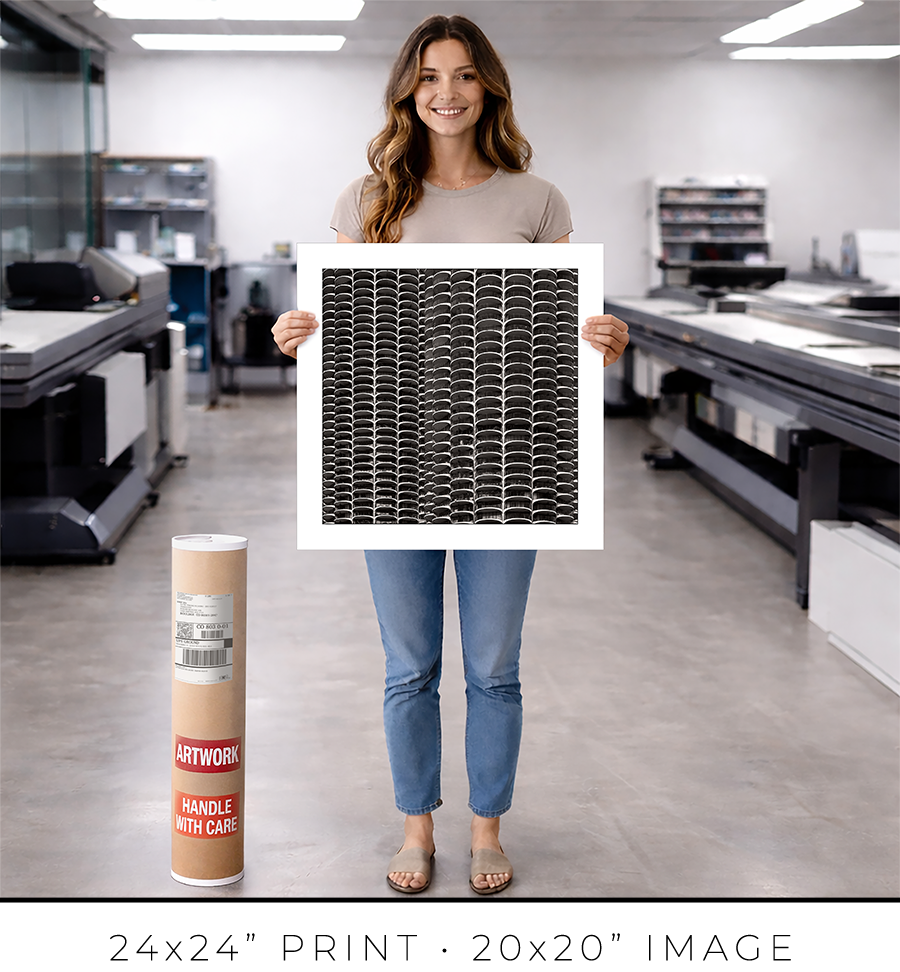
The actual photo print size for an 8x10” matted print is 6x6” with a 1” mat border, and for a 16x20” print, it is 12x12” with a 2” mat border. Since the photo prints are square and the matted prints are rectangular, the bottom mat border for 8x10” prints is 2” and for 16x20” prints it is 6”.
A framed print is a finished artwork. It is not just the image, it is a physical object that looks intentional, lasts decades, and feels complete.
The frame color, finish, and moulding profile. Print mounting, matting, and glazing. These are all deliberate decisions that elevate the image to the level of an artwork, which you can hold in your hands, put on the wall, and live with every day.
I am a professional framer, and I enjoy making frames for my prints. I put a lot of thought into what frame to use for my prints. And how to mat, glaze, and mount them. And after decades of frame-making, I acquired the skills to make my prints perfect, exactly the way I want them. I am proud of what I do.
I make every print myself in my studio. No photo lab. No outsourcing. Every print is personally crafted by me.
I start with printing the image on one of my large-format printers. I use glossy metallic photo paper almost exclusively. It is the perfect paper for black-and-white architectural photography. It adds a distinctive pearlescent, three-dimensional sheen to the print. In a bright spotlight, it looks like a hologram.
For glazing, I seal the print with archival 5-mil PET film, featuring a unique, high-gloss “mirror-like” finish. There is only one manufacturer of this glazing, the price has doubled in recent years, and it is issued in small batches that sell out instantly. But the result is worth the trouble. It gives the print that elusive look of a silver gelatin print from a traditional darkroom, which was treated with a vintage photo heat glossier.
I have been a photographer all my life, and I still have my traditional darkroom. I can produce small silver gelatin prints, but large 44x44” prints are obviously out of reach with this old technology. I am happy that I can replicate that look and feel for the prints on any scale with the new technology I developed.
But this is my choice. If you prefer to use museum anti-reflective glass sheets, please let me know. I can do that, but the print prices may double (since glass is expensive), and delivery will be limited to Chicagoland only (because it is glass and it breaks in shipping).
I permanently mount my prints to white aluminum Dibond sheets using archival pressure-sensitive high-tack acrylic adhesive. It is not a simple process. I use a heavy 750-pound, 60” wide large-format laminator to complete this task. And it is the most dangerous and nerve-racking stage in the whole printmaking process. A tiny misalignment or a speck of debris on the surface can ruin the almost-finished print.
Finally, the print is ready for framing. Frame-making is where a woodworker meets an artist. It is a totally different set of skills, materials, instruments, and studio space.
Over the years, I developed relationships with several suppliers, and I get my frame moulding delivered by truck in large, long boxes. I believe my studio stocks more frame moulding than your average frame shop down the street.
I cut the moulding at 45 degrees using my mitre saw mounted on a custom 10-foot-long, heavy-duty feed bench I built long ago. I then join the cut sticks with a pneumatic v-nailer to make a square frame. Now the finishing touches: I sand and paint the frame corners to make them even and smooth.
Now it is time to put the print and the frame together. I secure the print inside the frame with flexible points and install the hanging wire (or D-rings for the large prints). I sign the print, attach the Certificate of Authenticity, and the print is ready.
Now, let’s talk about the frames I use for my prints. In my opinion, black-and-white photography does not require elaborate framing. A simple but sophisticated matte black frame is all that is needed. It is like the famous Audrey Hepburn’s "little black dress" designed by Hubert de Givenchy for the movie “Breakfast at Tiffany's”. It became iconic and has been described as "perhaps the most famous little black dress of all time." Accordingly, a “little black frame” is all that is needed for my prints.
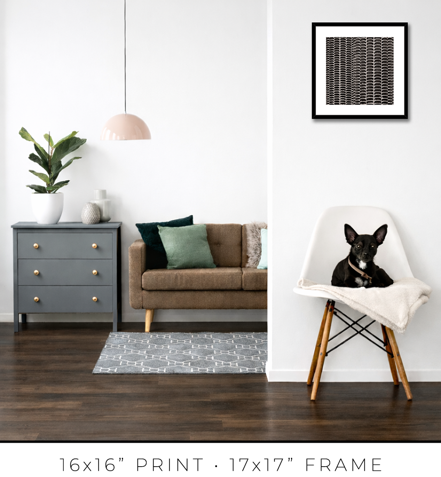
For 16x16” prints, I use a simple 3/4” matte black frame, but it is 1 1/8” tall, which adds a touch of sophistication. It looks proportional to the relatively small size of the 16x16” print.


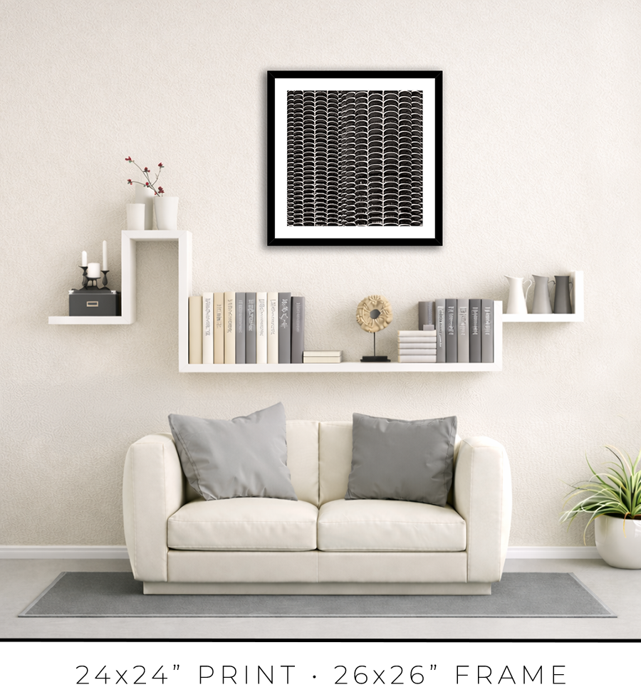
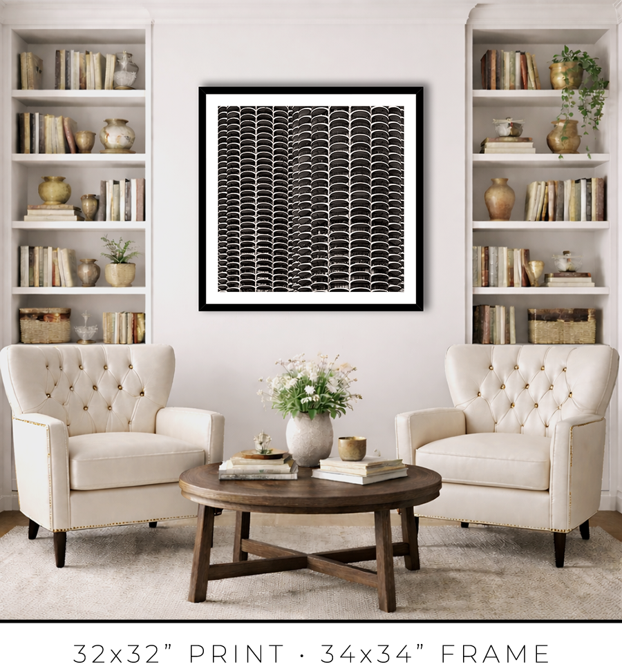
For 24x24” and 32x32” prints, I use the same style but a different profile frame. It is a wider 1 1/4" frame, which works for larger print sizes. And it is not as tall, only 7/8", which keeps the prints more grounded on the wall and less overpowering.


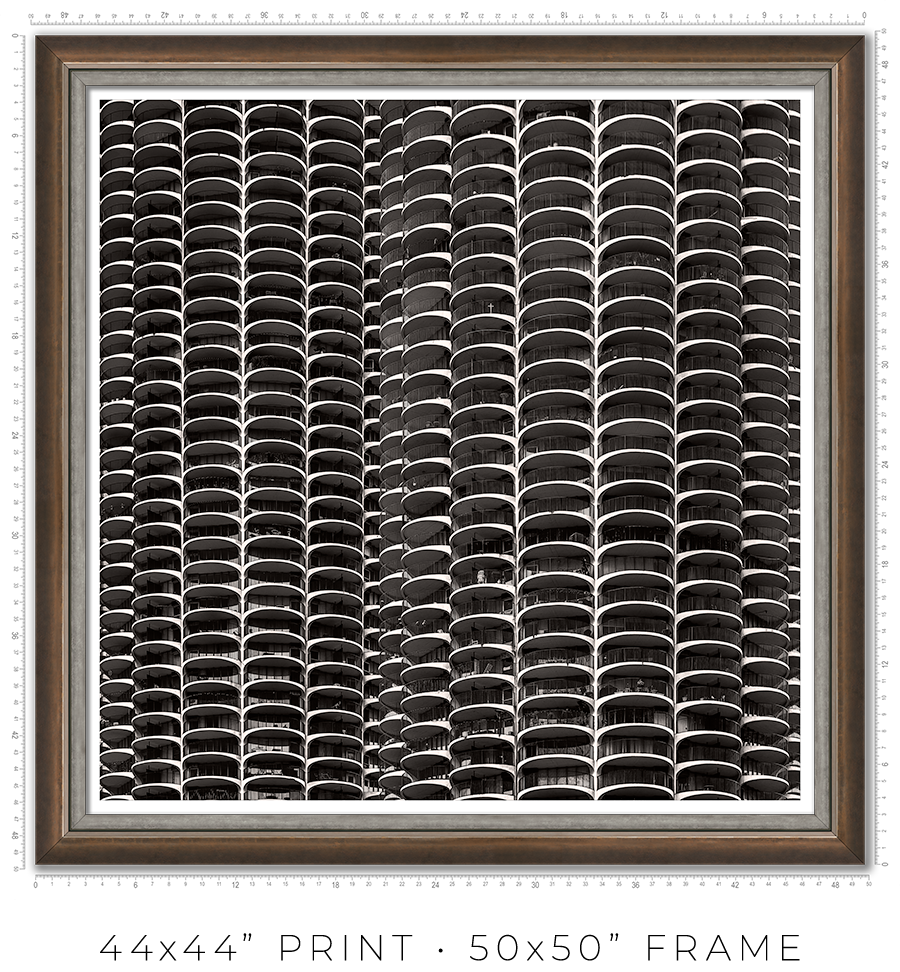
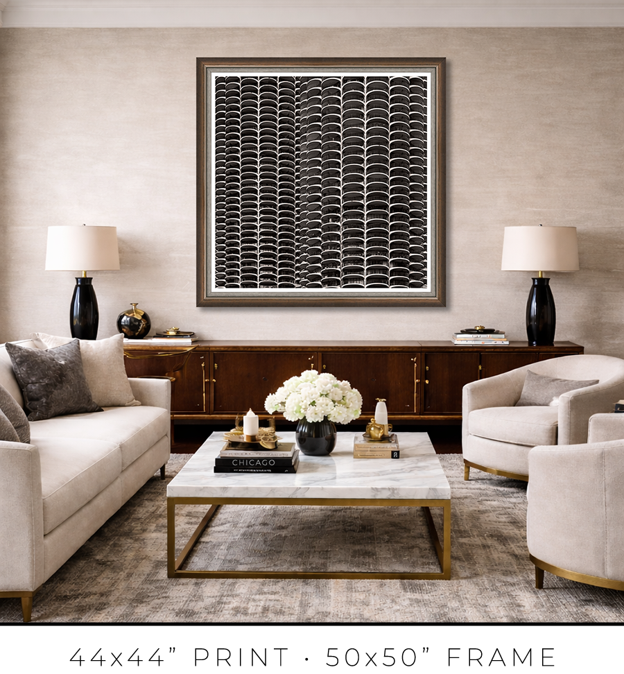
For large 44x44” prints, the frame design requires a totally different approach. Compared to smaller prints, the large print is a statement, it is a centerpiece of the room. It is a celebration, and the "little black dress" concept doesn’t work here. It needs a bit of exuberance. At the same time, it has to be constrained and confident. Like a Rolls-Royce brand identity.
To meet this challenge, I came up with a design of two different frames stacked together to form a unified frame for large prints.
The main frame is one of the most expensive frames I used, a custom frame made in Italy. It is 2” tall and 2” wide. It is a block, but it has a bevel on the inside. The beauty is in color, or to be precise, in color gradation. It is dark charcoal on the outer sides, which gradually transforms into a patina of silver leaf on the inner bevel through dark copper leaf on the front side. The beauty is that the gradation is not even, it looks painted by hand. It looks authentic, rustic, and antique.

The secondary frame is 1 1/8" wide, and it has a similar rustic, scratched, antique look, but it is pewter, which is almost the same color tonality as a photographic print it frames. It is more restrained than the primary frame and works well as a separator. Also, it has this chiseled, rough edge, another detail that adds authenticity to the whole frame.


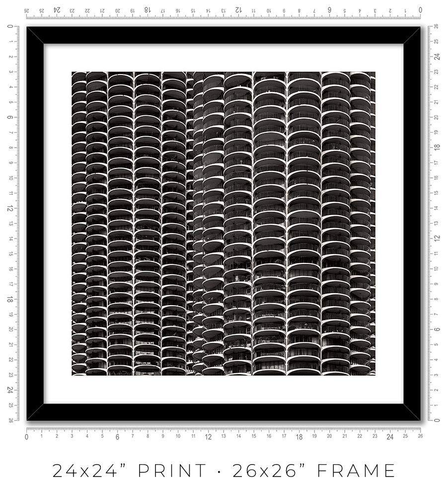
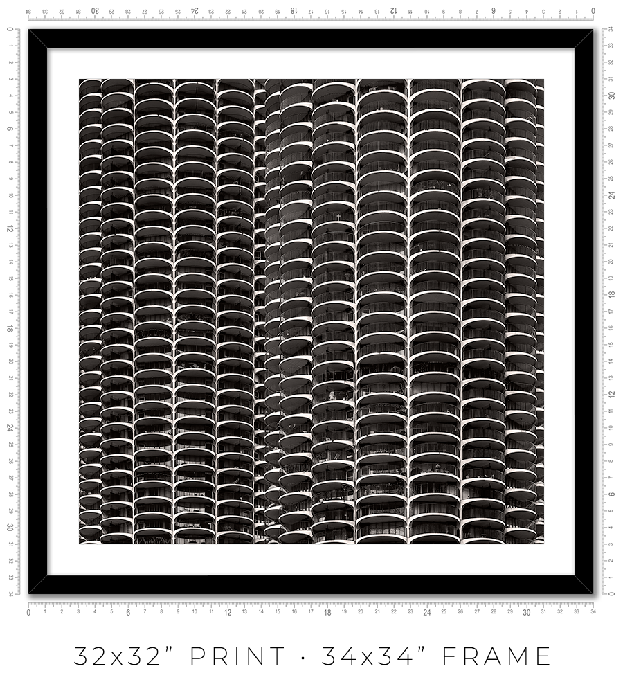
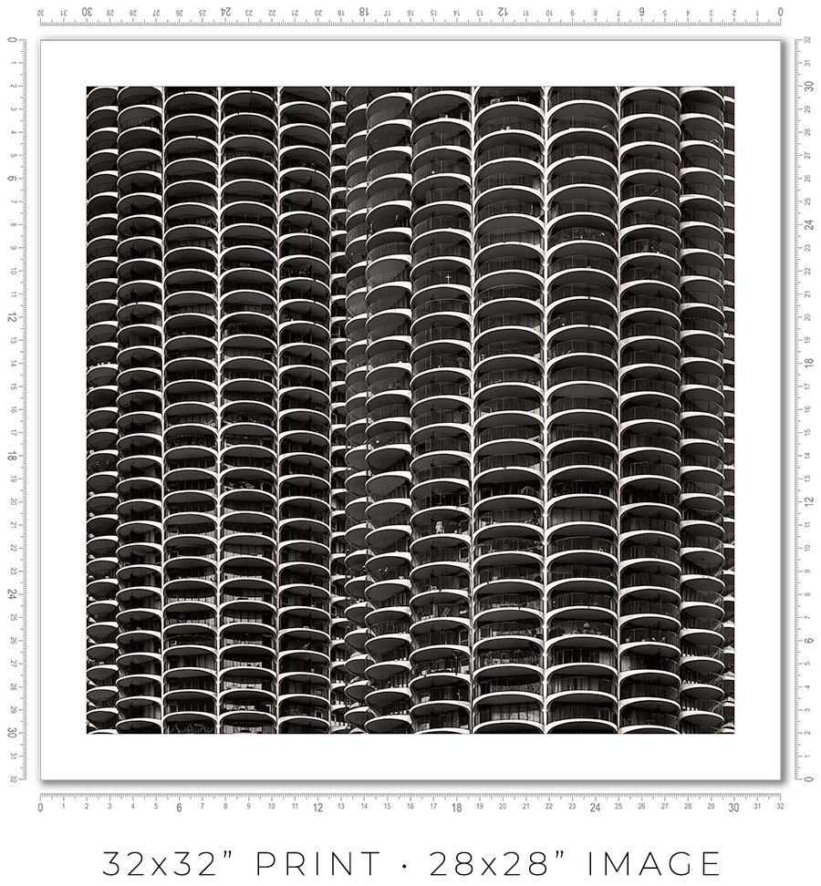
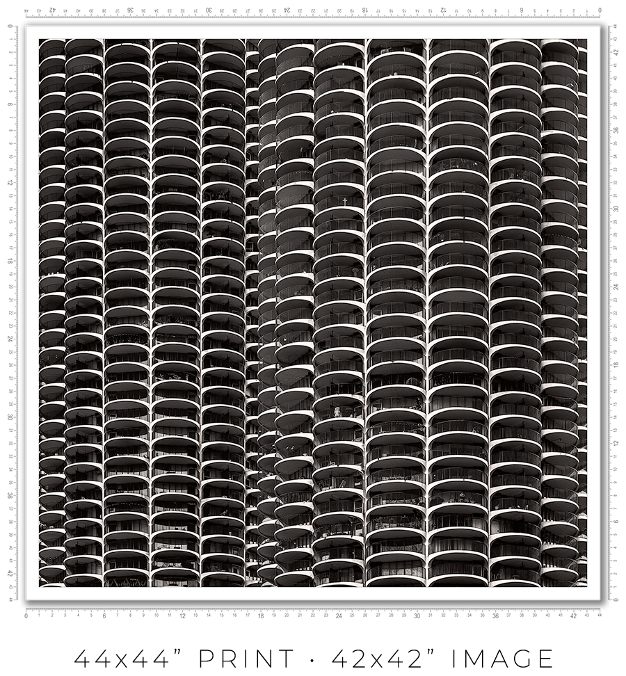
I owe you a clarification about print sizes. The framed print sizes listed on my website (16x16”, 24x24”, 32x32”, and 44x44”) refer to the sizes of prints mounted on the board before framing. But with the frame included, the outside dimensions will be obviously larger. Also, because of the white space (1” or 2”) around the image to separate it from the frame, the actual print size is smaller. Here is the table with all dimensions:
| Framed Print | Outside Dimensions | White Space | Actual Print |
| 16x16” | 17x17” | 2" | 12x12" |
| 24x24” | 26x26" | 2" | 20x20" |
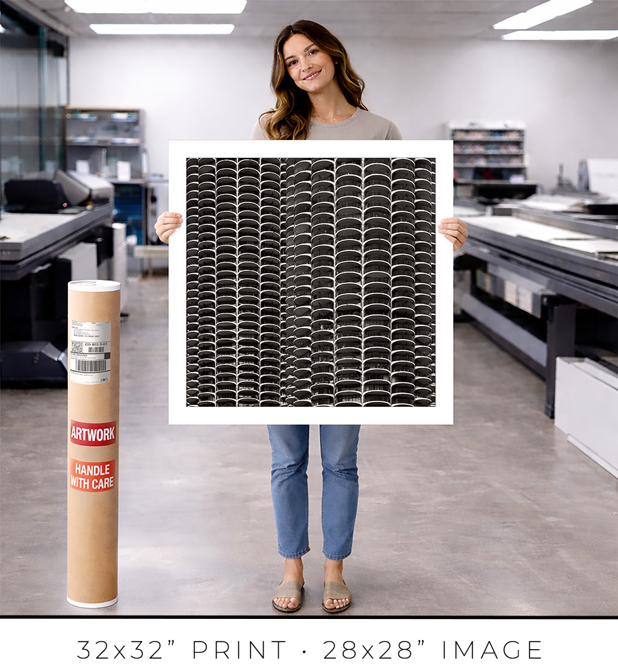
| 32x32" | 34x34" | 2" | 28x28" |
| 44x44" | 50x50" | 1" | 42x42" |
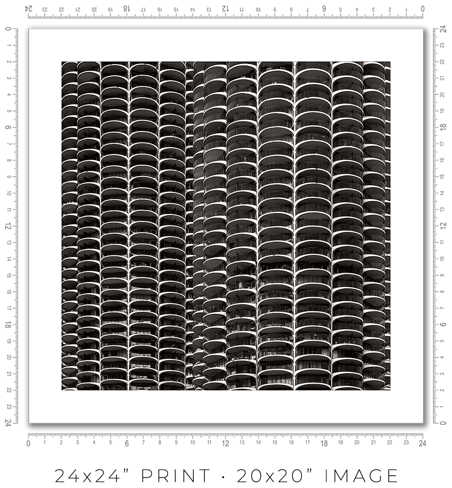
And here is the sample picture to explain the dimensions table:

These are the standard frame options I offer on my website. If you need a custom frame or print sizes, please reach out to me, and I would be happy to help.
A photo print is an option if you want to frame it yourself or have a frame shop you know and trust that will frame it for you.
A photo print is just a loose print that I will send to you in a shipping tube.
I make prints myself in my studio. I use glossy metallic photo paper almost exclusively. It is the perfect paper for black-and-white architectural photography. It adds a distinctive pearlescent, three-dimensional sheen to the print.
The prints are part of a limited edition. They are signed and numbered just below the print. The Certificate of Authenticity is enclosed with the print.
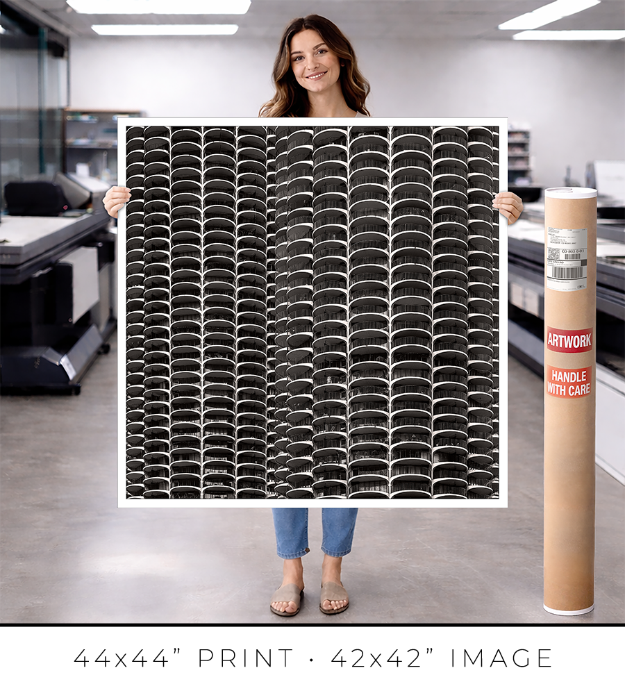
I offer on my website three different sizes for photo prints: 24x24”, 32x32”, and 44x44”. If you need a custom size print, please let me know.
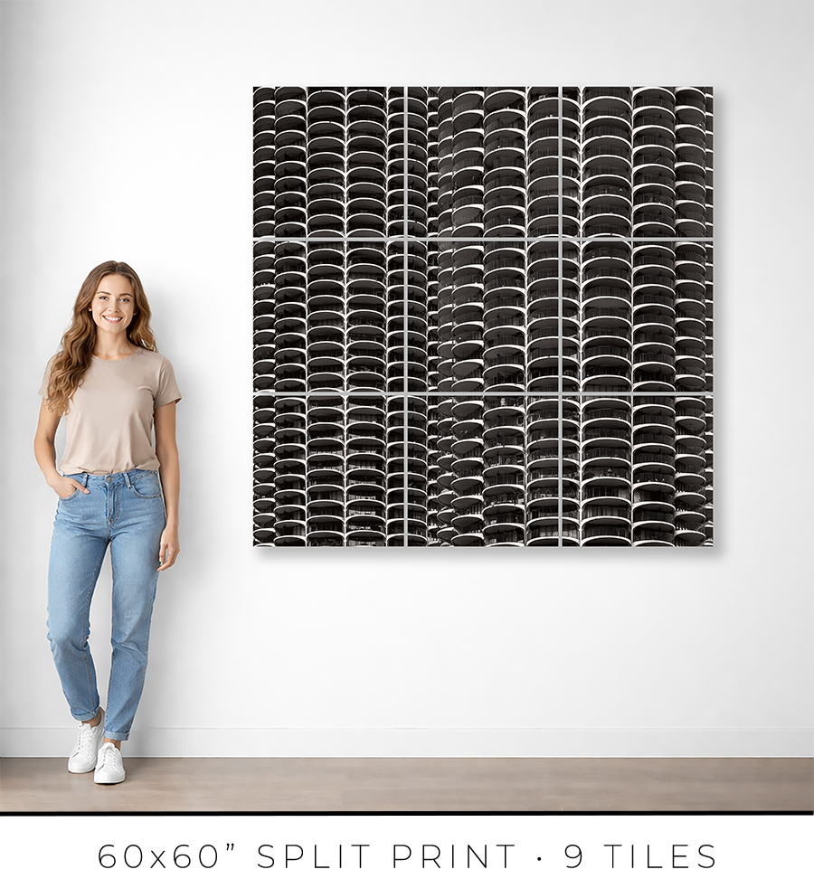
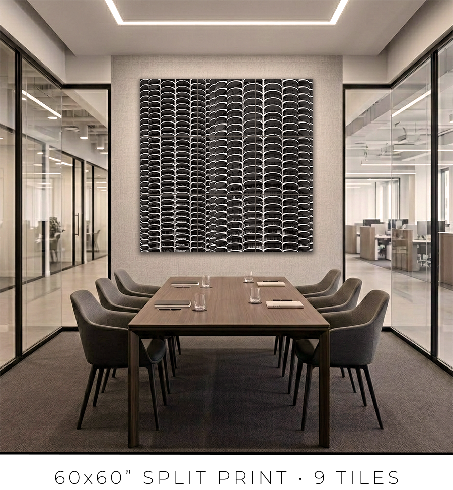
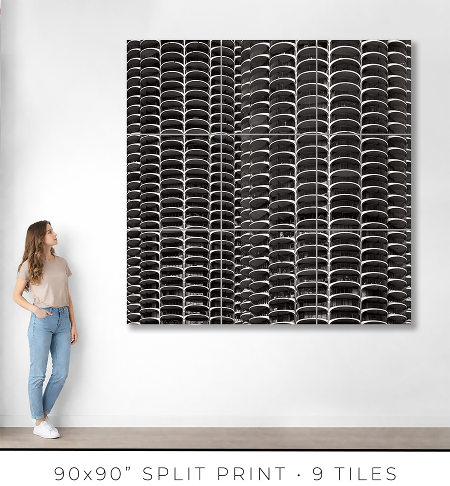
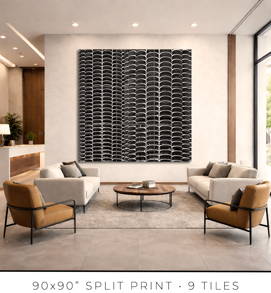
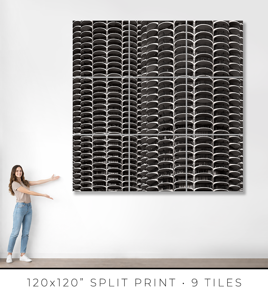
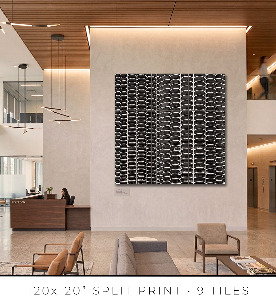
Split print is a great option if you want to go big, really big, up to 10 feet or maybe even bigger. It is a great option for office lobbies and for any place with large, tall walls.
There is a little “behind-the-scenes” story about split prints. I used to offer 60x60” on my website, but it was a mixed bag. First of all, that was the maximum print size I could make because all the materials (backing board, glass, etc.) do not come in sizes bigger than 60x60”. That was the ceiling I could not break. Second, the shipping of these prints was a nightmare. They are big and had to be shipped freight in a crate (not cheap), and every second print I shipped came back damaged, with big holes poked by careless forklift drivers at the sorting facilities.
There had to be a solution to these problems. And I found it in split prints.
Split print is a square print divided into nine (3 by 3) or more smaller squares. 60x60” print becomes a set of nine 20x20” prints, and 120x120” print is a set of nine 40x40” prints. No frame is required for this print presentation, as these are acrylic prints.

Acrylic print is a print on metallic photo paper face-mounted on a 1/4” thick sheet of acrylic (with polished edges) and sandwiched for strength with a sheet of aluminum Dibond. It is a modern, contemporary way to present a photographic print.
Because these are relatively small prints, compared to the final result, they can be shipped on a palette, which eliminates the shipping damage I had before. Plus, they are not heavy, and one person can easily put them on a wall using cleat hangers.
The best practice is to leave about a 1/4" or 1/2" gap between the acrylic print tiles. Since the edges of the acrylic prints are polished and the acrylic is quite thick at 1/4", it creates an interesting optical effect like looking through water.
If you are in the Chicagoland area, I will get you in touch with an installation guy I trust and have used for years, and he will help you install the split print in your home or office.
Each fine art print is produced specifically for you.
From the moment your order is confirmed, your print enters a deliberate production process: printing, inspection, drying, mounting, framing, final quality control, and secure packaging for shipping. Nothing is rushed. Every step is completed in-house to ensure consistency, precision, and permanence.
For matted prints and 16x16” framed prints, the production takes 1-2 days. For large framed prints, it takes 3-4 days.
If you are in the Chicagoland area, the shipping takes only one day. Large prints, I will deliver personally. I will contact you to schedule a delivery date and time that is convenient for you.
If you are outside of Chicago, the shipping takes 2-3 days, standard UPS Ground transit time. Large prints will be shipped in a crate built out of lumber and plywood. To open it, you might need a screwdriver, there will be many screws to remove.
You will receive an email with shipping tracking information once your order is ready for shipping.
Because most of the work is handmade in the studio, minor variations are part of the object's character. The result is not a mass-produced item, but a permanent piece crafted with attention.
Split prints are the only option I outsource to the photo lab. But I guarantee the quality of the prints because they are made under my supervision. Delivery time for split prints is about two weeks, but it can vary depending on the scope of the project.
If you have a specific deadline, please contact me before placing your order, and I will do my best to accommodate your timeline without compromising quality.
Each work is produced to order and crafted individually in my studio. Because of this, my payment and refund policies reflect the seriousness and permanence of the object.
Payments
Full payment is required at the time of purchase to secure your edition and initiate production.
I accept major credit cards and other secure payment methods at checkout. Production begins once payment is received.
There is an option at the checkout for “Payment in Person”. Please use it if you want to reserve your print but need to customize it and are unsure of the exact price. I will email you the invoice, which you can safely pay on my website later.
Refunds and Returns
All prints are made to order. As such, sales are considered final.
I do not offer refunds for change of mind, incorrect size selection, or personal preference. I encourage collectors to review dimensions, framing options, and placement carefully before purchasing.
If your work arrives damaged in transit, please contact me within 48 hours of delivery with photographs of the packaging and the piece. I will repair or replace the work as appropriate.
In the rare event of a production defect, I will make it right.
Cancellations
Orders may be cancelled within 24 hours of purchase, provided production has not yet begun. After production starts, cancellations are not possible.
I stand behind the quality, craftsmanship, and permanence of every piece. If you have questions before purchasing, I am always available to assist.
ADDRESS: 300 North State Street, Chicago, IL
ARCHITECT: Bertrand Goldberg
YEARS BUILT: 1964–1968
Most people walk past Marina City and see corncobs. Two round towers on the river. Some people like them, some people hate them. But they keep walking.
They miss everything.
Stand by the Wabash Avenue Bridge and look up. Not a glance. Really look. Let your eyes climb the building floor by floor. What you see is not a facade. There is no facade. No glass curtain wall, no applied skin, no decorative surface stretched over structure like makeup over a face. What you see is the building's skeleton turned inside out. The balconies are not attached to the structure. They are the structure. Concrete cantilevered from a central core, repeated sixty-five times, curving outward like the petals of a flower that never closes.
This is the thing almost no one understands about Marina City: the pattern you see is not ornament. It is anatomy.
Every residential floor is a slice of a circle. A wedge-shaped slab radiating from a cylindrical core, projecting outward into open air. Stack those slices vertically, and the tower becomes a column of arcs. A ribbed cylinder. Concrete fluted like a Greek column, except this column is 587 feet tall and people live inside it.
Bertrand Goldberg did not design a building and then add balconies. He designed a structural system that, as a consequence, produced balconies. The radial floor plan demanded them. Every apartment fans outward from the core like a branch from a trunk. The balcony is where the branch meets the sky. It is not decoration. It is the logical endpoint of the geometry.
This distinction matters more than you think.
In most buildings, the exterior is a lie. A glass curtain wall tells you nothing about what happens behind it. The surface is separated from the structure. The face is separated from the body. You look at a Miesian tower, and you see a mirror. You look at Marina City, and you see the building itself: its bones, its logic, its repetition made visible.
Goldberg stripped the mask off. What remains is pure structural honesty. Concrete stacked into rhythm.
The pattern changes every hour. This is not poetic exaggeration. It is physics.
Morning light strikes the outer rims of the balconies, sharpening them into bright horizontal bands. The shadows between floors are shallow. The tower looks crisp, almost mechanical. By afternoon, the sun moves west over the river, and the shadows deepen. Each balcony casts a dark line on the floor below it. The ribbing intensifies. The building gains weight, gravity, and presence.
In winter, the low sun exaggerates everything. The horizontal bands become so pronounced that the towers look striped, like the rings of a tree trunk cut open for counting. In summer, overhead light softens the shadows, and the balconies merge into a continuous texture, almost honeycomb-like, almost organic. The same building. The same concrete. Four different readings in a single day.
You cannot get this effect from a flat wall. You cannot get it from a glass box. You can only get it from a curve repeated with absolute discipline, floor after floor, sixty-five times, without variation. The repetition is the point. The repetition is what transforms engineering into something that stops you on the sidewalk and makes you look up.
Here is the contradiction Goldberg built into the design.
The pattern is exact. Mathematical. Every floor identical. Every balcony is the same radius, the same depth, the same concrete edge. From the street, the repetition is hypnotic. The eye follows the curve upward, and the building becomes an abstract object, a sculpture, a pure form liberated from the mess of daily life.
Then you look closer. One balcony has a chair. Another has tomato plants in terra cotta pots. A third has a bicycle leaning against the railing. A fourth has wind chimes and a small dog staring down at you.
The strict geometry shatters. The modernist purity cracks open, and life pours through the gaps. Every balcony is the same shape, and no two balconies are the same. The architect's vision collides with sixty-five floors of human improvisation, and neither side wins. The building oscillates between order and chaos, between the abstract and the personal, between the blueprint and the breakfast table.
This tension is not a flaw. It is the design.
Goldberg understood something his contemporaries refused to accept. A building that demands perfection from its inhabitants is a prison. A building that offers structure and then steps back is a home. The balconies give you the frame. You fill the frame with your life. The pattern holds. The pattern also bends.
Most architects of the 1960s wanted control. Goldberg wanted a conversation.
Chicago is a city of right angles. Steel frames and glass planes. The Miesian grid repeated block after block along the lakefront. Marina City rejects all of it.
No flat facade. No vertical plane. No orthogonal discipline. Instead: circles. Arcs. Curves that have more in common with biology than with engineering. Against the rigid rationalism of the city's skyline, these balconies introduce something almost subversive: softness. Not weakness. Softness, the way a river is soft. The way water finds its way around stone.
Goldberg studied under Mies van der Rohe. He learned the grid. He mastered the box. And then he walked away from it because he believed the box was a cage. He said it out loud: "No right angles exist in nature." He looked at the glass towers his peers were building and called them psychological slums.
The balconies of Marina City are the physical proof of that conviction. Every curve is a refusal. Every arc is an argument. The building does not stand on the riverbank as a neutral container. It stands as a manifesto in concrete: the right angle is not the only way to organize a human life.
The balconies have become cultural shorthand. Wilco's album cover. Steve McQueen's car plunge. Instagram silhouettes at golden hour. The pattern is so graphically clear that it works even in shadow, even at a distance, even reduced to a thumbnail on a phone screen.
But icons are dangerous. The more familiar something becomes, the less you see it. You recognize Marina City the way you recognize a famous face: instantly, and without depth.
Go back to the Wabash Avenue Bridge. Look at the towers again. This time, do not photograph them. Look at a single balcony. One floor. One curve of concrete. Notice the edge where the slab meets the open air. Notice the shadow it casts on the floor below. Notice how the curve catches light on its western edge and loses it on its eastern edge, all in the same moment.
Now multiply that by sixty-five.
What you are seeing is not a pattern imposed on a building. It is a pattern generated by a building. Born from structure, from material, from the logic of a cylinder and the weight of concrete, and the fact that gravity pulls everything toward the earth, and the architect's job is to push back.
Concrete stacked into rhythm. Circles translated into skyline. A building that does not hide behind a surface but stands exposed, its repetition visible, its logic readable, its humanity written in plastic chairs and tomato plants and wind chimes sixty stories above the river.
That is what Marina City's balconies are. Not decoration. Not style. Structure made visible, repeated until it becomes music.
You just have to stop and listen.
Choose options