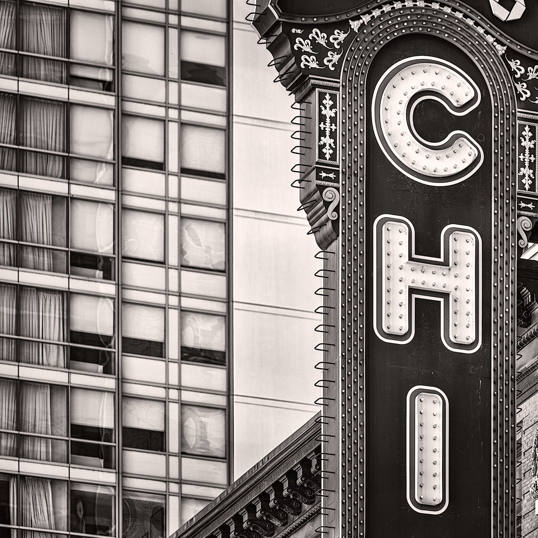

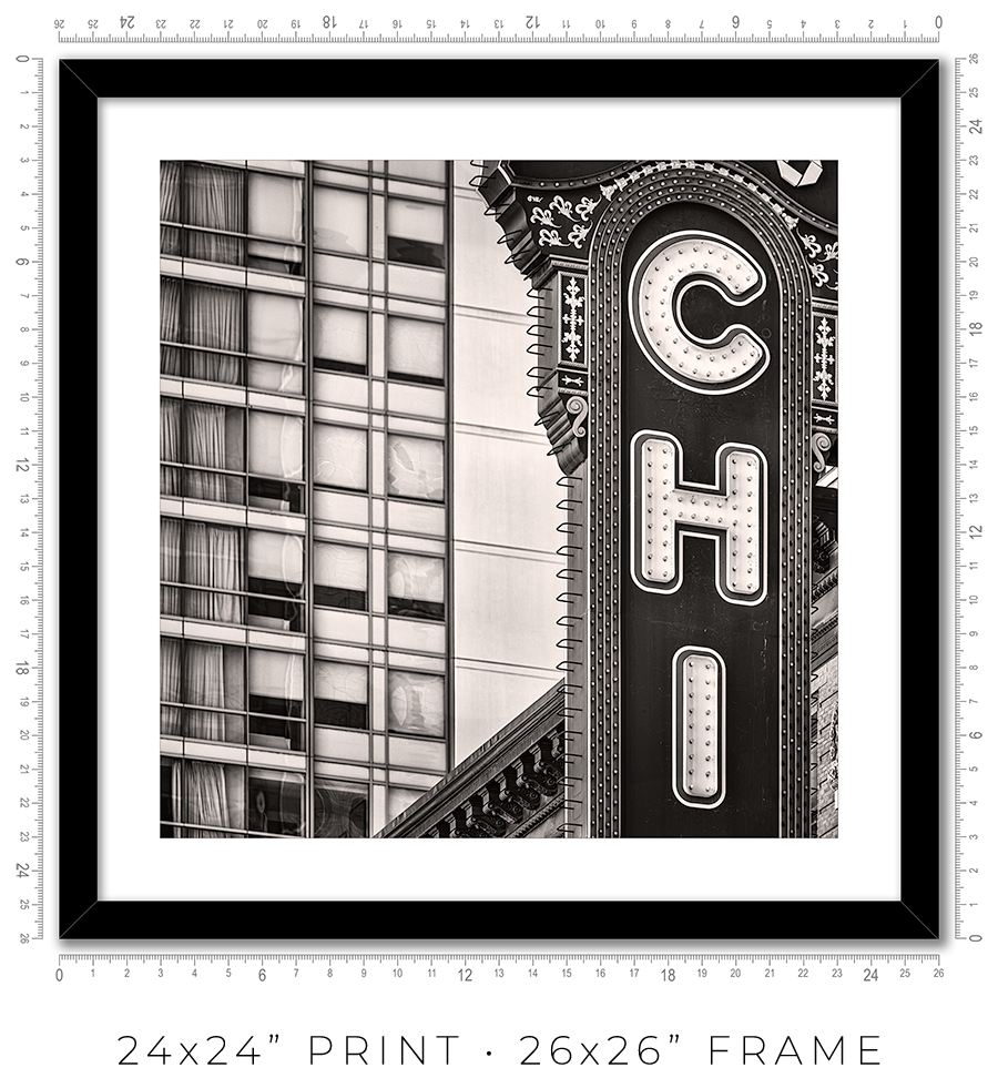
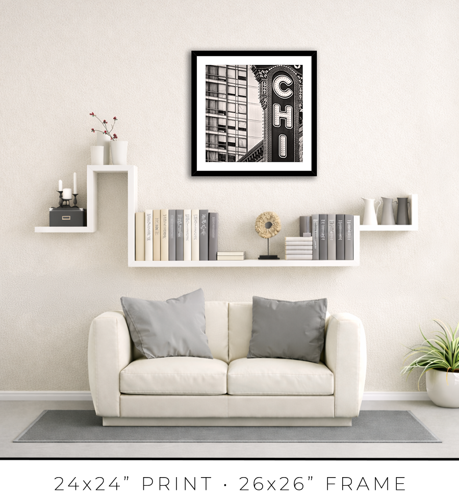
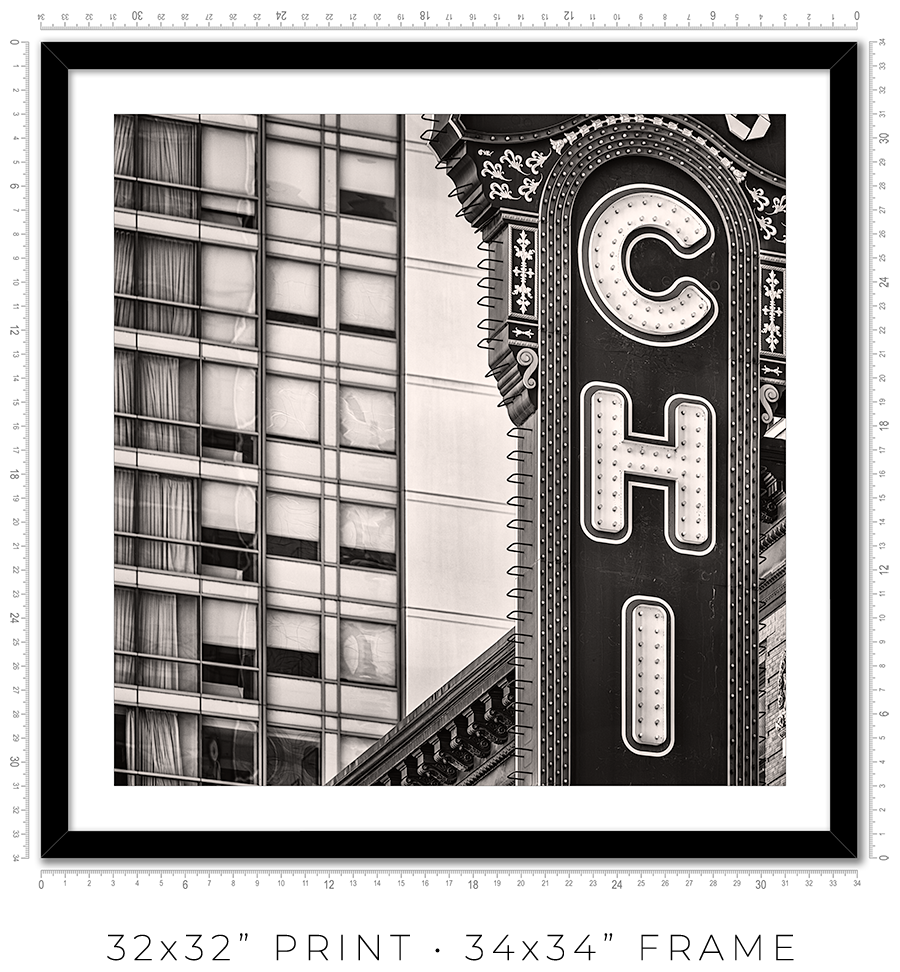
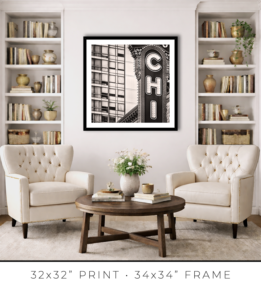

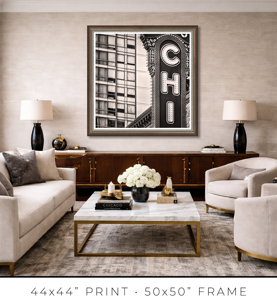
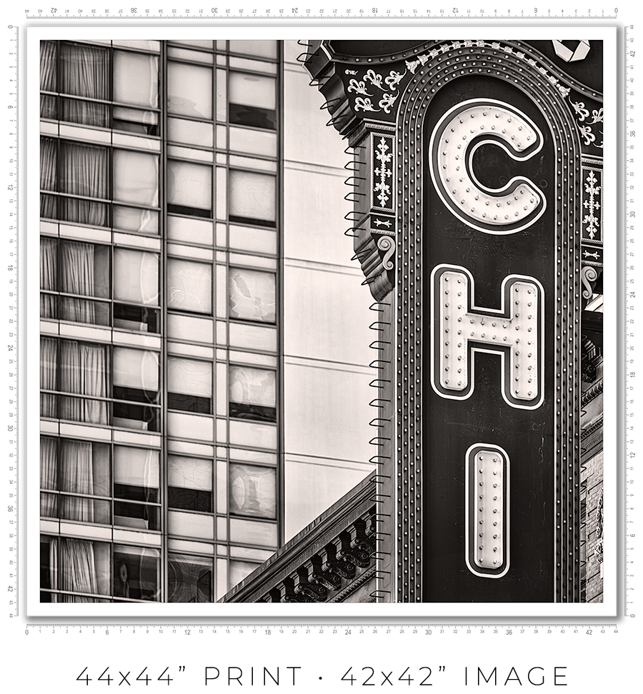
Chicago Theater Vertical Sign
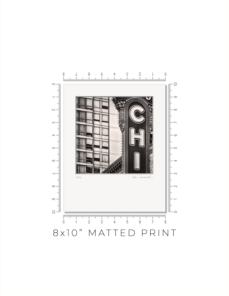
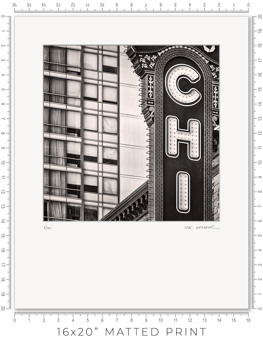
Matted prints are a great option if you want to choose your own frame. They come in two sizes: 8x10" and 16x20". These are standard frame sizes. You may easily find these frames at any retail shop.
One thing you need to know about frames. Those cheap, thin frames with swivel locks and kickstands will not work. They are designed for simple photo prints or diplomas. The matted print will be too thick for these frames. Find a decent frame that is at least 1" deep.
I make every print myself in my studio. No photo lab. No outsourcing. Every print is handmade.
I print on metallic photo paper. It is the perfect paper for black-and-white architectural photography. It adds a distinctive pearlescent, three-dimensional sheen to the prints.
For mats, I use 4-ply Crescent Arctic White matboard. It is off-white, traditional, and restrained. Not bright white, which is too bright and overwhelms the image. This matboard is the archival standard for conservation framing.
I mount prints on 3/16" Bainbridge foamcore. It is acid-free, clay-coated, rigid, and lightweight. It is ideal for archival print mounting.
The print is permanently sealed between the mat and the mounting board. It is intentional. A hinge mount leaves the print too loose. Also, it causes the print to bulge in the middle. A sealed mount keeps the print flat and tight. If you need a hinge mount or a matboard backing instead of foamcore, let me know.
Every print is signed and numbered (limited edition) on the mat in pencil. On the back, you will find a Certificate of Authenticity with all the details about the print and my contact information.
The actual photo print size for an 8x10” matted print is 6x6” with a 1” mat border, and for a 16x20” print, it is 12x12” with a 2” mat border. Since the photo prints are square and the matted prints are rectangular, the bottom mat border for 8x10” prints is 2” and for 16x20” prints it is 6”.
A framed print is a finished artwork. It is not just the image, it is a physical object that looks intentional, lasts decades, and feels complete.
The frame color, finish, and moulding profile. Print mounting, matting, and glazing. These are all deliberate decisions that elevate the image to the level of an artwork, which you can hold in your hands, put on the wall, and live with every day.
I am a professional framer, and I enjoy making frames for my prints. I put a lot of thought into what frame to use for my prints. And how to mat, glaze, and mount them. And after decades of frame-making, I acquired the skills to make my prints perfect, exactly the way I want them. I am proud of what I do.
I make every print myself in my studio. No photo lab. No outsourcing. Every print is personally crafted by me.
I start with printing the image on one of my large-format printers. I use glossy metallic photo paper almost exclusively. It is the perfect paper for black-and-white architectural photography. It adds a distinctive pearlescent, three-dimensional sheen to the print. In a bright spotlight, it looks like a hologram.
For glazing, I seal the print with archival 5-mil PET film, featuring a unique, high-gloss “mirror-like” finish. There is only one manufacturer of this glazing, the price has doubled in recent years, and it is issued in small batches that sell out instantly. But the result is worth the trouble. It gives the print that elusive look of a silver gelatin print from a traditional darkroom, which was treated with a vintage photo heat glossier.
I have been a photographer all my life, and I still have my traditional darkroom. I can produce small silver gelatin prints, but large 44x44” prints are obviously out of reach with this old technology. I am happy that I can replicate that look and feel for the prints on any scale with the new technology I developed.
But this is my choice. If you prefer to use museum anti-reflective glass sheets, please let me know. I can do that, but the print prices may double (since glass is expensive), and delivery will be limited to Chicagoland only (because it is glass and it breaks in shipping).
I permanently mount my prints to white aluminum Dibond sheets using archival pressure-sensitive high-tack acrylic adhesive. It is not a simple process. I use a heavy 750-pound, 60” wide large-format laminator to complete this task. And it is the most dangerous and nerve-racking stage in the whole printmaking process. A tiny misalignment or a speck of debris on the surface can ruin the almost-finished print.
Finally, the print is ready for framing. Frame-making is where a woodworker meets an artist. It is a totally different set of skills, materials, instruments, and studio space.
Over the years, I developed relationships with several suppliers, and I get my frame moulding delivered by truck in large, long boxes. I believe my studio stocks more frame moulding than your average frame shop down the street.
I cut the moulding at 45 degrees using my mitre saw mounted on a custom 10-foot-long, heavy-duty feed bench I built long ago. I then join the cut sticks with a pneumatic v-nailer to make a square frame. Now the finishing touches: I sand and paint the frame corners to make them even and smooth.
Now it is time to put the print and the frame together. I secure the print inside the frame with flexible points and install the hanging wire (or D-rings for the large prints). I sign the print, attach the Certificate of Authenticity, and the print is ready.
Now, let’s talk about the frames I use for my prints. In my opinion, black-and-white photography does not require elaborate framing. A simple but sophisticated matte black frame is all that is needed. It is like the famous Audrey Hepburn’s "little black dress" designed by Hubert de Givenchy for the movie “Breakfast at Tiffany's”. It became iconic and has been described as "perhaps the most famous little black dress of all time." Accordingly, a “little black frame” is all that is needed for my prints.
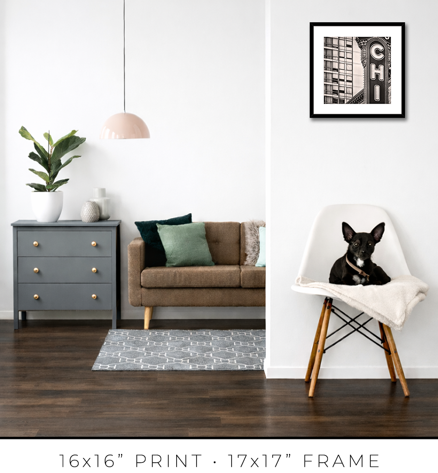
For 16x16” prints, I use a simple 3/4” matte black frame, but it is 1 1/8” tall, which adds a touch of sophistication. It looks proportional to the relatively small size of the 16x16” print.


For 24x24” and 32x32” prints, I use the same style but a different profile frame. It is a wider 1 1/4" frame, which works for larger print sizes. And it is not as tall, only 7/8", which keeps the prints more grounded on the wall and less overpowering.


For large 44x44” prints, the frame design requires a totally different approach. Compared to smaller prints, the large print is a statement, it is a centerpiece of the room. It is a celebration, and the "little black dress" concept doesn’t work here. It needs a bit of exuberance. At the same time, it has to be constrained and confident. Like a Rolls-Royce brand identity.
To meet this challenge, I came up with a design of two different frames stacked together to form a unified frame for large prints.
The main frame is one of the most expensive frames I used, a custom frame made in Italy. It is 2” tall and 2” wide. It is a block, but it has a bevel on the inside. The beauty is in color, or to be precise, in color gradation. It is dark charcoal on the outer sides, which gradually transforms into a patina of silver leaf on the inner bevel through dark copper leaf on the front side. The beauty is that the gradation is not even, it looks painted by hand. It looks authentic, rustic, and antique.

The secondary frame is 1 1/8" wide, and it has a similar rustic, scratched, antique look, but it is pewter, which is almost the same color tonality as a photographic print it frames. It is more restrained than the primary frame and works well as a separator. Also, it has this chiseled, rough edge, another detail that adds authenticity to the whole frame.


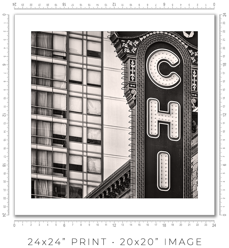
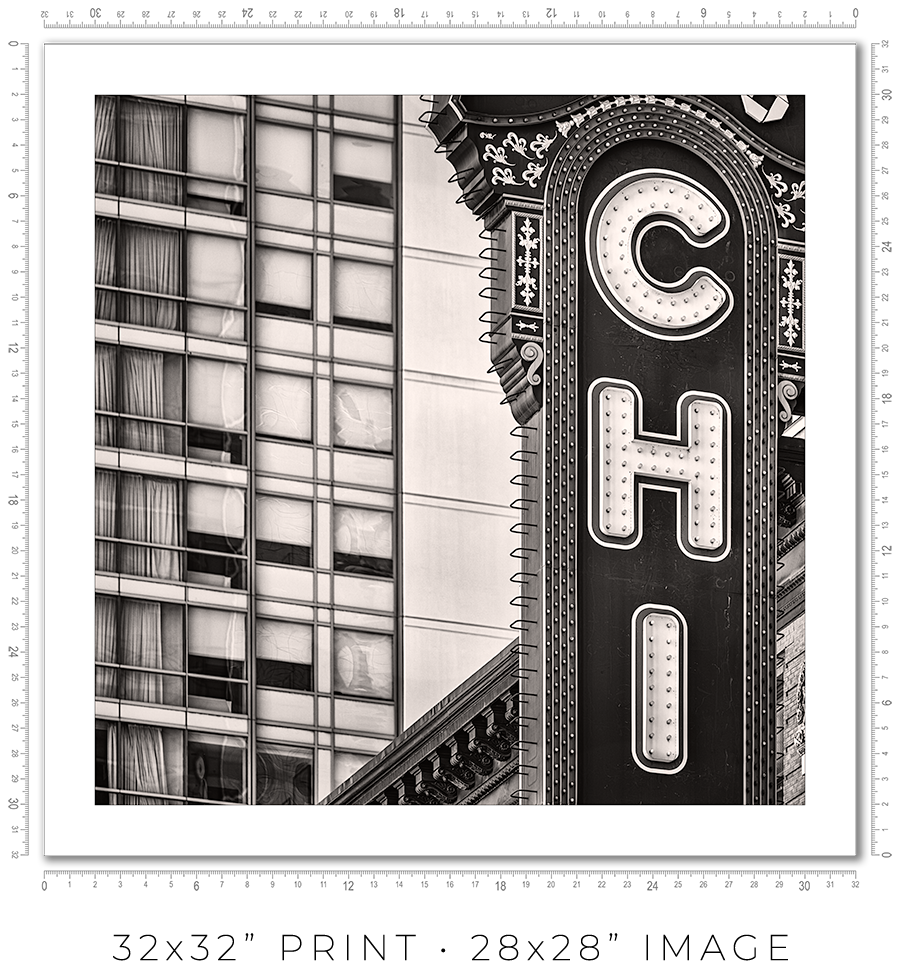
I owe you a clarification about print sizes. The framed print sizes listed on my website (16x16”, 24x24”, 32x32”, and 44x44”) refer to the sizes of prints mounted on the board before framing. But with the frame included, the outside dimensions will be obviously larger. Also, because of the white space (1” or 2”) around the image to separate it from the frame, the actual print size is smaller. Here is the table with all dimensions:
| Framed Print | Outside Dimensions | White Space | Actual Print |
| 16x16” | 17x17” | 2" | 12x12" |
| 24x24” | 26x26" | 2" | 20x20" |
| 32x32" | 34x34" | 2" | 28x28" |
| 44x44" | 50x50" | 1" | 42x42" |
And here is the sample picture to explain the dimensions table:

These are the standard frame options I offer on my website. If you need a custom frame or print sizes, please reach out to me, and I would be happy to help.
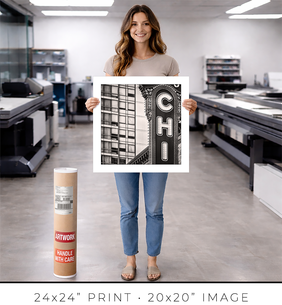
A photo print is an option if you want to frame it yourself or have a frame shop you know and trust that will frame it for you.
A photo print is just a loose print that I will send to you in a shipping tube.
I make prints myself in my studio. I use glossy metallic photo paper almost exclusively. It is the perfect paper for black-and-white architectural photography. It adds a distinctive pearlescent, three-dimensional sheen to the print.
The prints are part of a limited edition. They are signed and numbered just below the print. The Certificate of Authenticity is enclosed with the print.
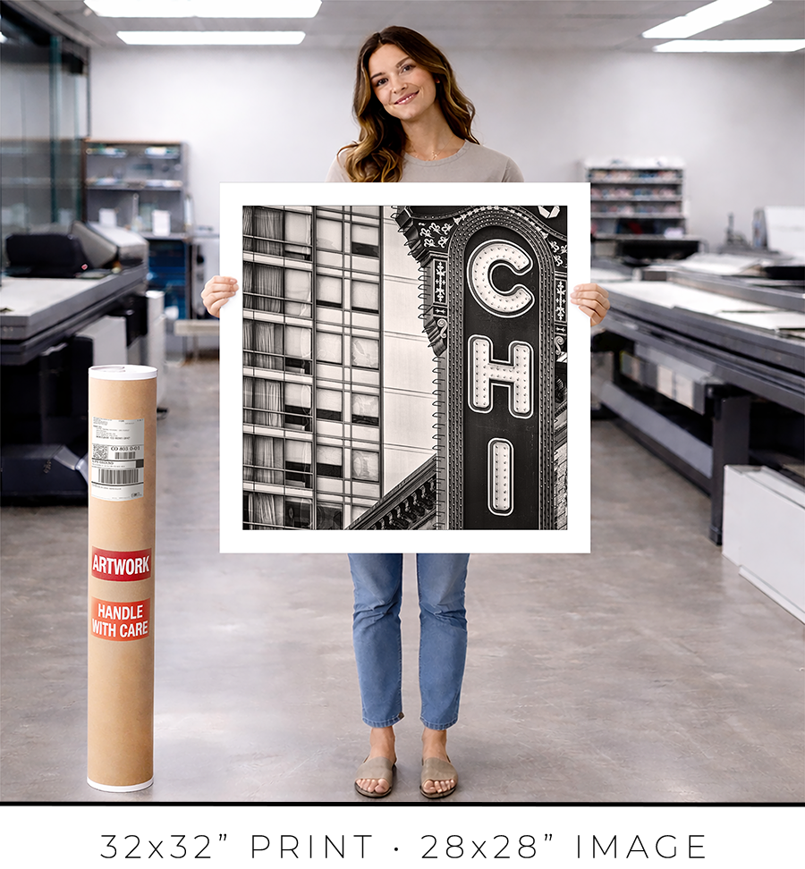
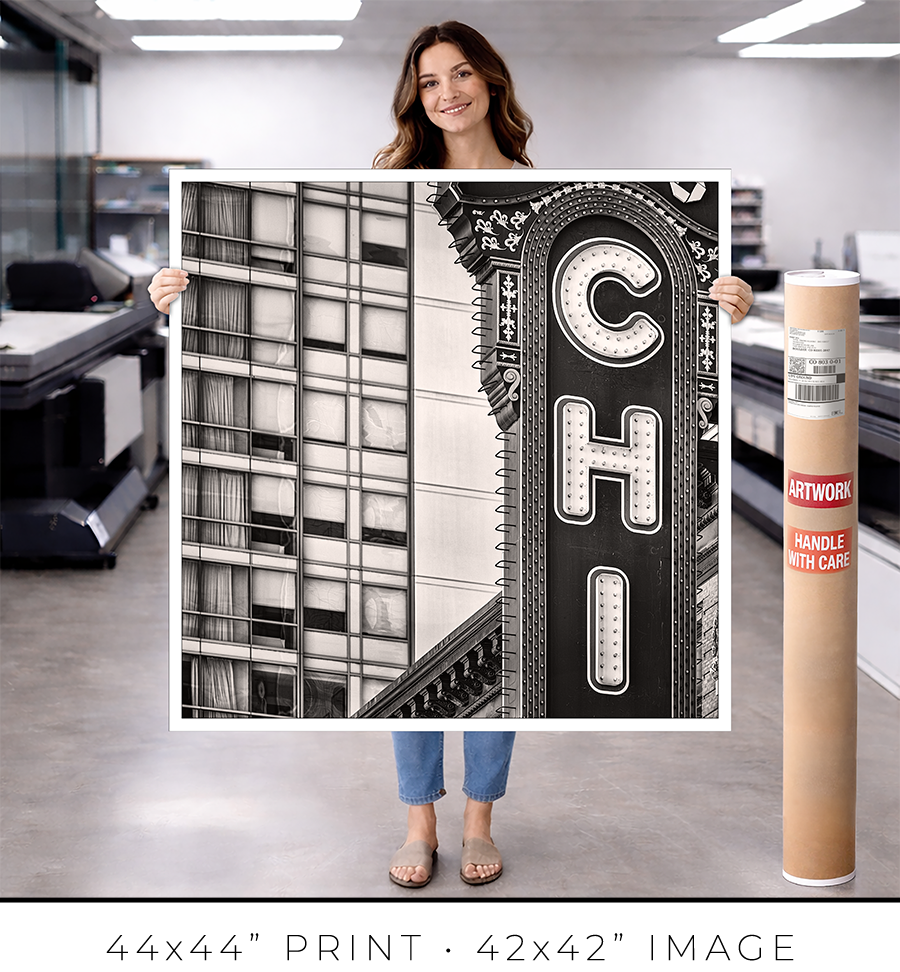
I offer on my website three different sizes for photo prints: 24x24”, 32x32”, and 44x44”. If you need a custom size print, please let me know.
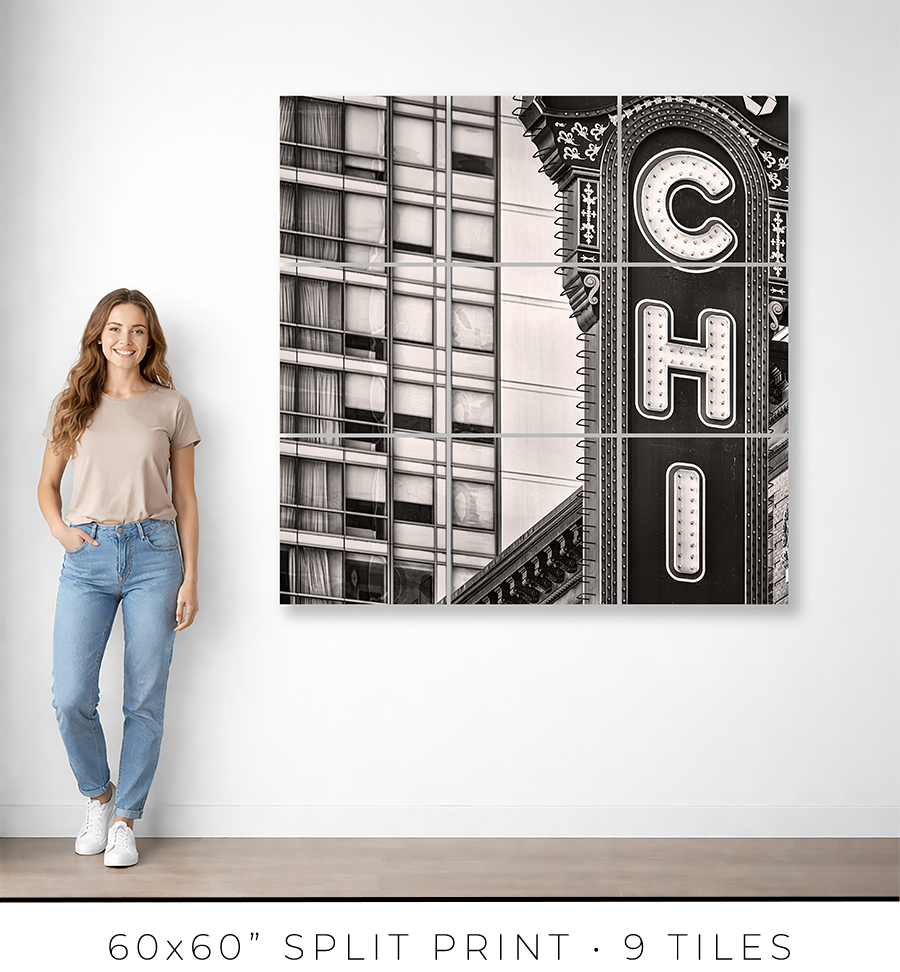
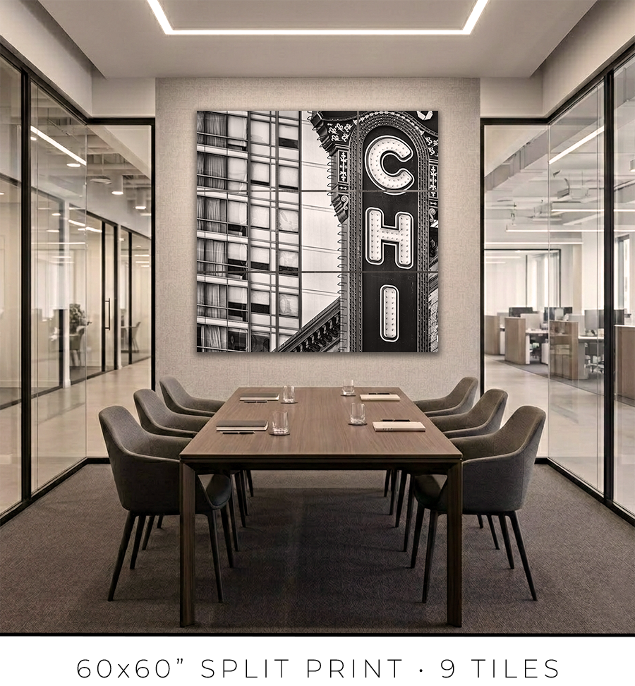
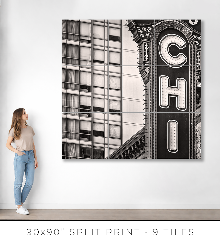
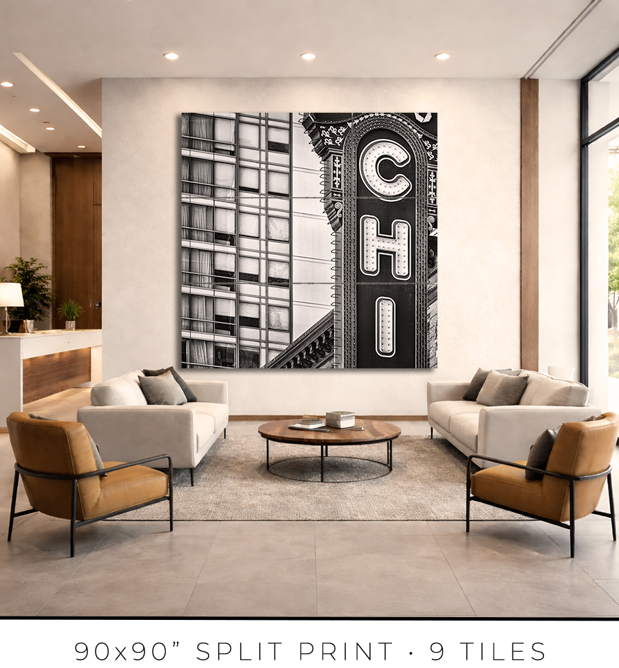
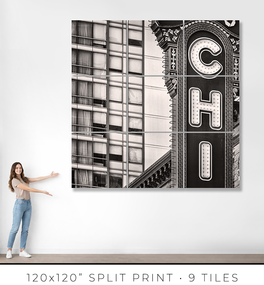
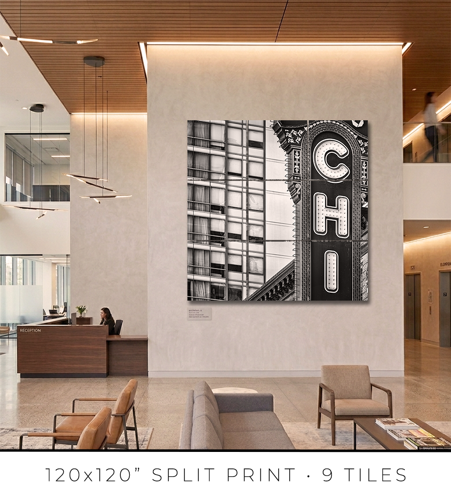
Split print is a great option if you want to go big, really big, up to 10 feet or maybe even bigger. It is a great option for office lobbies and for any place with large, tall walls.
There is a little “behind-the-scenes” story about split prints. I used to offer 60x60” on my website, but it was a mixed bag. First of all, that was the maximum print size I could make because all the materials (backing board, glass, etc.) do not come in sizes bigger than 60x60”. That was the ceiling I could not break. Second, the shipping of these prints was a nightmare. They are big and had to be shipped freight in a crate (not cheap), and every second print I shipped came back damaged, with big holes poked by careless forklift drivers at the sorting facilities.
There had to be a solution to these problems. And I found it in split prints.
Split print is a square print divided into nine (3 by 3) or more smaller squares. 60x60” print becomes a set of nine 20x20” prints, and 120x120” print is a set of nine 40x40” prints. No frame is required for this print presentation, as these are acrylic prints.

Acrylic print is a print on metallic photo paper face-mounted on a 1/4” thick sheet of acrylic (with polished edges) and sandwiched for strength with a sheet of aluminum Dibond. It is a modern, contemporary way to present a photographic print.
Because these are relatively small prints, compared to the final result, they can be shipped on a palette, which eliminates the shipping damage I had before. Plus, they are not heavy, and one person can easily put them on a wall using cleat hangers.
The best practice is to leave about a 1/4" or 1/2" gap between the acrylic print tiles. Since the edges of the acrylic prints are polished and the acrylic is quite thick at 1/4", it creates an interesting optical effect like looking through water.
If you are in the Chicagoland area, I will get you in touch with an installation guy I trust and have used for years, and he will help you install the split print in your home or office.
Each fine art print is produced specifically for you.
From the moment your order is confirmed, your print enters a deliberate production process: printing, inspection, drying, mounting, framing, final quality control, and secure packaging for shipping. Nothing is rushed. Every step is completed in-house to ensure consistency, precision, and permanence.
For matted prints and 16x16” framed prints, the production takes 1-2 days. For large framed prints, it takes 3-4 days.
If you are in the Chicagoland area, the shipping takes only one day. Large prints, I will deliver personally. I will contact you to schedule a delivery date and time that is convenient for you.
If you are outside of Chicago, the shipping takes 2-3 days, standard UPS Ground transit time. Large prints will be shipped in a crate built out of lumber and plywood. To open it, you might need a screwdriver, there will be many screws to remove.
You will receive an email with shipping tracking information once your order is ready for shipping.
Because most of the work is handmade in the studio, minor variations are part of the object's character. The result is not a mass-produced item, but a permanent piece crafted with attention.
Split prints are the only option I outsource to the photo lab. But I guarantee the quality of the prints because they are made under my supervision. Delivery time for split prints is about two weeks, but it can vary depending on the scope of the project.
If you have a specific deadline, please contact me before placing your order, and I will do my best to accommodate your timeline without compromising quality.
Each work is produced to order and crafted individually in my studio. Because of this, my payment and refund policies reflect the seriousness and permanence of the object.
Payments
Full payment is required at the time of purchase to secure your edition and initiate production.
I accept major credit cards and other secure payment methods at checkout. Production begins once payment is received.
There is an option at the checkout for “Payment in Person”. Please use it if you want to reserve your print but need to customize it and are unsure of the exact price. I will email you the invoice, which you can safely pay on my website later.
Refunds and Returns
All prints are made to order. As such, sales are considered final.
I do not offer refunds for change of mind, incorrect size selection, or personal preference. I encourage collectors to review dimensions, framing options, and placement carefully before purchasing.
If your work arrives damaged in transit, please contact me within 48 hours of delivery with photographs of the packaging and the piece. I will repair or replace the work as appropriate.
In the rare event of a production defect, I will make it right.
Cancellations
Orders may be cancelled within 24 hours of purchase, provided production has not yet begun. After production starts, cancellations are not possible.
I stand behind the quality, craftsmanship, and permanence of every piece. If you have questions before purchasing, I am always available to assist.
ADDRESS: 175 North State Street, Chicago, IL
BUILT BY: Thomas Cusack
YEAR BUILT: 1921
Seventy-six feet of vertical light. Seven letters. One word: CHICAGO.
The sign rises from the marquee of the Chicago Theatre like a glowing column planted in the middle of State Street. It is not the tallest thing on the block. It is not the oldest. But it is the thing you see first, the thing you photograph, the thing that tells you where you are before your brain catches up with your eyes. It has been doing this for over a century.
The sign has a story. And it is the story is worth knowing.
The man who built it was Thomas Cusack. Born in Kilrush, County Clare, Ireland, in 1858. His family immigrated to New York in 1861. Both parents died shortly after. Cusack, orphaned and barely out of childhood, was sent to relatives in Chicago. He learned to paint signs. At seventeen, he started his own business with a paint pot, a brush, and nothing else.
By the early 1900s, the Thomas Cusack Company was the largest outdoor advertising firm in the United States, with branches in over a hundred cities and leases on more than 100,000 billboard and wall locations. Cusack controlled forty million square feet of advertising surface. He was known as the Billboard Baron. He served on Chicago's board of education, then in the United States Congress. When he retired in 1924, it took a Wall Street banking syndicate to buy out his company. His balance sheet showed assets over twenty-six million dollars.
This was the man Balaban and Katz hired to build their sign in 1921. They didn't want a sign. They wanted a beacon. They wanted every person walking down State Street, the busiest shopping corridor in the Midwest, to look up and see the name of their theater burning in the sky.
Cusack delivered.
The sign stands 76 feet high and 17 feet wide. When it was first switched on, on October 26, 1921, the same night the theater opened its doors, it contained 2,534 exposed incandescent lamps. The letters were channel-cut, spelling C-H-I-C-A-G-O vertically, each one large enough to read from blocks away. The border featured a four-trough system of chaser lights that cascaded in a swirl pattern, a waterfall of electricity pouring down the face of the building.
The original letters were soon replaced with porcelain enamel-coated sheet metal, an early use of this material in commercial signage. The structure itself was steel, and it was heavy. Over fifty thousand pounds of it, hanging off the facade of a building that was never engineered to carry that kind of load.
At the top of the sign, above the letters, sat the name of the owner. First, it read Balaban and Katz. Then ABC-Great States. Then Plitt. Then it says simply THE. The Chicago Theatre. The crown changed hands. The sign stayed.
The sign did not just identify the building. It dominated the street. Unlike modern signage that sits flat against a wall, this sign projected outward from the facade, perpendicular to State Street, so that pedestrians and drivers could see it from both directions. It functioned less like an advertisement and more like a monument. A glowing column of typography rising above the sidewalk.
The sign changed during World War II. The cascading chaser lights were abandoned, likely as part of wartime dimout regulations that restricted illuminated signage in American cities. After the war, the color scheme was altered. The sign adapted. It survived.
By the 1970s, the theater beneath it was dying. B-movies played to empty seats. The screen had bullet holes. Rodents outnumbered patrons. On September 19, 1985, the doors closed. The wrecking ball approached. But the sign kept standing, dark now, its letters unlit, a ghost of what it had been.
In 1986, the theater was restored and reopened. Frank Sinatra headlined the gala. The sign burned again.
Then, in September 1996, a routine inspection revealed the truth: seventy-five years of Chicago weather had corroded the original steel structure from the inside out. The sign that had survived war and neglect and decades of snow and rain and Lake Michigan wind was rotting at its core. It had to come down.
Steve Kieffer, owner of Kieffer and Company in Sheboygan, Wisconsin, was hired to build the replacement. The job cost half a million dollars and took 860 hours of painstaking work. Everything had to be identical: the seams between the metal pieces, the obsolete maintenance ladders outside the sign, the intricate scrollwork. The new sign was fabricated from aluminum rather than steel, reducing its weight from 50,000 pounds to 33,000. An exact reduction of one-third. The building's bones could finally breathe.
The replica was built in Sheboygan, shipped to Kieffer's office in Buffalo Grove, and transported to State Street for installation. When they raised it into position, it looked exactly like the original. That was the point. Preservation is not about keeping the object. It is about keeping the truth of the object alive.
In 2011, a Chase Bank logo was added to the top of the vertical sign, replacing the spot where Balaban and Katz once announced their name. The city's 2004 redevelopment agreement permitted changes only to that top section, and Preservation Chicago considered the corporate sponsorship a reasonable price for the landmark's continued security. The sign now carries a bank's name where a family's name used to be. The letters C-H-I-C-A-G-O remain untouched.
This is the tension at the heart of preservation in a commercial city. The sign exists because it was always an advertisement. Balaban and Katz built it to sell tickets. Thomas Cusack built it because selling signs was his business. The sign became a symbol of the city not because anyone planned it, but because it outlasted the intentions of the people who made it. It stopped being an ad and became a landmark. The Chase logo is a reminder that the process can also run in reverse.
The sign is one of the few remaining original exposed-lamp electric signs still in use in the United States. It is one of the most photographed pieces of typography in the country. Its neon font inspired the title design for the 2002 film Chicago. It appears in movies and television shows whenever a director needs a single image to establish the city. No skyline required. No lake. No river. Just seven red letters burning against the night.
An Irish orphan who started with a paint pot built the original sign. A family of Jewish immigrants from Odesa built the theater beneath it. A sign maker in Sheboygan, Wisconsin, built the replica that stands today. The Smithsonian holds the bones of the first one. The city holds the light of the second.
That is what a sign does when it outlives its purpose. It stops selling and starts meaning. It stops advertising a theater and starts announcing a city. The building is the proof. The marquee is the signature.
The light still burns.
Choose options