

Chicago Skyline From North Avenue Beach Pier
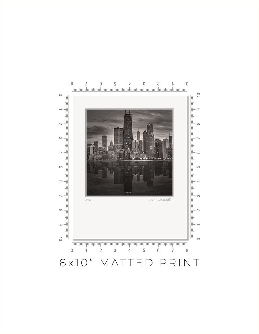
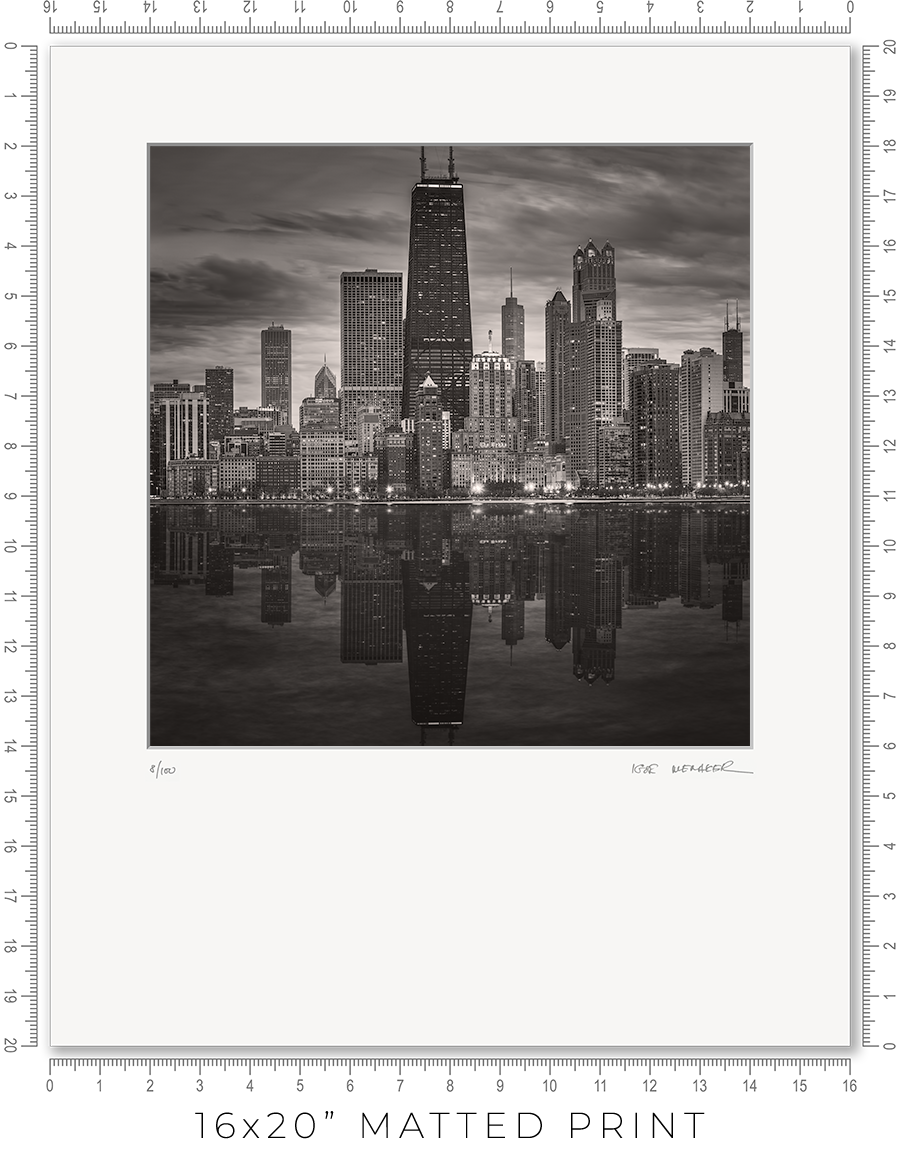
Matted prints are a great option if you want to choose your own frame. They come in two sizes: 8x10" and 16x20". These are standard frame sizes. You may easily find these frames at any retail shop.
One thing you need to know about frames. Those cheap, thin frames with swivel locks and kickstands will not work. They are designed for simple photo prints or diplomas. The matted print will be too thick for these frames. Find a decent frame that is at least 1" deep.
I make every print myself in my studio. No photo lab. No outsourcing. Every print is handmade.
I print on metallic photo paper. It is the perfect paper for black-and-white architectural photography. It adds a distinctive pearlescent, three-dimensional sheen to the prints.
For mats, I use 4-ply Crescent Arctic White matboard. It is off-white, traditional, and restrained. Not bright white, which is too bright and overwhelms the image. This matboard is the archival standard for conservation framing.
I mount prints on 3/16" Bainbridge foamcore. It is acid-free, clay-coated, rigid, and lightweight. It is ideal for archival print mounting.
The print is permanently sealed between the mat and the mounting board. It is intentional. A hinge mount leaves the print too loose. Also, it causes the print to bulge in the middle. A sealed mount keeps the print flat and tight. If you need a hinge mount or a matboard backing instead of foamcore, let me know.
Every print is signed and numbered (limited edition) on the mat in pencil. On the back, you will find a Certificate of Authenticity with all the details about the print and my contact information.
The actual photo print size for an 8x10” matted print is 6x6” with a 1” mat border, and for a 16x20” print, it is 12x12” with a 2” mat border. Since the photo prints are square and the matted prints are rectangular, the bottom mat border for 8x10” prints is 2” and for 16x20” prints it is 6”.
A framed print is a finished artwork. It is not just the image, it is a physical object that looks intentional, lasts decades, and feels complete.
The frame color, finish, and moulding profile. Print mounting, matting, and glazing. These are all deliberate decisions that elevate the image to the level of an artwork, which you can hold in your hands, put on the wall, and live with every day.
I am a professional framer, and I enjoy making frames for my prints. I put a lot of thought into what frame to use for my prints. And how to mat, glaze, and mount them. And after decades of frame-making, I acquired the skills to make my prints perfect, exactly the way I want them. I am proud of what I do.
I make every print myself in my studio. No photo lab. No outsourcing. Every print is personally crafted by me.
I start with printing the image on one of my large-format printers. I use glossy metallic photo paper almost exclusively. It is the perfect paper for black-and-white architectural photography. It adds a distinctive pearlescent, three-dimensional sheen to the print. In a bright spotlight, it looks like a hologram.
For glazing, I seal the print with archival 5-mil PET film, featuring a unique, high-gloss “mirror-like” finish. There is only one manufacturer of this glazing, the price has doubled in recent years, and it is issued in small batches that sell out instantly. But the result is worth the trouble. It gives the print that elusive look of a silver gelatin print from a traditional darkroom, which was treated with a vintage photo heat glossier.
I have been a photographer all my life, and I still have my traditional darkroom. I can produce small silver gelatin prints, but large 44x44” prints are obviously out of reach with this old technology. I am happy that I can replicate that look and feel for the prints on any scale with the new technology I developed.
But this is my choice. If you prefer to use museum anti-reflective glass sheets, please let me know. I can do that, but the print prices may double (since glass is expensive), and delivery will be limited to Chicagoland only (because it is glass and it breaks in shipping).
I permanently mount my prints to white aluminum Dibond sheets using archival pressure-sensitive high-tack acrylic adhesive. It is not a simple process. I use a heavy 750-pound, 60” wide large-format laminator to complete this task. And it is the most dangerous and nerve-racking stage in the whole printmaking process. A tiny misalignment or a speck of debris on the surface can ruin the almost-finished print.
Finally, the print is ready for framing. Frame-making is where a woodworker meets an artist. It is a totally different set of skills, materials, instruments, and studio space.
Over the years, I developed relationships with several suppliers, and I get my frame moulding delivered by truck in large, long boxes. I believe my studio stocks more frame moulding than your average frame shop down the street.
I cut the moulding at 45 degrees using my mitre saw mounted on a custom 10-foot-long, heavy-duty feed bench I built long ago. I then join the cut sticks with a pneumatic v-nailer to make a square frame. Now the finishing touches: I sand and paint the frame corners to make them even and smooth.
Now it is time to put the print and the frame together. I secure the print inside the frame with flexible points and install the hanging wire (or D-rings for the large prints). I sign the print, attach the Certificate of Authenticity, and the print is ready.
Now, let’s talk about the frames I use for my prints. In my opinion, black-and-white photography does not require elaborate framing. A simple but sophisticated matte black frame is all that is needed. It is like the famous Audrey Hepburn’s "little black dress" designed by Hubert de Givenchy for the movie “Breakfast at Tiffany's”. It became iconic and has been described as "perhaps the most famous little black dress of all time." Accordingly, a “little black frame” is all that is needed for my prints.
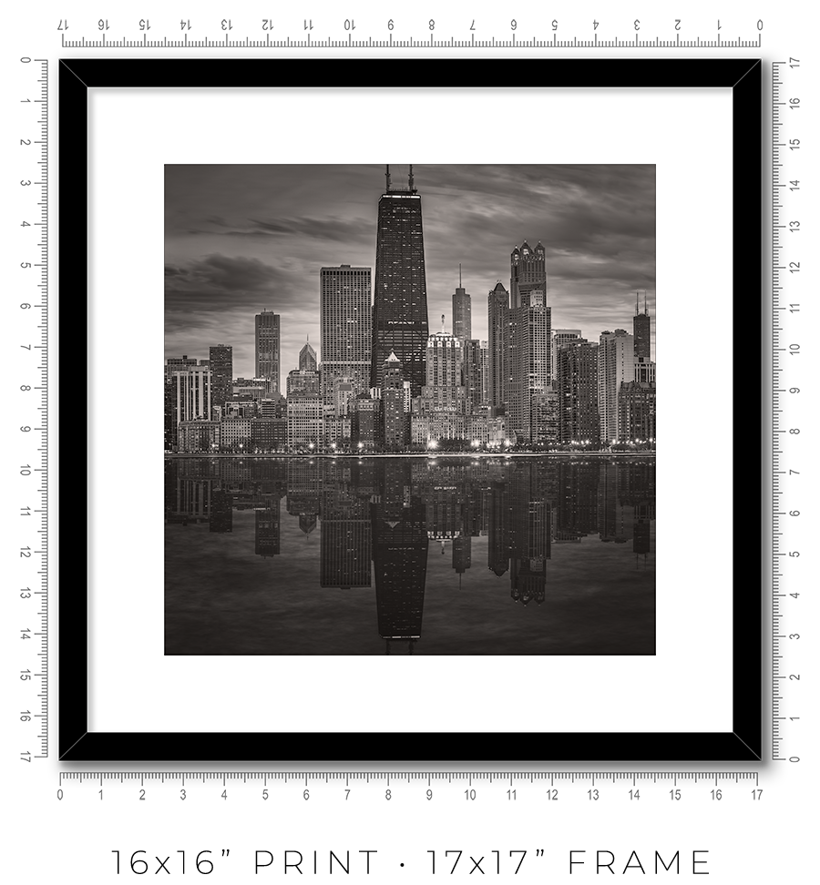
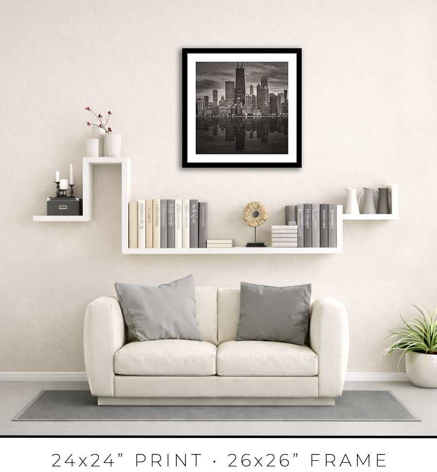
For 16x16” prints, I use a simple 3/4” matte black frame, but it is 1 1/8” tall, which adds a touch of sophistication. It looks proportional to the relatively small size of the 16x16” print.


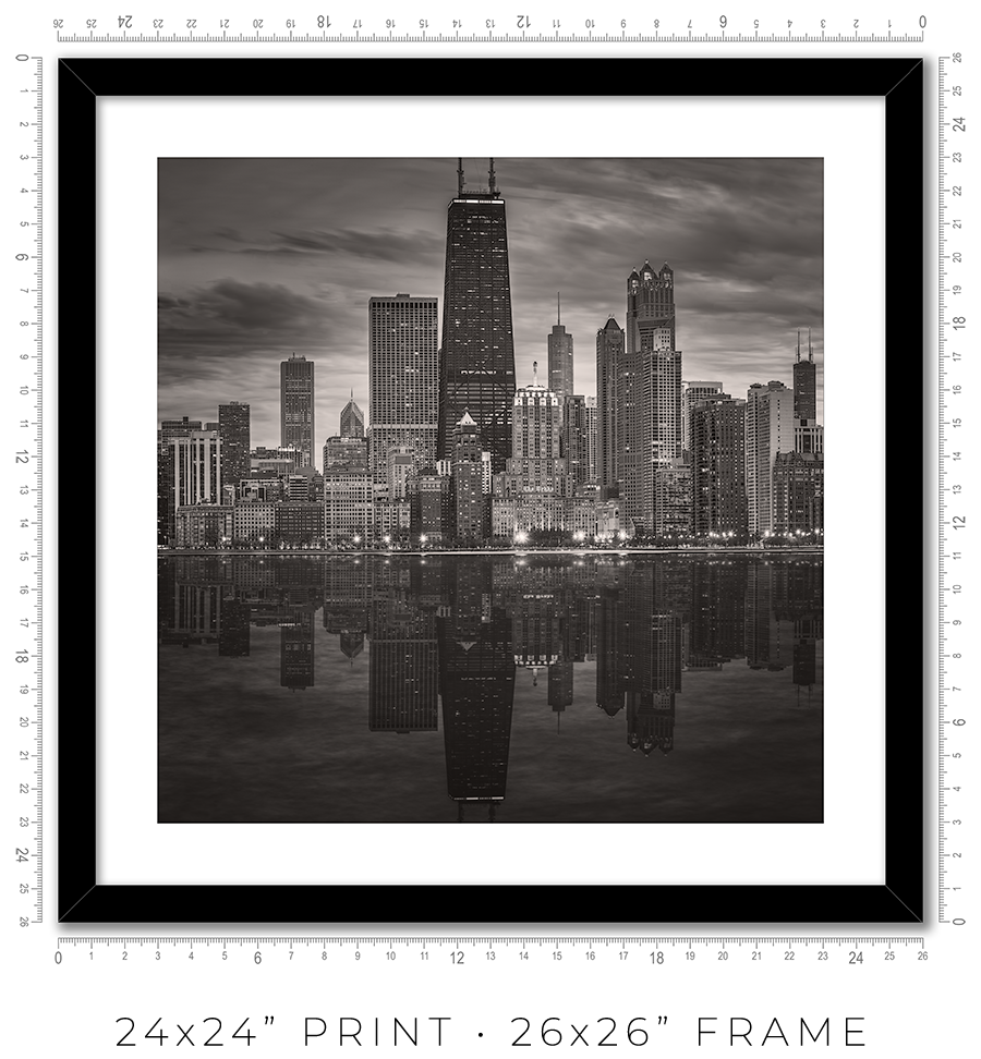
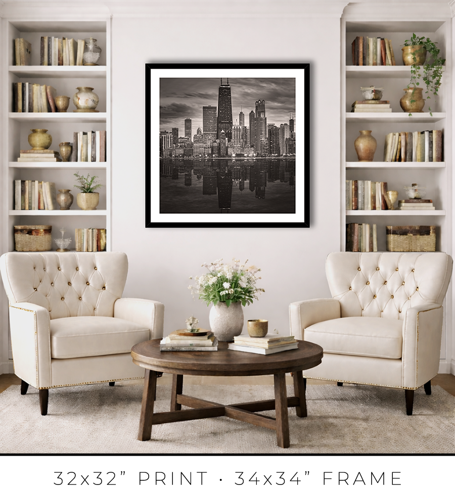
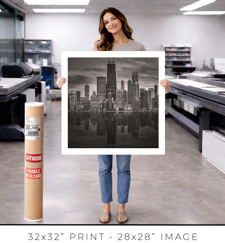
For 24x24” and 32x32” prints, I use the same style but a different profile frame. It is a wider 1 1/4" frame, which works for larger print sizes. And it is not as tall, only 7/8", which keeps the prints more grounded on the wall and less overpowering.


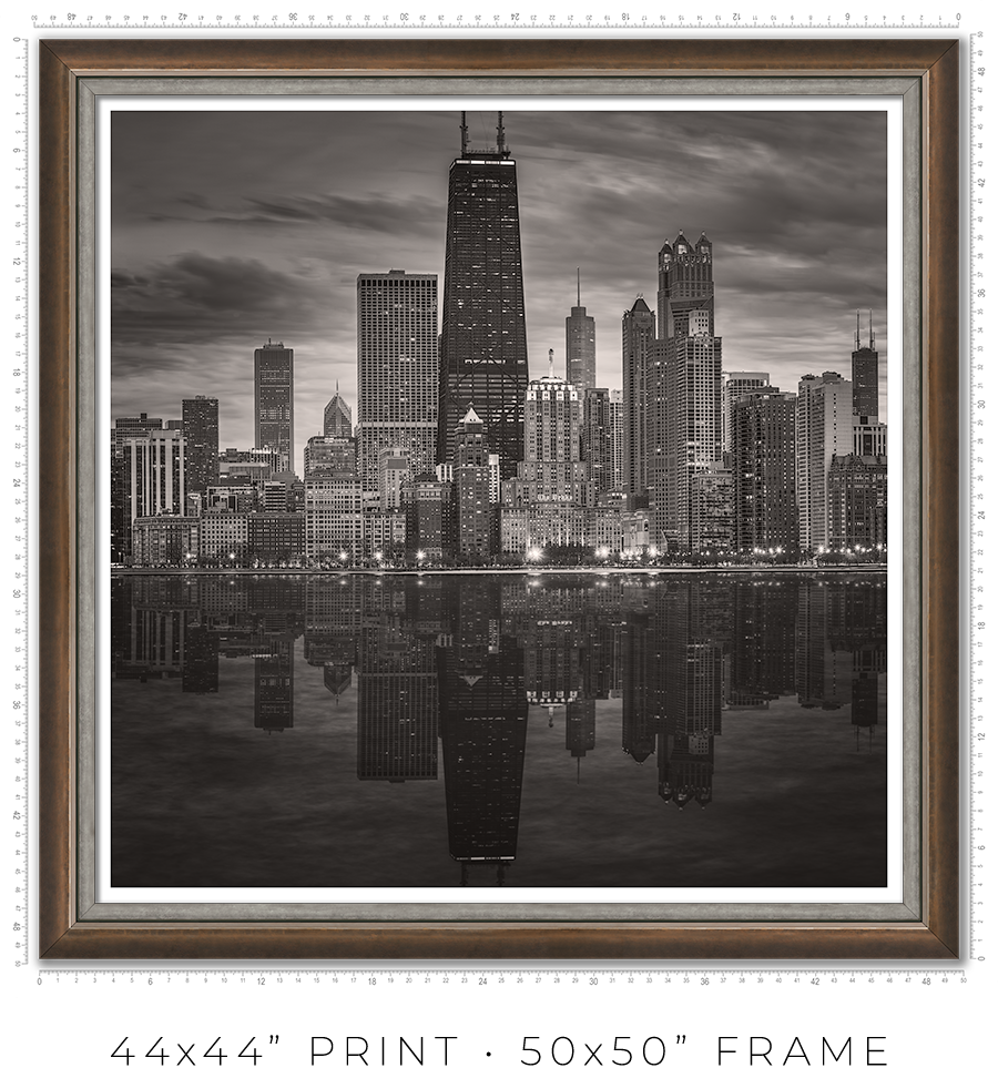
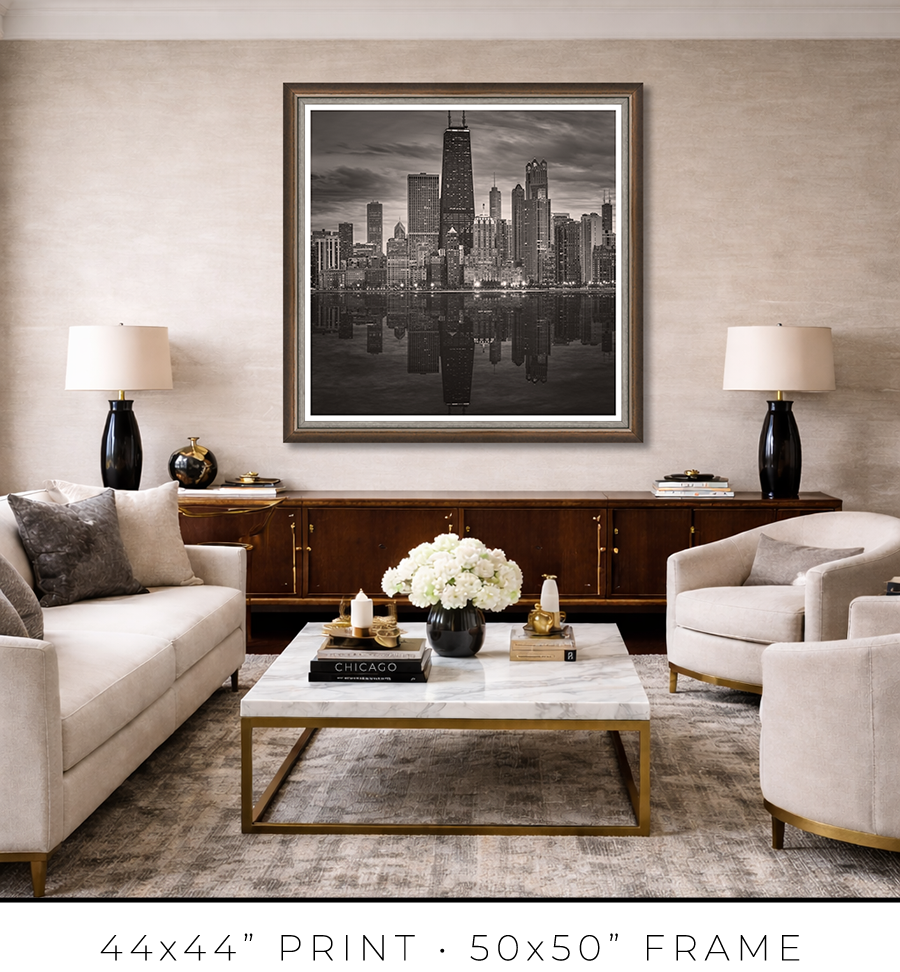
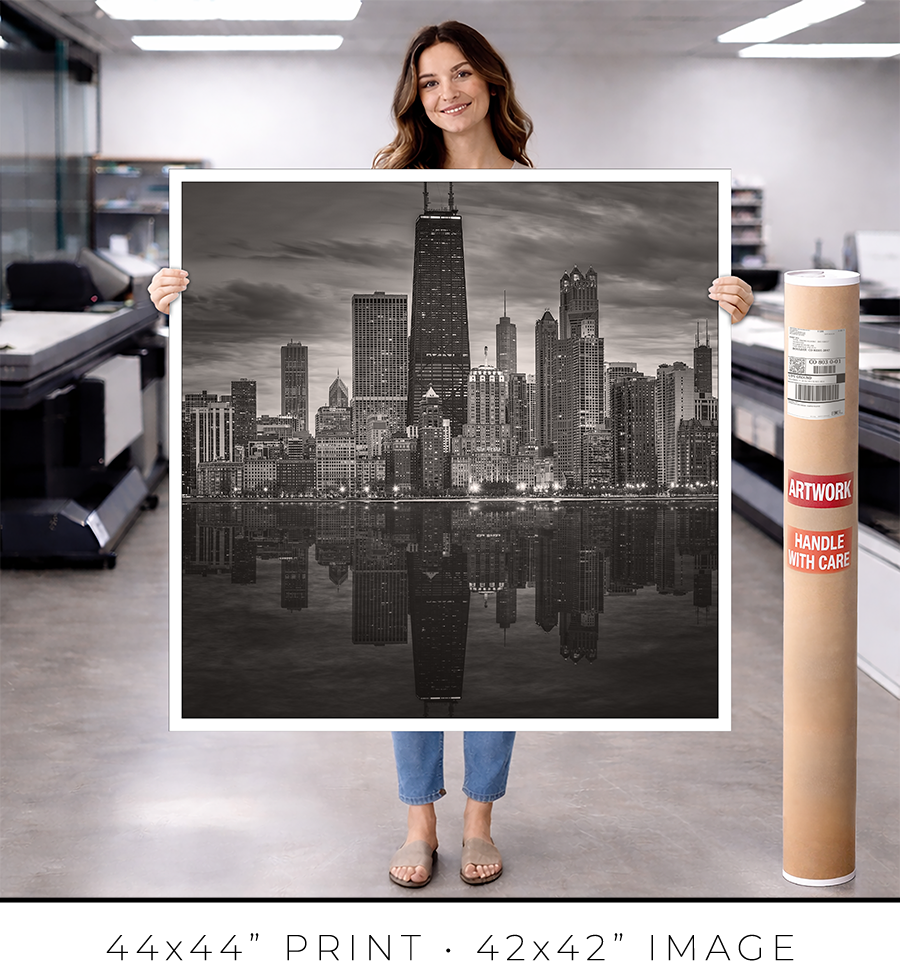
For large 44x44” prints, the frame design requires a totally different approach. Compared to smaller prints, the large print is a statement, it is a centerpiece of the room. It is a celebration, and the "little black dress" concept doesn’t work here. It needs a bit of exuberance. At the same time, it has to be constrained and confident. Like a Rolls-Royce brand identity.
To meet this challenge, I came up with a design of two different frames stacked together to form a unified frame for large prints.
The main frame is one of the most expensive frames I used, a custom frame made in Italy. It is 2” tall and 2” wide. It is a block, but it has a bevel on the inside. The beauty is in color, or to be precise, in color gradation. It is dark charcoal on the outer sides, which gradually transforms into a patina of silver leaf on the inner bevel through dark copper leaf on the front side. The beauty is that the gradation is not even, it looks painted by hand. It looks authentic, rustic, and antique.

The secondary frame is 1 1/8" wide, and it has a similar rustic, scratched, antique look, but it is pewter, which is almost the same color tonality as a photographic print it frames. It is more restrained than the primary frame and works well as a separator. Also, it has this chiseled, rough edge, another detail that adds authenticity to the whole frame.


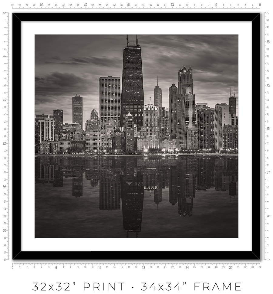
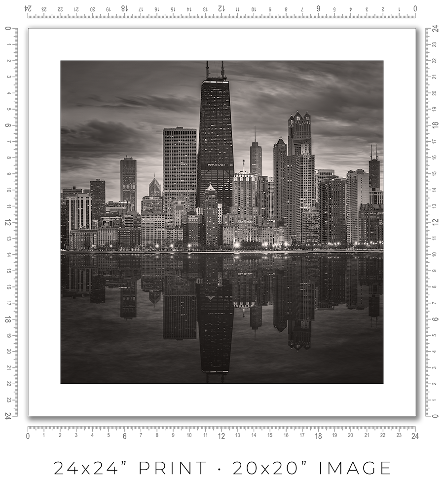
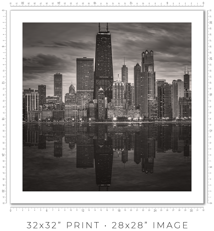
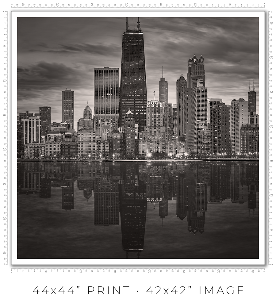
I owe you a clarification about print sizes. The framed print sizes listed on my website (16x16”, 24x24”, 32x32”, and 44x44”) refer to the sizes of prints mounted on the board before framing. But with the frame included, the outside dimensions will be obviously larger. Also, because of the white space (1” or 2”) around the image to separate it from the frame, the actual print size is smaller. Here is the table with all dimensions:
| Framed Print | Outside Dimensions | White Space | Actual Print |
| 16x16” | 17x17” | 2" | 12x12" |
| 24x24” | 26x26" | 2" | 20x20" |
| 32x32" | 34x34" | 2" | 28x28" |
| 44x44" | 50x50" | 1" | 42x42" |
And here is the sample picture to explain the dimensions table:

These are the standard frame options I offer on my website. If you need a custom frame or print sizes, please reach out to me, and I would be happy to help.
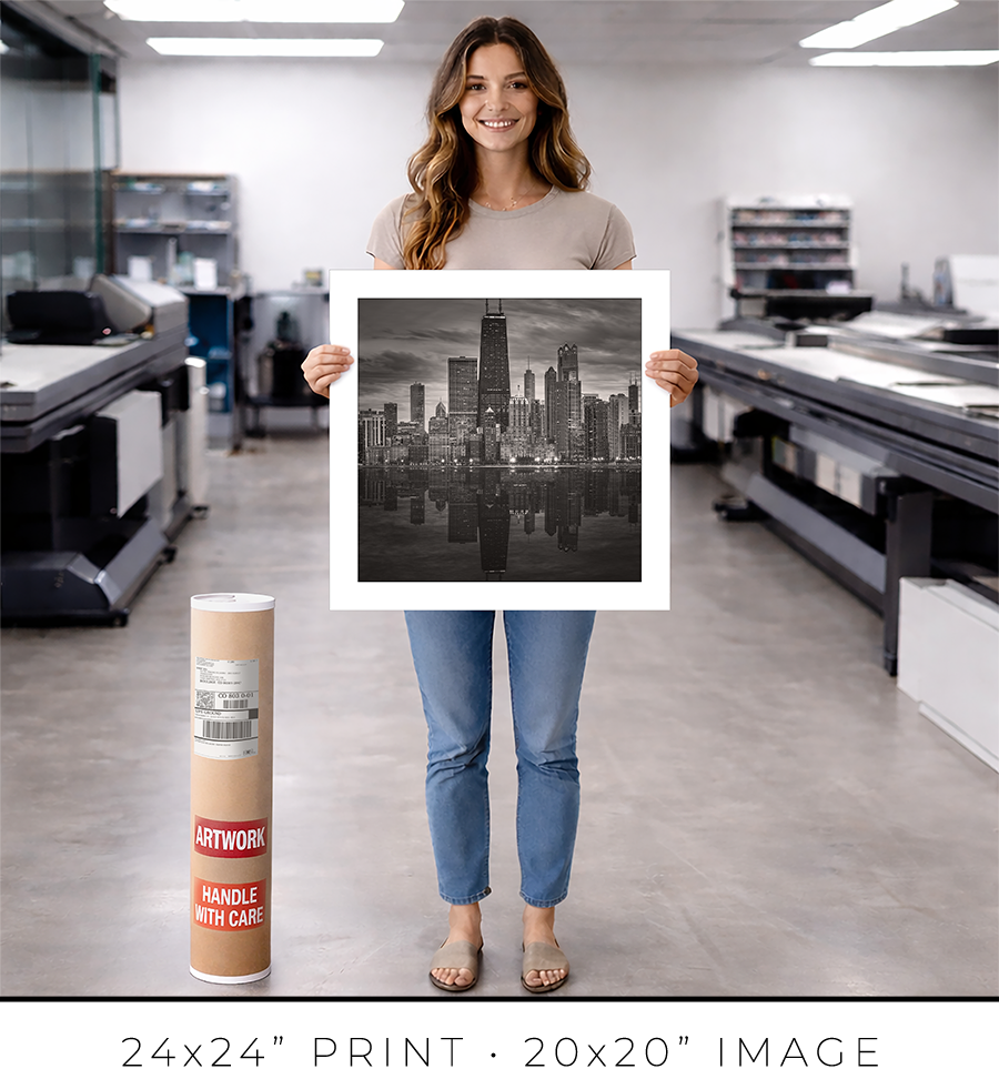
A photo print is an option if you want to frame it yourself or have a frame shop you know and trust that will frame it for you.
A photo print is just a loose print that I will send to you in a shipping tube.
I make prints myself in my studio. I use glossy metallic photo paper almost exclusively. It is the perfect paper for black-and-white architectural photography. It adds a distinctive pearlescent, three-dimensional sheen to the print.
The prints are part of a limited edition. They are signed and numbered just below the print. The Certificate of Authenticity is enclosed with the print.
I offer on my website three different sizes for photo prints: 24x24”, 32x32”, and 44x44”. If you need a custom size print, please let me know.
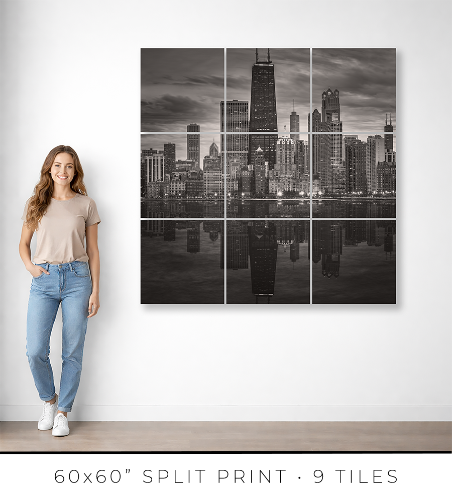
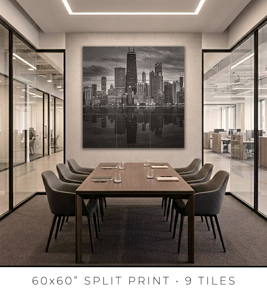
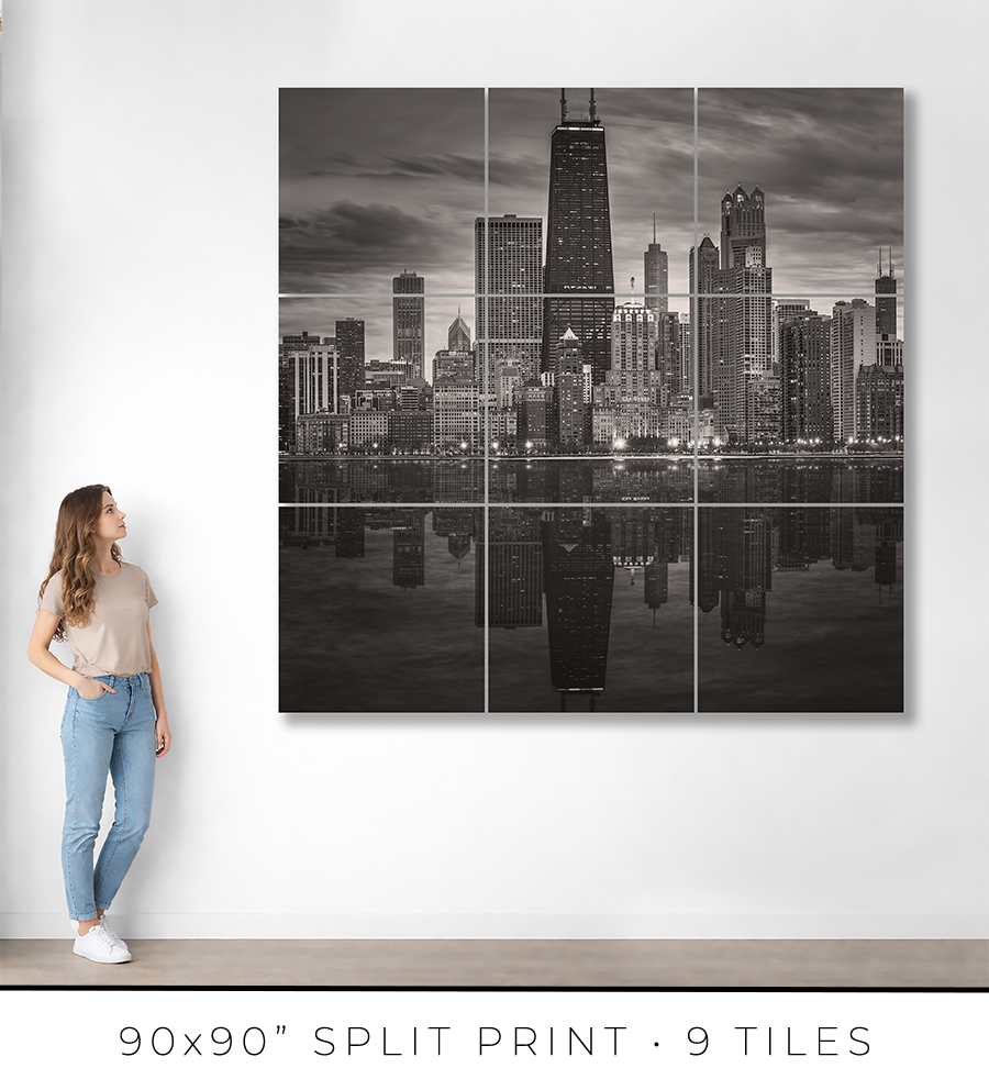
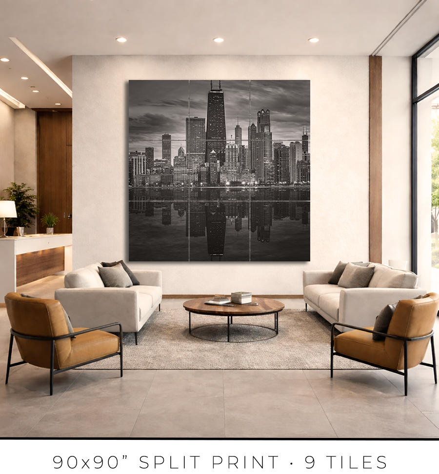
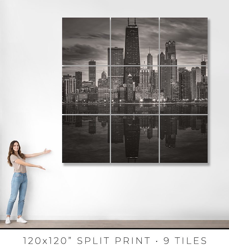
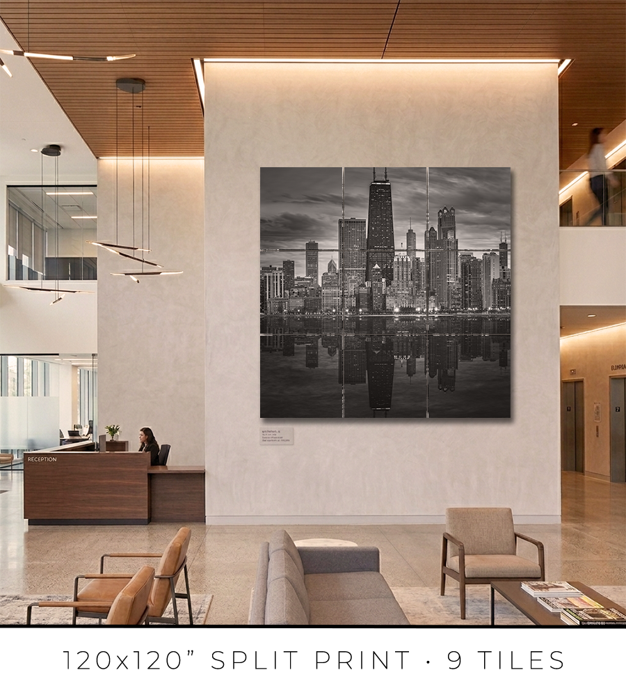
Split print is a great option if you want to go big, really big, up to 10 feet or maybe even bigger. It is a great option for office lobbies and for any place with large, tall walls.
There is a little “behind-the-scenes” story about split prints. I used to offer 60x60” on my website, but it was a mixed bag. First of all, that was the maximum print size I could make because all the materials (backing board, glass, etc.) do not come in sizes bigger than 60x60”. That was the ceiling I could not break. Second, the shipping of these prints was a nightmare. They are big and had to be shipped freight in a crate (not cheap), and every second print I shipped came back damaged, with big holes poked by careless forklift drivers at the sorting facilities.
There had to be a solution to these problems. And I found it in split prints.
Split print is a square print divided into nine (3 by 3) or more smaller squares. 60x60” print becomes a set of nine 20x20” prints, and 120x120” print is a set of nine 40x40” prints. No frame is required for this print presentation, as these are acrylic prints.

Acrylic print is a print on metallic photo paper face-mounted on a 1/4” thick sheet of acrylic (with polished edges) and sandwiched for strength with a sheet of aluminum Dibond. It is a modern, contemporary way to present a photographic print.
Because these are relatively small prints, compared to the final result, they can be shipped on a palette, which eliminates the shipping damage I had before. Plus, they are not heavy, and one person can easily put them on a wall using cleat hangers.
The best practice is to leave about a 1/4" or 1/2" gap between the acrylic print tiles. Since the edges of the acrylic prints are polished and the acrylic is quite thick at 1/4", it creates an interesting optical effect like looking through water.
If you are in the Chicagoland area, I will get you in touch with an installation guy I trust and have used for years, and he will help you install the split print in your home or office.
Each fine art print is produced specifically for you.
From the moment your order is confirmed, your print enters a deliberate production process: printing, inspection, drying, mounting, framing, final quality control, and secure packaging for shipping. Nothing is rushed. Every step is completed in-house to ensure consistency, precision, and permanence.
For matted prints and 16x16” framed prints, the production takes 1-2 days. For large framed prints, it takes 3-4 days.
If you are in the Chicagoland area, the shipping takes only one day. Large prints, I will deliver personally. I will contact you to schedule a delivery date and time that is convenient for you.
If you are outside of Chicago, the shipping takes 2-3 days, standard UPS Ground transit time. Large prints will be shipped in a crate built out of lumber and plywood. To open it, you might need a screwdriver, there will be many screws to remove.
You will receive an email with shipping tracking information once your order is ready for shipping.
Because most of the work is handmade in the studio, minor variations are part of the object's character. The result is not a mass-produced item, but a permanent piece crafted with attention.
Split prints are the only option I outsource to the photo lab. But I guarantee the quality of the prints because they are made under my supervision. Delivery time for split prints is about two weeks, but it can vary depending on the scope of the project.
If you have a specific deadline, please contact me before placing your order, and I will do my best to accommodate your timeline without compromising quality.
Each work is produced to order and crafted individually in my studio. Because of this, my payment and refund policies reflect the seriousness and permanence of the object.
Payments
Full payment is required at the time of purchase to secure your edition and initiate production.
I accept major credit cards and other secure payment methods at checkout. Production begins once payment is received.
There is an option at the checkout for “Payment in Person”. Please use it if you want to reserve your print but need to customize it and are unsure of the exact price. I will email you the invoice, which you can safely pay on my website later.
Refunds and Returns
All prints are made to order. As such, sales are considered final.
I do not offer refunds for change of mind, incorrect size selection, or personal preference. I encourage collectors to review dimensions, framing options, and placement carefully before purchasing.
If your work arrives damaged in transit, please contact me within 48 hours of delivery with photographs of the packaging and the piece. I will repair or replace the work as appropriate.
In the rare event of a production defect, I will make it right.
Cancellations
Orders may be cancelled within 24 hours of purchase, provided production has not yet begun. After production starts, cancellations are not possible.
I stand behind the quality, craftsmanship, and permanence of every piece. If you have questions before purchasing, I am always available to assist.
Most people look at the Chicago skyline, and they see a postcard. They pull out their phone, take a picture, and walk away believing they have witnessed something. They have not. They have documented the surface of a thing they never looked at.
Stand at North Avenue Beach and face south. Don't take the picture yet. Look.
What you are seeing is not decoration. It is not a backdrop. It is a confession: a city showing you exactly what it is, what it survived, what it chose to become. Chicago's skyline is an autobiography written in steel, glass, limestone, and light. And like every honest autobiography, it begins with catastrophe.
Chicago burned to the ground in 1871. The Great Fire erased the city in two days. Everything the young city had built was gone. That was the problem, and also, though nobody knew it yet, the gift. The fire created a blank page. And what Chicago wrote on that page changed architecture forever.
Out of the ash came necessity, and necessity invented the skyscraper. Steel-frame construction. The elevator. Fireproof materials. Architects like William Le Baron Jenney and Daniel Burnham did not theorize these advances in comfortable studios. They built them because the city had to be rebuilt, and it had to stand. Chicago became the laboratory of vertical space, the place where height stopped being a novelty and became logic. Every tower you see from this beach carries that origin. The skyline is rational and deliberate because it was born from disaster, not from ambition alone.
The buildings reveal themselves in sequence, and the sequence matters.
The John Hancock Center rises closest to you, dark and tapering against the sky. It was completed in 1969, and it is still, more than fifty years later, an act of structural honesty. The X-braces on its exterior are not an ornament applied to a building. They are the building. They hold it up. The engineers refused to hide how it stands. The result is something that looks exactly like what it is: a tower that has decided to show you its bones. In most architecture, the structure is concealed behind cladding and polish. The Hancock says no. It says, "Here is how I work."
Just south of it, the Drake Hotel anchors the curve of Michigan Avenue at Oak Street. The Drake was completed in 1920, when a luxury hotel was not merely a place to sleep but a civic statement, a theater of society. Its limestone facade and Beaux-Arts proportions carry the optimism of an era that believed craft and grandeur were civic obligations. Stand at the beach and squint at it. It looks permanent. It looks like a building that expects to be there long after you are gone. That confidence is not arrogance. It is the honesty of a building that was made to last.
Along East Lake Shore Drive, running south from the Drake, stands a continuous wall of residential towers built primarily between 1910 and 1930. They are not famous. They do not appear in architectural surveys the way the Hancock and Willis Tower do. But from the lake, they tell you something the famous towers cannot: that ordinary Chicago ambition, the ambition of private citizens wanting to live well above the street, shaped this shoreline just as surely as corporate engineering. Their classical cornices, limestone facades, and rhythmic window grids belong to an era that believed beauty was not optional in building. These are not luxury towers in the modern sense. They are monuments to domestic dignity.
Then Water Tower Place, completed in 1976, cuts across that historical rhythm. It is glass and steel, clean vertical lines, unapologetically modern. It announced that density itself could be an urban strategy: retail, hotel, offices, and residences stacked in a single structure. From the lake, it reads as commercial optimism. It does not pretend to speak the same language as the Drake or the East Lake Shore Drive buildings. It does not need to. Honesty about what an era values is its own form of integrity.
Moving south and inland, the AON Center rises as a white marble column, severe and vertical. Completed in 1973, it was originally clad in Italian Carrara marble, a gesture of corporate grandeur that turned catastrophic. The marble panels cracked in Chicago's climate and had to be replaced entirely, the whole building re-skinned in granite two decades later. The lesson the city absorbed without flinching: beauty that cannot survive the weather is not beauty. It is pretension. The AON Center stands today as a monument to that correction.
Two Prudential Plaza, completed in 1990, rises beside the original Prudential building with crystalline, faceted geometry, its glass crown catching and breaking light the way a prism does. Where the Hancock makes itself legible through exposed structure, Two Prudential Plaza makes itself memorable through light. From the beach on a clear afternoon, it glitters. That is not a small thing. In a skyline of dark steel and pale masonry, a building that genuinely glitters earns its place.
Then, the Aqua Tower, completed in 2009, does something none of the others attempt. Its undulating concrete balconies ripple across the facade like contour lines on a topographic map, like layers of sedimentary stone, like water frozen mid-motion. From North Avenue Beach, it reads as organic among the geometric, soft among the hard. It does not compete with the Hancock or Willis Tower. It does not need to. It reminds you that the human body actually lives inside these structures, breathes the air on those balconies, and feels the wind off the lake.
Behind everything, anchoring the southern end of the composition, is Willis Tower. Completed in 1973 with its bundled-tube structural system, a feat of engineering that allowed unprecedented height without unprecedented waste. From North Avenue Beach, it is austere and commanding, stepped and severe. It does not ask for your admiration. It earns it through scale and logic.
Here is what the lake does to all of this. It gives you distance, and distance gives you truth.
In a dense city, buildings crowd each other, and you crowd them. You see facades, not forms. You see surfaces, not structures. The lake pulls you back and reveals the whole composition at once. Morning light softens the steel, turning it silver. Midday sharpens the geometry until you can read every setback and structural decision. Dusk collapses the detail into silhouettes, and the silhouettes are enough: each tower still reads as itself, still speaks in its own architectural language against the darkening water. Winter strips everything to monochrome, and you see Chicago's essential grammar: line, proportion, weight, light.
The lake does not flatter the skyline. It edits it. A building that fails at this distance, that loses its identity across miles of open water, fails entirely. Chicago's towers all survive the distance. That is not an accident.
Here is the uncomfortable truth about Chicago's skyline. It is not unified. It does not speak in a single aesthetic voice. Classicism stands beside modernism. The ornament stands beside the glass. Structural expression stands beside corporate restraint. If you are looking for coherence, it’s nowhere to be found.
What you will find is an argument made visible over 150 years. The argument goes like this: a city is not a style. A city is a set of convictions held across time, through fire and reinvention, through economic boom and collapse, through architectural fashion and reaction. Chicago's conviction was this: buildings must earn their presence. They must be honest about what they are and how they work. They must contribute to the collective image, not just occupy space within it. The 1909 Plan of Chicago, championed by Burnham, seeded a cultural expectation that never fully died: architecture serves the city, not only the client.
You see that conviction in the Hancock's exposed structure. You see it in the Drake's civic permanence. You see it in the mathematical severity of Willis Tower. They disagree about almost everything except that.
Now take the picture if you want. But look first.
Stand at North Avenue Beach, face south, and understand what you are looking at. A city that burned and chose to rebuild honestly. A skyline that is not decoration but documentation. Steel and glass and limestone recording what Chicago survived, what it valued, what it believed architecture owed the people who had to live inside it and look at it.
Chicago did not build a backdrop. It built a self-portrait.
This is what a city looks like when it has actually paid for what it knows.
Choose options