Aqua Tower
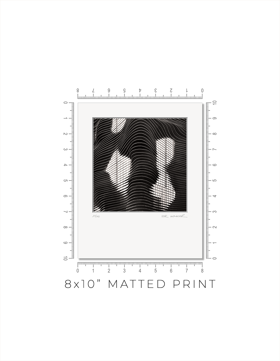
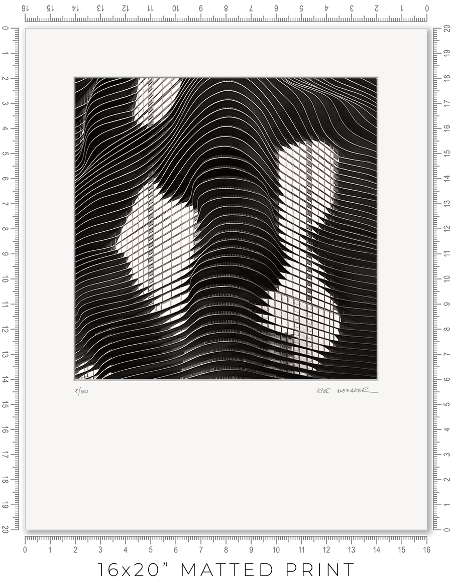
Matted prints are a great option if you want to choose your own frame. They come in two sizes: 8x10" and 16x20". These are standard frame sizes. You may easily find these frames at any retail shop.
One thing you need to know about frames. Those cheap, thin frames with swivel locks and kickstands will not work. They are designed for simple photo prints or diplomas. The matted print will be too thick for these frames. Find a decent frame that is at least 1" deep.
I make every print myself in my studio. No photo lab. No outsourcing. Every print is handmade.
I print on metallic photo paper. It is the perfect paper for black-and-white architectural photography. It adds a distinctive pearlescent, three-dimensional sheen to the prints.
For mats, I use 4-ply Crescent Arctic White matboard. It is off-white, traditional, and restrained. Not bright white, which is too bright and overwhelms the image. This matboard is the archival standard for conservation framing.
I mount prints on 3/16" Bainbridge foamcore. It is acid-free, clay-coated, rigid, and lightweight. It is ideal for archival print mounting.
The print is permanently sealed between the mat and the mounting board. It is intentional. A hinge mount leaves the print too loose. Also, it causes the print to bulge in the middle. A sealed mount keeps the print flat and tight. If you need a hinge mount or a matboard backing instead of foamcore, let me know.
Every print is signed and numbered (limited edition) on the mat in pencil. On the back, you will find a Certificate of Authenticity with all the details about the print and my contact information.
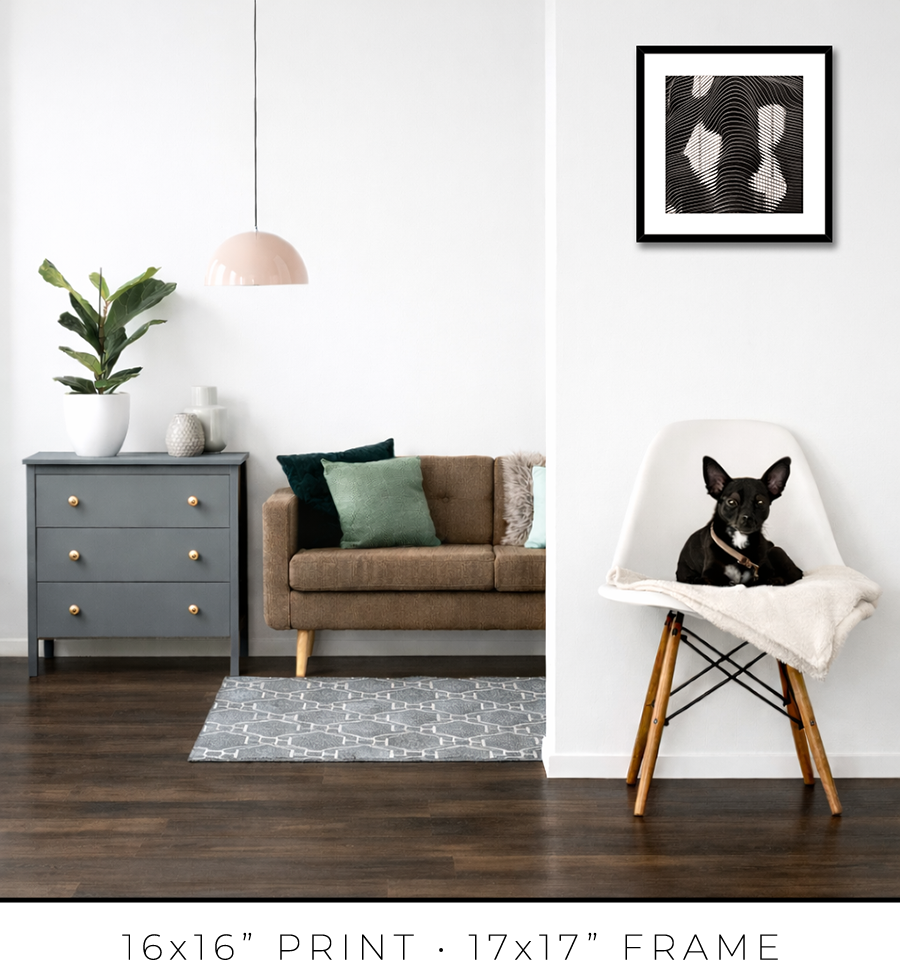
The actual photo print size for an 8x10” matted print is 6x6” with a 1” mat border, and for a 16x20” print, it is 12x12” with a 2” mat border. Since the photo prints are square and the matted prints are rectangular, the bottom mat border for 8x10” prints is 2” and for 16x20” prints it is 6”.
A framed print is a finished artwork. It is not just the image, it is a physical object that looks intentional, lasts decades, and feels complete.
The frame color, finish, and moulding profile. Print mounting, matting, and glazing. These are all deliberate decisions that elevate the image to the level of an artwork, which you can hold in your hands, put on the wall, and live with every day.
I am a professional framer, and I enjoy making frames for my prints. I put a lot of thought into what frame to use for my prints. And how to mat, glaze, and mount them. And after decades of frame-making, I acquired the skills to make my prints perfect, exactly the way I want them. I am proud of what I do.
I make every print myself in my studio. No photo lab. No outsourcing. Every print is personally crafted by me.
I start with printing the image on one of my large-format printers. I use glossy metallic photo paper almost exclusively. It is the perfect paper for black-and-white architectural photography. It adds a distinctive pearlescent, three-dimensional sheen to the print. In a bright spotlight, it looks like a hologram.
For glazing, I seal the print with archival 5-mil PET film, featuring a unique, high-gloss “mirror-like” finish. There is only one manufacturer of this glazing, the price has doubled in recent years, and it is issued in small batches that sell out instantly. But the result is worth the trouble. It gives the print that elusive look of a silver gelatin print from a traditional darkroom, which was treated with a vintage photo heat glossier.
I have been a photographer all my life, and I still have my traditional darkroom. I can produce small silver gelatin prints, but large 44x44” prints are obviously out of reach with this old technology. I am happy that I can replicate that look and feel for the prints on any scale with the new technology I developed.
But this is my choice. If you prefer to use museum anti-reflective glass sheets, please let me know. I can do that, but the print prices may double (since glass is expensive), and delivery will be limited to Chicagoland only (because it is glass and it breaks in shipping).
I permanently mount my prints to white aluminum Dibond sheets using archival pressure-sensitive high-tack acrylic adhesive. It is not a simple process. I use a heavy 750-pound, 60” wide large-format laminator to complete this task. And it is the most dangerous and nerve-racking stage in the whole printmaking process. A tiny misalignment or a speck of debris on the surface can ruin the almost-finished print.
Finally, the print is ready for framing. Frame-making is where a woodworker meets an artist. It is a totally different set of skills, materials, instruments, and studio space.
Over the years, I developed relationships with several suppliers, and I get my frame moulding delivered by truck in large, long boxes. I believe my studio stocks more frame moulding than your average frame shop down the street.
I cut the moulding at 45 degrees using my mitre saw mounted on a custom 10-foot-long, heavy-duty feed bench I built long ago. I then join the cut sticks with a pneumatic v-nailer to make a square frame. Now the finishing touches: I sand and paint the frame corners to make them even and smooth.
Now it is time to put the print and the frame together. I secure the print inside the frame with flexible points and install the hanging wire (or D-rings for the large prints). I sign the print, attach the Certificate of Authenticity, and the print is ready.
Now, let’s talk about the frames I use for my prints. In my opinion, black-and-white photography does not require elaborate framing. A simple but sophisticated matte black frame is all that is needed. It is like the famous Audrey Hepburn’s "little black dress" designed by Hubert de Givenchy for the movie “Breakfast at Tiffany's”. It became iconic and has been described as "perhaps the most famous little black dress of all time." Accordingly, a “little black frame” is all that is needed for my prints.
For 16x16” prints, I use a simple 3/4” matte black frame, but it is 1 1/8” tall, which adds a touch of sophistication. It looks proportional to the relatively small size of the 16x16” print.


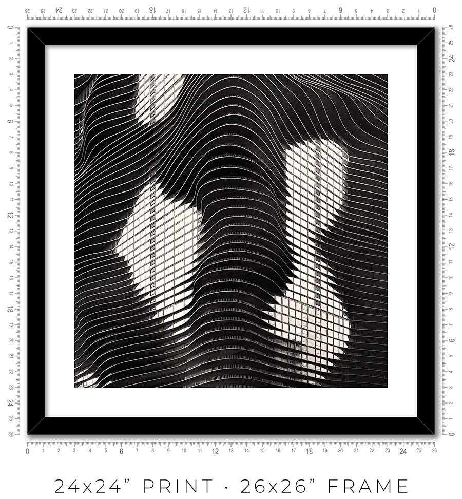
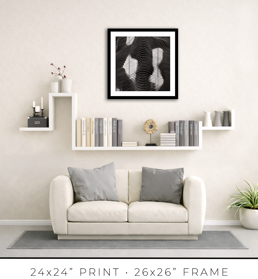
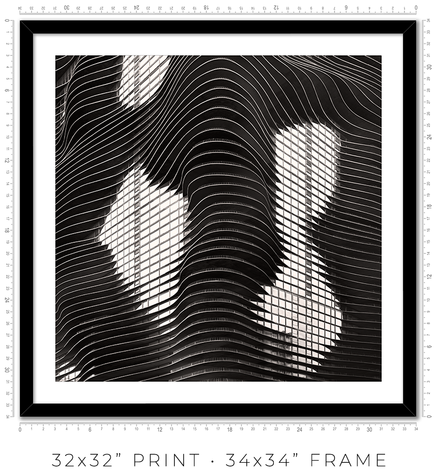
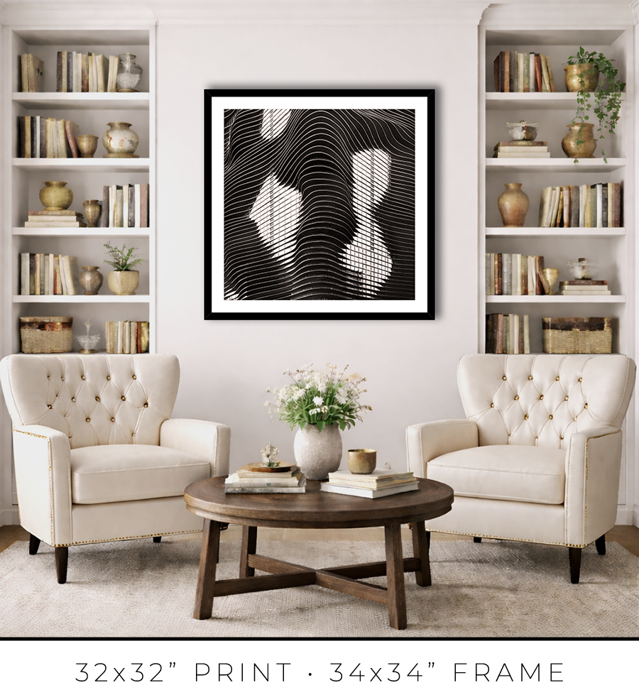
For 24x24” and 32x32” prints, I use the same style but a different profile frame. It is a wider 1 1/4" frame, which works for larger print sizes. And it is not as tall, only 7/8", which keeps the prints more grounded on the wall and less overpowering.


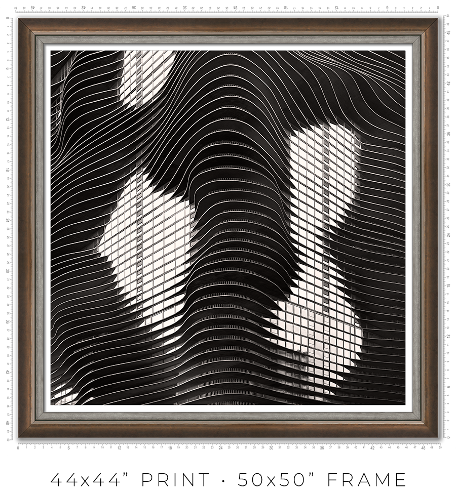
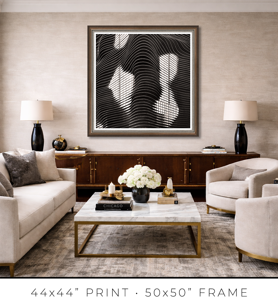
For large 44x44” prints, the frame design requires a totally different approach. Compared to smaller prints, the large print is a statement, it is a centerpiece of the room. It is a celebration, and the "little black dress" concept doesn’t work here. It needs a bit of exuberance. At the same time, it has to be constrained and confident. Like a Rolls-Royce brand identity.
To meet this challenge, I came up with a design of two different frames stacked together to form a unified frame for large prints.
The main frame is one of the most expensive frames I used, a custom frame made in Italy. It is 2” tall and 2” wide. It is a block, but it has a bevel on the inside. The beauty is in color, or to be precise, in color gradation. It is dark charcoal on the outer sides, which gradually transforms into a patina of silver leaf on the inner bevel through dark copper leaf on the front side. The beauty is that the gradation is not even, it looks painted by hand. It looks authentic, rustic, and antique.

The secondary frame is 1 1/8" wide, and it has a similar rustic, scratched, antique look, but it is pewter, which is almost the same color tonality as a photographic print it frames. It is more restrained than the primary frame and works well as a separator. Also, it has this chiseled, rough edge, another detail that adds authenticity to the whole frame.


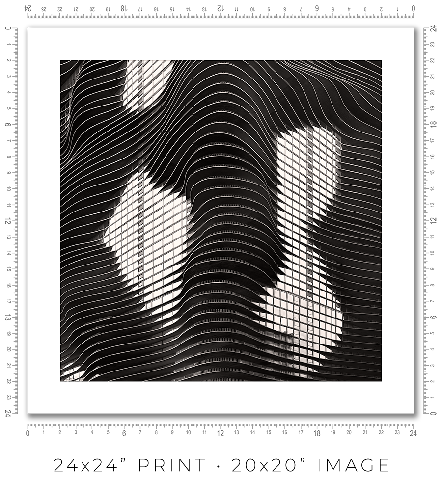
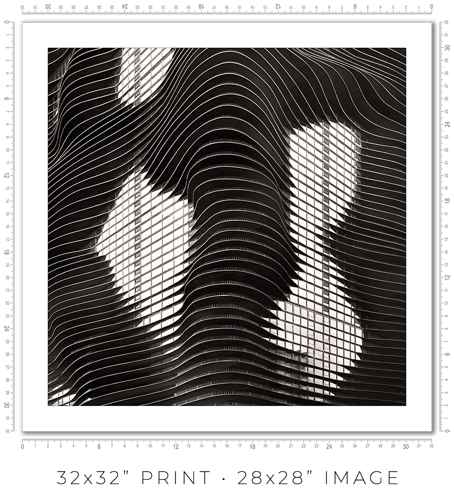
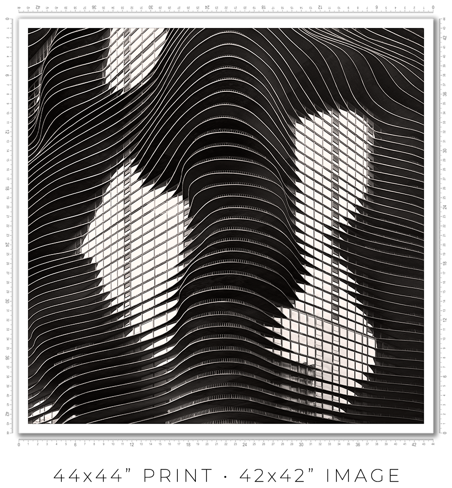
I owe you a clarification about print sizes. The framed print sizes listed on my website (16x16”, 24x24”, 32x32”, and 44x44”) refer to the sizes of prints mounted on the board before framing. But with the frame included, the outside dimensions will be obviously larger. Also, because of the white space (1” or 2”) around the image to separate it from the frame, the actual print size is smaller. Here is the table with all dimensions:
| Framed Print | Outside Dimensions | White Space | Actual Print |
| 16x16” | 17x17” | 2" | 12x12" |
| 24x24” | 26x26" | 2" | 20x20" |
| 32x32" | 34x34" | 2" | 28x28" |
| 44x44" | 50x50" | 1" | 42x42" |
And here is the sample picture to explain the dimensions table:

These are the standard frame options I offer on my website. If you need a custom frame or print sizes, please reach out to me, and I would be happy to help.
A photo print is an option if you want to frame it yourself or have a frame shop you know and trust that will frame it for you.
A photo print is just a loose print that I will send to you in a shipping tube.
I make prints myself in my studio. I use glossy metallic photo paper almost exclusively. It is the perfect paper for black-and-white architectural photography. It adds a distinctive pearlescent, three-dimensional sheen to the print.
The prints are part of a limited edition. They are signed and numbered just below the print. The Certificate of Authenticity is enclosed with the print.
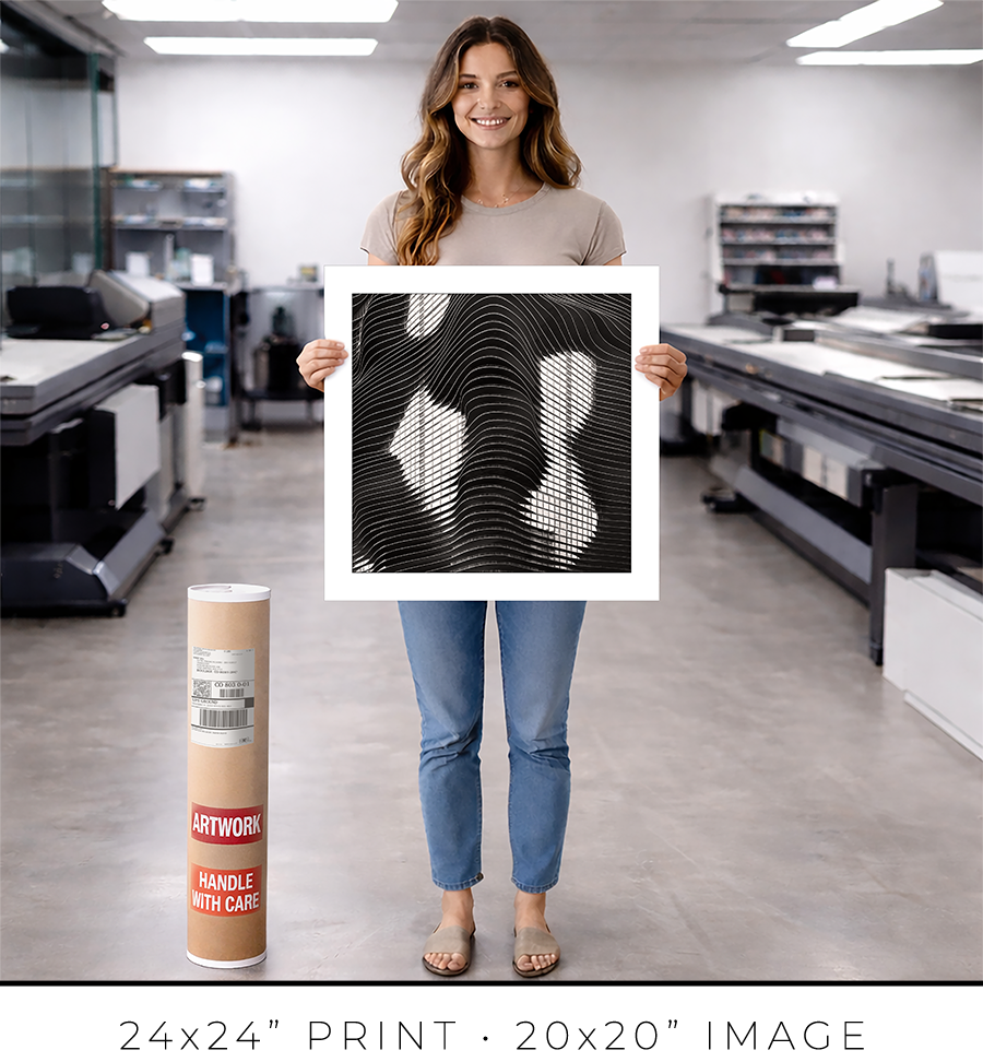
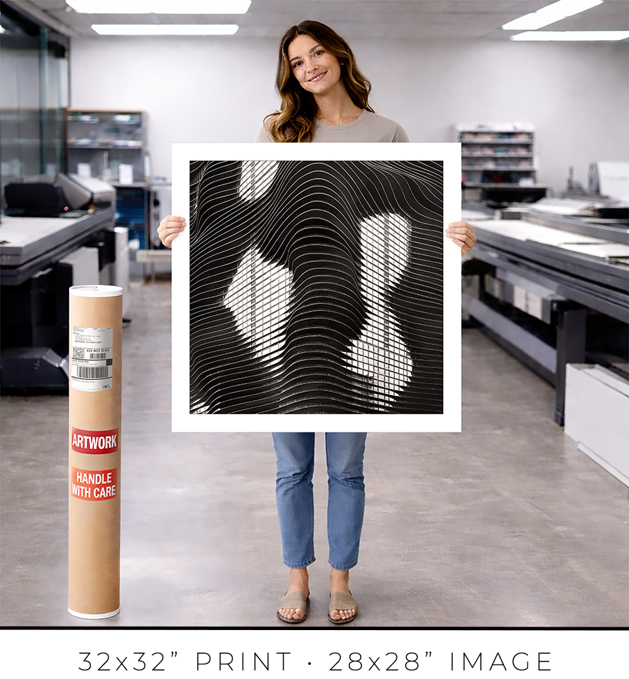
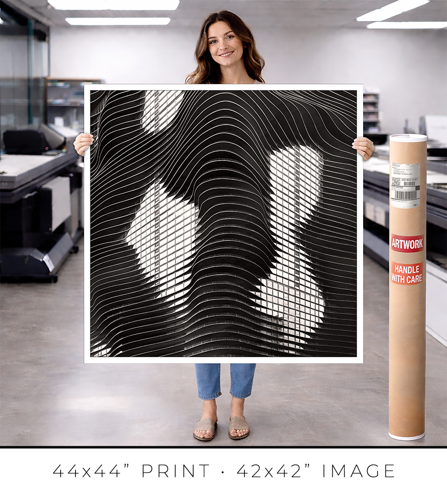
I offer on my website three different sizes for photo prints: 24x24”, 32x32”, and 44x44”. If you need a custom size print, please let me know.
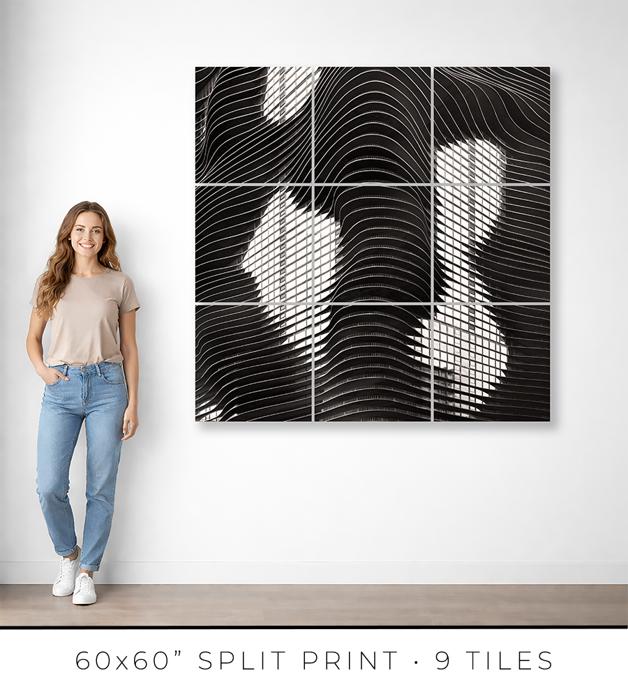
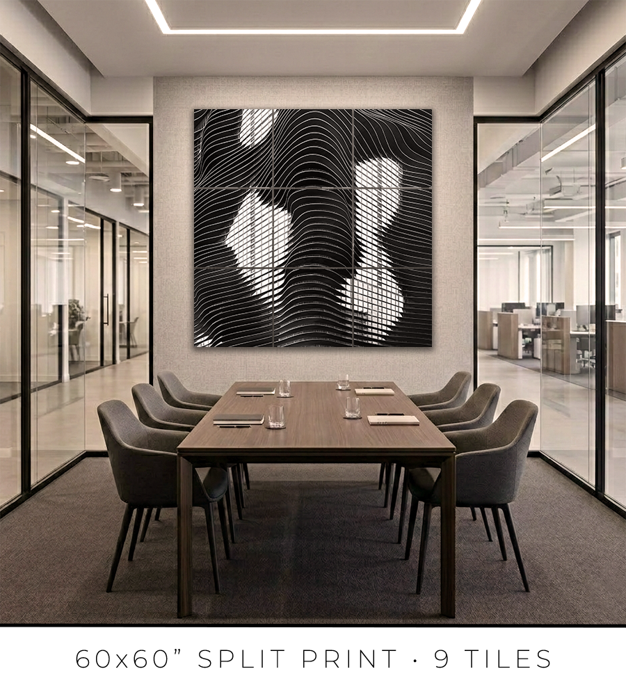
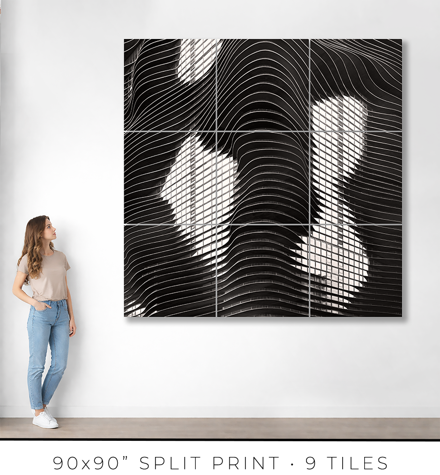
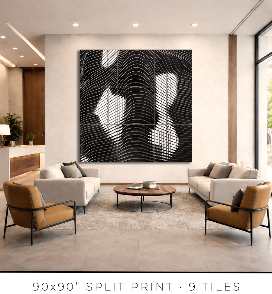
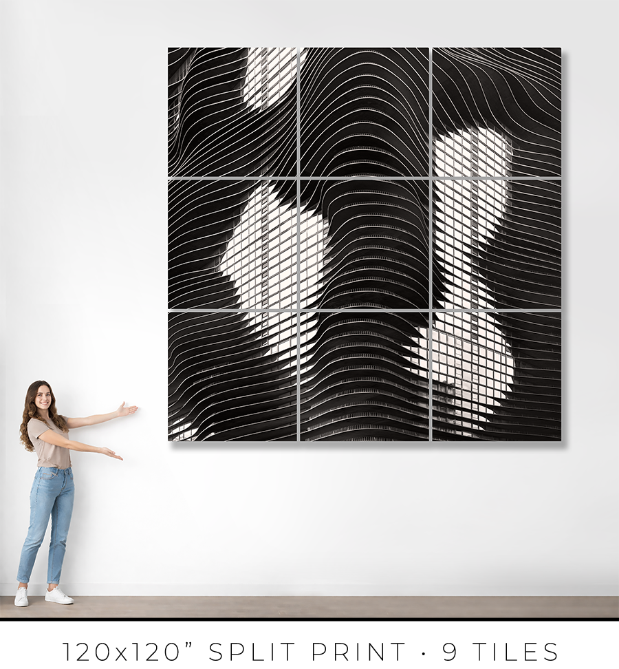
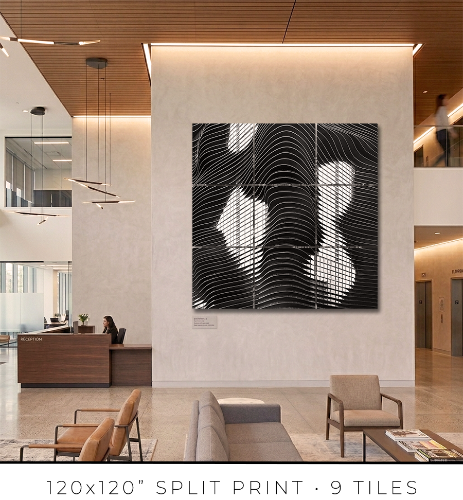
Split print is a great option if you want to go big, really big, up to 10 feet or maybe even bigger. It is a great option for office lobbies and for any place with large, tall walls.
There is a little “behind-the-scenes” story about split prints. I used to offer 60x60” on my website, but it was a mixed bag. First of all, that was the maximum print size I could make because all the materials (backing board, glass, etc.) do not come in sizes bigger than 60x60”. That was the ceiling I could not break. Second, the shipping of these prints was a nightmare. They are big and had to be shipped freight in a crate (not cheap), and every second print I shipped came back damaged, with big holes poked by careless forklift drivers at the sorting facilities.
There had to be a solution to these problems. And I found it in split prints.
Split print is a square print divided into nine (3 by 3) or more smaller squares. 60x60” print becomes a set of nine 20x20” prints, and 120x120” print is a set of nine 40x40” prints. No frame is required for this print presentation, as these are acrylic prints.

Acrylic print is a print on metallic photo paper face-mounted on a 1/4” thick sheet of acrylic (with polished edges) and sandwiched for strength with a sheet of aluminum Dibond. It is a modern, contemporary way to present a photographic print.
Because these are relatively small prints, compared to the final result, they can be shipped on a palette, which eliminates the shipping damage I had before. Plus, they are not heavy, and one person can easily put them on a wall using cleat hangers.
The best practice is to leave about a 1/4" or 1/2" gap between the acrylic print tiles. Since the edges of the acrylic prints are polished and the acrylic is quite thick at 1/4", it creates an interesting optical effect like looking through water.
If you are in the Chicagoland area, I will get you in touch with an installation guy I trust and have used for years, and he will help you install the split print in your home or office.
Each fine art print is produced specifically for you.
From the moment your order is confirmed, your print enters a deliberate production process: printing, inspection, drying, mounting, framing, final quality control, and secure packaging for shipping. Nothing is rushed. Every step is completed in-house to ensure consistency, precision, and permanence.
For matted prints and 16x16” framed prints, the production takes 1-2 days. For large framed prints, it takes 3-4 days.
If you are in the Chicagoland area, the shipping takes only one day. Large prints, I will deliver personally. I will contact you to schedule a delivery date and time that is convenient for you.
If you are outside of Chicago, the shipping takes 2-3 days, standard UPS Ground transit time. Large prints will be shipped in a crate built out of lumber and plywood. To open it, you might need a screwdriver, there will be many screws to remove.
You will receive an email with shipping tracking information once your order is ready for shipping.
Because most of the work is handmade in the studio, minor variations are part of the object's character. The result is not a mass-produced item, but a permanent piece crafted with attention.
Split prints are the only option I outsource to the photo lab. But I guarantee the quality of the prints because they are made under my supervision. Delivery time for split prints is about two weeks, but it can vary depending on the scope of the project.
If you have a specific deadline, please contact me before placing your order, and I will do my best to accommodate your timeline without compromising quality.
Each work is produced to order and crafted individually in my studio. Because of this, my payment and refund policies reflect the seriousness and permanence of the object.
Payments
Full payment is required at the time of purchase to secure your edition and initiate production.
I accept major credit cards and other secure payment methods at checkout. Production begins once payment is received.
There is an option at the checkout for “Payment in Person”. Please use it if you want to reserve your print but need to customize it and are unsure of the exact price. I will email you the invoice, which you can safely pay on my website later.
Refunds and Returns
All prints are made to order. As such, sales are considered final.
I do not offer refunds for change of mind, incorrect size selection, or personal preference. I encourage collectors to review dimensions, framing options, and placement carefully before purchasing.
If your work arrives damaged in transit, please contact me within 48 hours of delivery with photographs of the packaging and the piece. I will repair or replace the work as appropriate.
In the rare event of a production defect, I will make it right.
Cancellations
Orders may be cancelled within 24 hours of purchase, provided production has not yet begun. After production starts, cancellations are not possible.
I stand behind the quality, craftsmanship, and permanence of every piece. If you have questions before purchasing, I am always available to assist.
ADDRESS: 225 North Columbus Drive, Chicago, IL
ARCHITECTS: Jeanne Gang of Studio Gang Architects
YEARS BUILT: 2007-09
Chicago invented the skyscraper. Then it spent a hundred years repeating itself.
Walk down any block in the Loop and count the glass boxes. They rise clean, rational, merciless. Louis Sullivan believed form follows function. Mies van der Rohe believed less is more. Their students believed the same thing, and their students' students, until the entire skyline became a single argument repeated in glass and steel across every square mile of the lakefront. The argument is this: a building should look like what it is. A tower is a tower. A box is a box. Ornament is a crime.
For a century, nobody in Chicago seriously challenged that argument. Then, in 2004, an architect named Jeanne Gang sat down to dinner.
The story goes like this. Developer James Loewenberg had a problem. He was building a cluster of towers in the Lakeshore East neighborhood, a new development rising from what had been a derelict rail yard just east of Millennium Park. The site was prime. The design was not. He had a preliminary tower concept, serviceable and forgettable, another glass rectangle about to be added to a skyline that already had too many glass rectangles.
That evening, after a Frank Gehry lecture, Loewenberg sat next to Gang at dinner and challenged her directly: take the design and make it sing.
Gang had never designed a skyscraper. Studio Gang was a young firm. The commission was a gamble for both of them. But Gang took it, went back to her studio, and asked a question that nobody designing Chicago towers had bothered to ask in decades: what if a skyscraper looked like the land it came from?
The answer she found was not in architecture. It was in geology.
Drive two hours north of Chicago, and you reach the limestone outcroppings of the Great Lakes region. Rain and wind have been working on those rocks for ten thousand years. The result is not flat. The result is not regular. The result is layered stone eroded into waves, ridges, and shelves, each stratum slightly different from the one above it, each plane projecting outward at its own angle and depth, the whole surface alive with the memory of water moving through it.
Gang looked at that eroded limestone and saw a skyscraper.
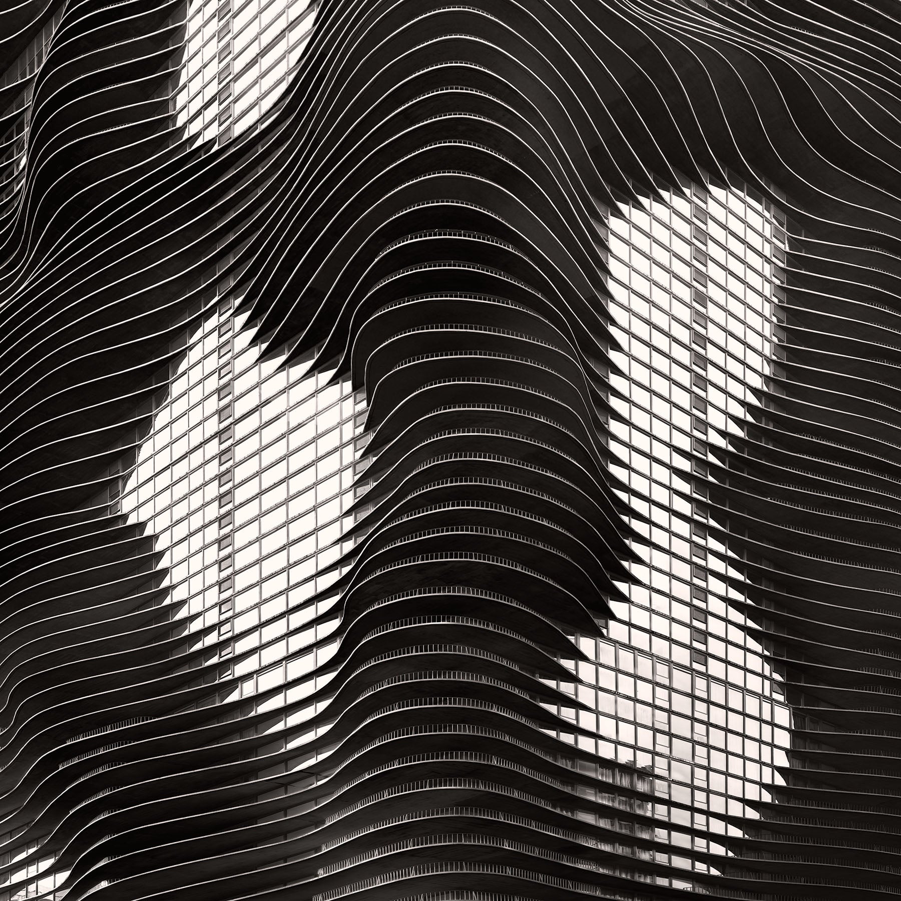
The idea was simple and radical: extend the concrete floor slabs of a conventional tower outward in irregular curves, a different shape on every floor, each slab projecting as little as two feet or as much as twelve. The result is what critics eventually called vertical topography. Not a flat façade. Not a glass curtain wall. A building whose surface has hills and valleys, overhangs and recesses, a face that changes completely depending on where you stand and what time of day it is.
Aqua Tower was completed in 2009. It stands 82 stories at 225 North Columbus Drive. When it opened, it was the tallest building in the world designed by a woman.
Here is what nobody tells you about Aqua: building it was an act of obsessive precision disguised as organic chaos.
Every single floor slab is different. Not approximately different. Mathematically, digitally, irreducibly different. The shape of each balcony was calculated using GPS coordinates and 3D modeling software before a single drop of concrete was poured. Contractors on the ground used GPS surveying tripods with built-in computers to verify each pour in real time. The edge forms, the steel plates that gave each slab its curved profile, were custom-bent for every floor, then snapped back into straight planes and reused on the next level.
Eighty-two unique floors. Eighty-two unique shapes. What looks like water moving through stone is the result of thousands of engineering calculations executed with the same precision that Chicago architects have always brought to their work. The wildness is controlled. The freedom is engineered. This is still Chicago.
The concrete slabs are nine inches thick at the base and taper as they extend outward, so rainwater drains off instead of pooling. The irregular edges break up wind vortices. In a city known for winds powerful enough to require massive dampening systems in most towers of this height, Aqua's own surface does the work. No tuned mass damper. The ripples kill the wind. This is why residents can step onto the 80th-floor balconies in weather that would make them impossible in a conventional tower.
Aqua does something no glass box can do. It makes you a neighbor.
Because the balconies extend outward at different angles on different floors, residents above and below can sometimes see each other. Not into each other's apartments. Not with any violation of privacy. Just a face, leaning on a railing two floors up, looking at the same view. A hand waving. Someone's dog pressed against the glass. Gang designed this deliberately. The geometry of the building creates accidental community. In a city where apartment towers are designed to maximize solitude, Aqua insists on something different: you are not alone up here.
No two balconies on the entire building are exactly the same. Every resident has a shape that belongs only to them, calculated from their floor's specific relationship to views of Lake Michigan, Millennium Park, and the skyline.
There is also this: if you stand at a certain angle on the street and look up at the façade in the right light, you can see a face in the ripples. Some residents say it looks like the mayor's face. Gang heard this and welcomed it. She said she liked the ambiguity. She said it opened the building up to interpretation.
That is not how modernist architects talk. Sullivan believed in function. Mies believed in less. Gang believes in what you see when you look long enough.
You live in a city that invented the skyscraper. You walk past buildings every day that changed architecture permanently, buildings that architects travel from Tokyo, Berlin, and Sao Paulo to stand in front of. You probably do not look up. Most people don't.
Look up at Aqua.
Stand next to the building on a sunny day, when the light is bright, and shadows are deep, and look at the surface of that building. Watch how the shadows underneath the balconies turn black while the edges turn white. Watch how the building stops looking like a building and starts looking like something made by geological forces, not by human hands.
It took ten thousand years for water to carve those rock outcroppings north of the city. It took Jeanne Gang five years to turn that process into an 82-story tower.
The right-angle argument lasted a hundred years in Chicago. A conversation at a dinner party ended it.
How do you look at a building? Most people look for what a building is. They want to identify it, categorize it, and fit it into a known shape. A box. A tower. A skyscraper.
Look instead for what a building remembers.
The Aqua Tower remembers water. It remembers the slow pressure of prehistoric proglacial Lake Chicago receding ten thousand years ago, leaving those limestone formations behind.
Every city gets the buildings it deserves. Chicago deserved this one.
Go find it. Stand close enough to see the taper of the concrete, the way each slab thins as it reaches outward. Then look at the glass boxes on either side and ask yourself which one is trying harder to see you back.
Choose options