Tiffany Dome Of The Chicago Cultural Center
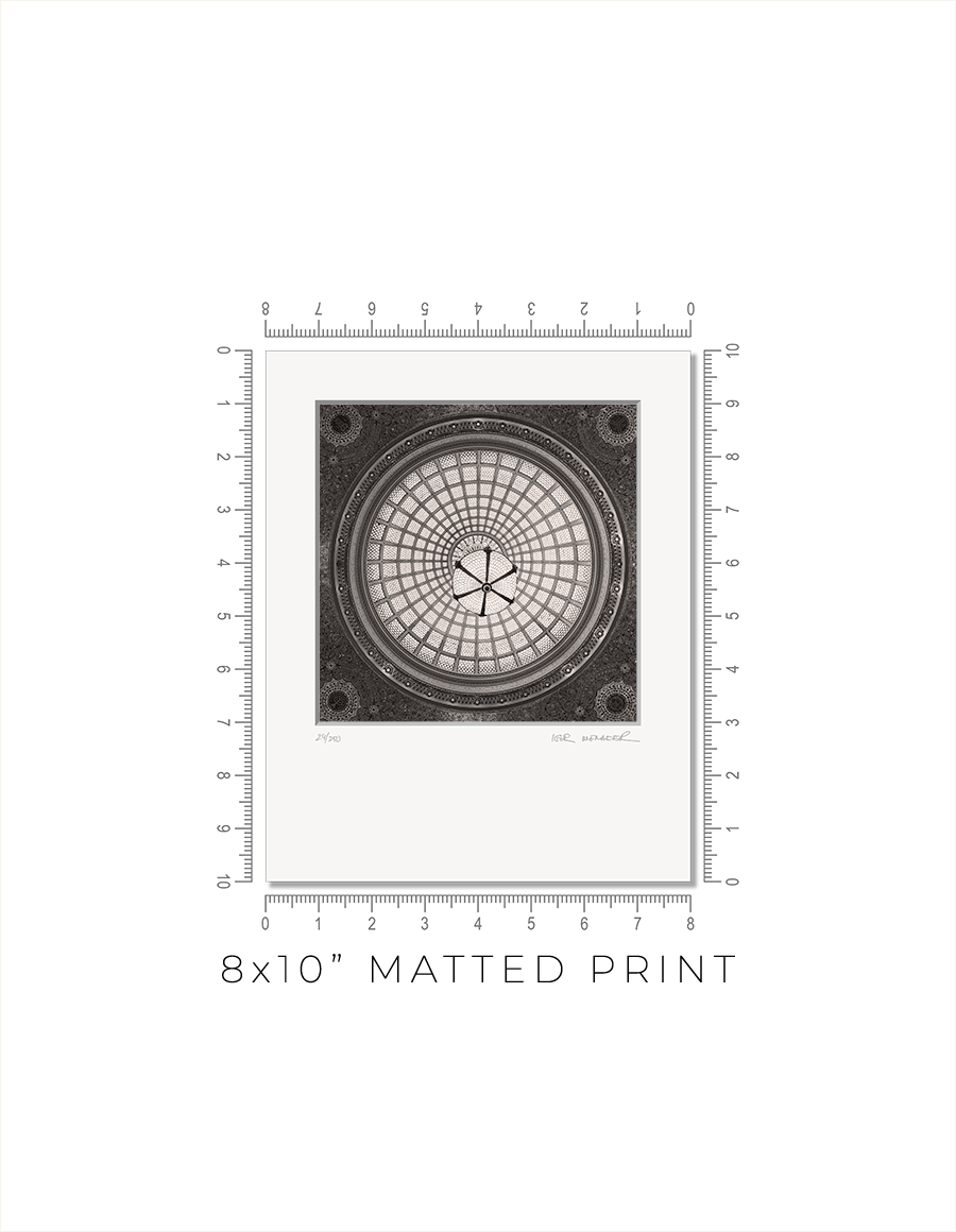
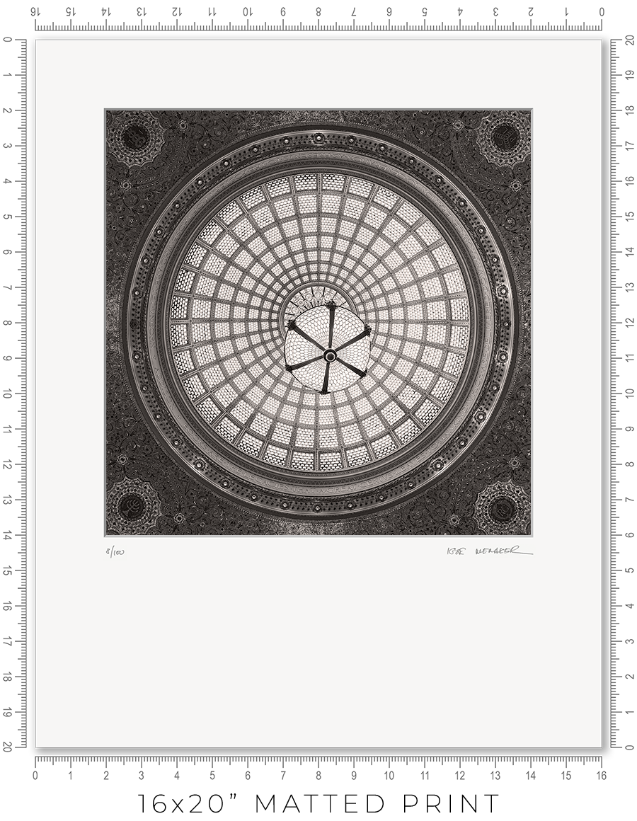
Matted prints are a great option if you want to choose your own frame. They come in two sizes: 8x10" and 16x20". These are standard frame sizes. You may easily find these frames at any retail shop.
One thing you need to know about frames. Those cheap, thin frames with swivel locks and kickstands will not work. They are designed for simple photo prints or diplomas. The matted print will be too thick for these frames. Find a decent frame that is at least 1" deep.
I make every print myself in my studio. No photo lab. No outsourcing. Every print is handmade.
I print on metallic photo paper. It is the perfect paper for black-and-white architectural photography. It adds a distinctive pearlescent, three-dimensional sheen to the prints.
For mats, I use 4-ply Crescent Arctic White matboard. It is off-white, traditional, and restrained. Not bright white, which is too bright and overwhelms the image. This matboard is the archival standard for conservation framing.
I mount prints on 3/16" Bainbridge foamcore. It is acid-free, clay-coated, rigid, and lightweight. It is ideal for archival print mounting.
The print is permanently sealed between the mat and the mounting board. It is intentional. A hinge mount leaves the print too loose. Also, it causes the print to bulge in the middle. A sealed mount keeps the print flat and tight. If you need a hinge mount or a matboard backing instead of foamcore, let me know.
Every print is signed and numbered (limited edition) on the mat in pencil. On the back, you will find a Certificate of Authenticity with all the details about the print and my contact information.
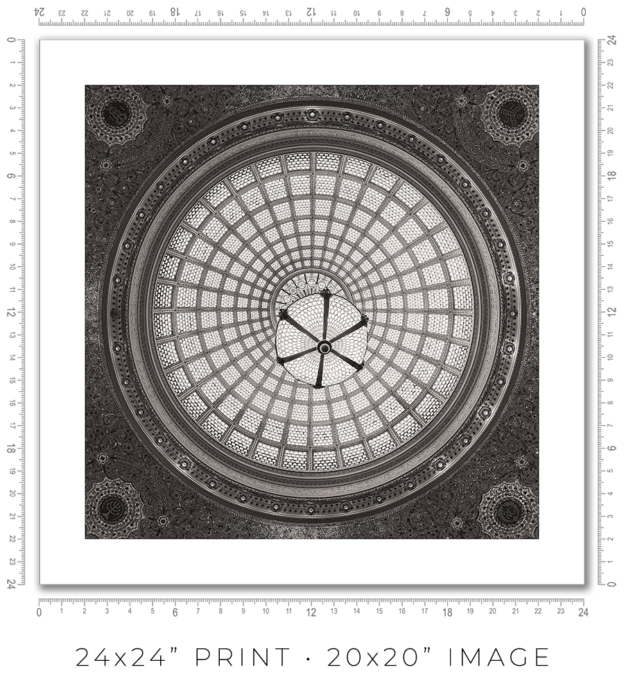
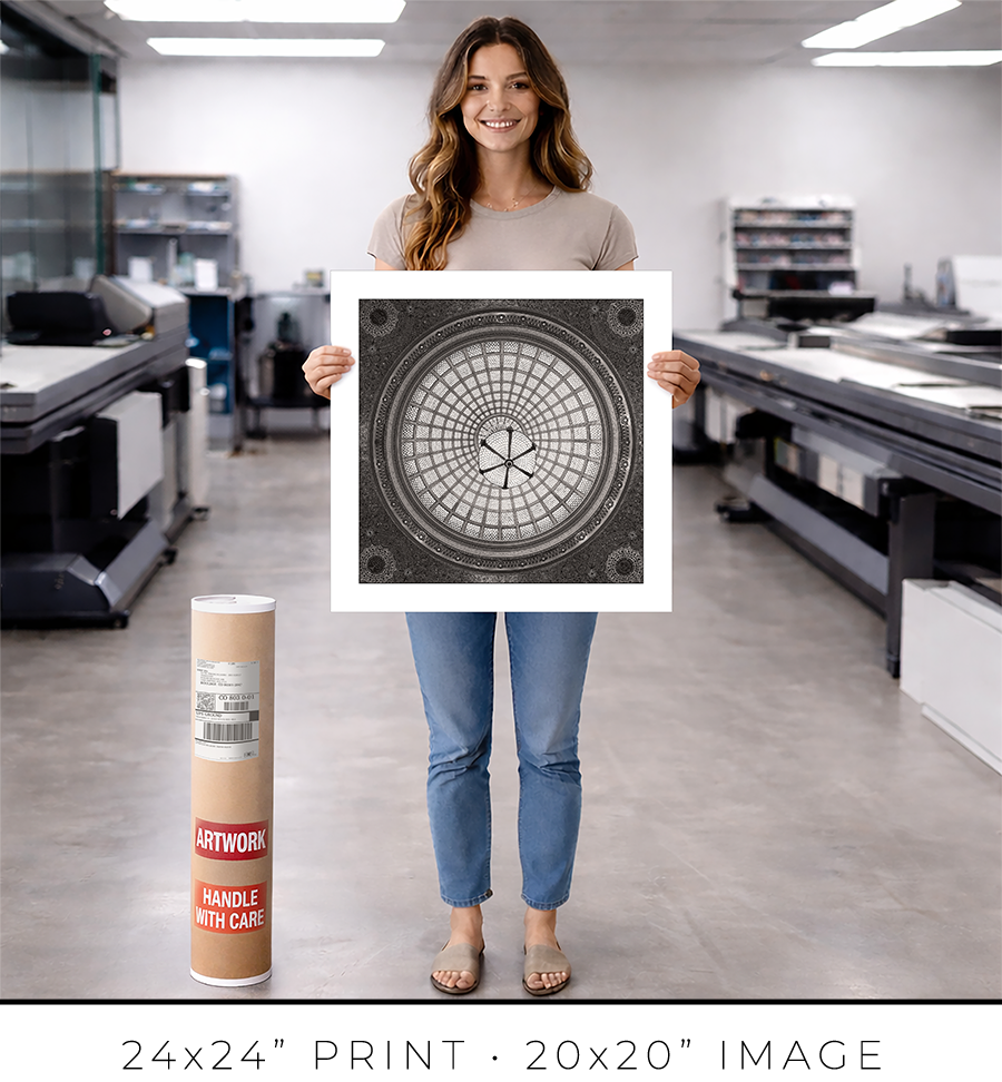
The actual photo print size for an 8x10” matted print is 6x6” with a 1” mat border, and for a 16x20” print, it is 12x12” with a 2” mat border. Since the photo prints are square and the matted prints are rectangular, the bottom mat border for 8x10” prints is 2” and for 16x20” prints it is 6”.
A framed print is a finished artwork. It is not just the image, it is a physical object that looks intentional, lasts decades, and feels complete.
The frame color, finish, and moulding profile. Print mounting, matting, and glazing. These are all deliberate decisions that elevate the image to the level of an artwork, which you can hold in your hands, put on the wall, and live with every day.
I am a professional framer, and I enjoy making frames for my prints. I put a lot of thought into what frame to use for my prints. And how to mat, glaze, and mount them. And after decades of frame-making, I acquired the skills to make my prints perfect, exactly the way I want them. I am proud of what I do.
I make every print myself in my studio. No photo lab. No outsourcing. Every print is personally crafted by me.
I start with printing the image on one of my large-format printers. I use glossy metallic photo paper almost exclusively. It is the perfect paper for black-and-white architectural photography. It adds a distinctive pearlescent, three-dimensional sheen to the print. In a bright spotlight, it looks like a hologram.
For glazing, I seal the print with archival 5-mil PET film, featuring a unique, high-gloss “mirror-like” finish. There is only one manufacturer of this glazing, the price has doubled in recent years, and it is issued in small batches that sell out instantly. But the result is worth the trouble. It gives the print that elusive look of a silver gelatin print from a traditional darkroom, which was treated with a vintage photo heat glossier.
I have been a photographer all my life, and I still have my traditional darkroom. I can produce small silver gelatin prints, but large 44x44” prints are obviously out of reach with this old technology. I am happy that I can replicate that look and feel for the prints on any scale with the new technology I developed.
But this is my choice. If you prefer to use museum anti-reflective glass sheets, please let me know. I can do that, but the print prices may double (since glass is expensive), and delivery will be limited to Chicagoland only (because it is glass and it breaks in shipping).
I permanently mount my prints to white aluminum Dibond sheets using archival pressure-sensitive high-tack acrylic adhesive. It is not a simple process. I use a heavy 750-pound, 60” wide large-format laminator to complete this task. And it is the most dangerous and nerve-racking stage in the whole printmaking process. A tiny misalignment or a speck of debris on the surface can ruin the almost-finished print.
Finally, the print is ready for framing. Frame-making is where a woodworker meets an artist. It is a totally different set of skills, materials, instruments, and studio space.
Over the years, I developed relationships with several suppliers, and I get my frame moulding delivered by truck in large, long boxes. I believe my studio stocks more frame moulding than your average frame shop down the street.
I cut the moulding at 45 degrees using my mitre saw mounted on a custom 10-foot-long, heavy-duty feed bench I built long ago. I then join the cut sticks with a pneumatic v-nailer to make a square frame. Now the finishing touches: I sand and paint the frame corners to make them even and smooth.
Now it is time to put the print and the frame together. I secure the print inside the frame with flexible points and install the hanging wire (or D-rings for the large prints). I sign the print, attach the Certificate of Authenticity, and the print is ready.
Now, let’s talk about the frames I use for my prints. In my opinion, black-and-white photography does not require elaborate framing. A simple but sophisticated matte black frame is all that is needed. It is like the famous Audrey Hepburn’s "little black dress" designed by Hubert de Givenchy for the movie “Breakfast at Tiffany's”. It became iconic and has been described as "perhaps the most famous little black dress of all time." Accordingly, a “little black frame” is all that is needed for my prints.
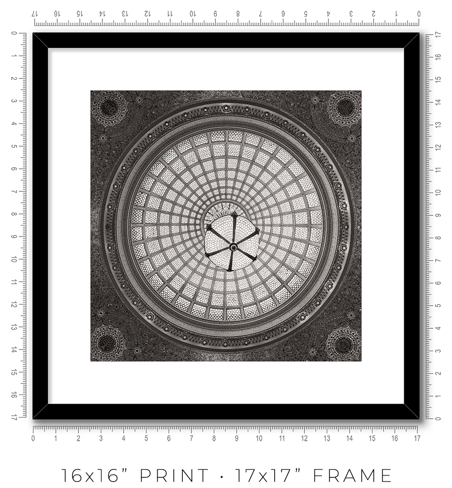
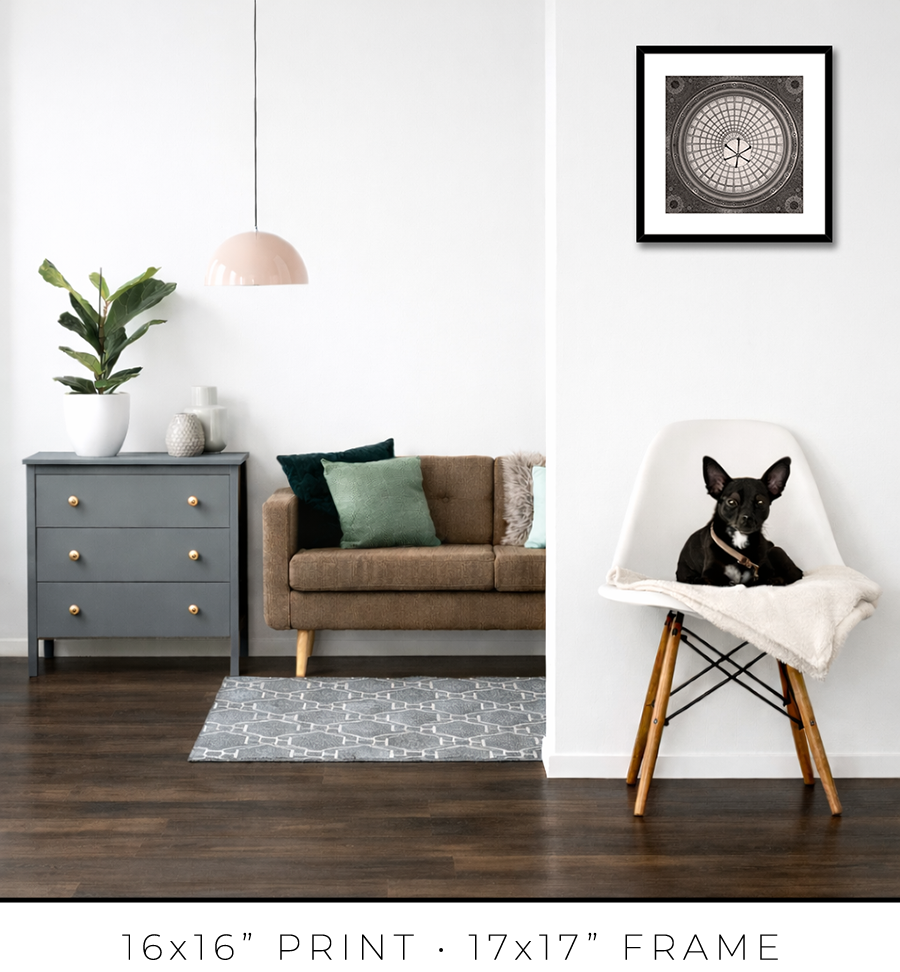
For 16x16” prints, I use a simple 3/4” matte black frame, but it is 1 1/8” tall, which adds a touch of sophistication. It looks proportional to the relatively small size of the 16x16” print.


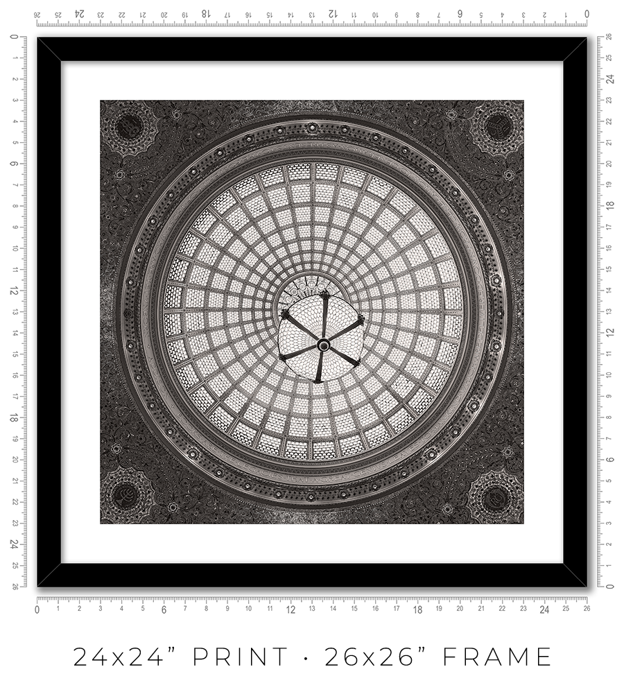
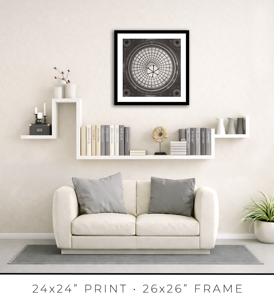
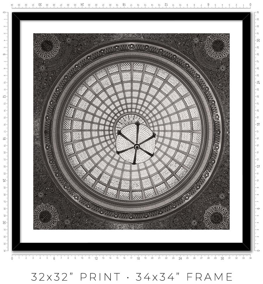
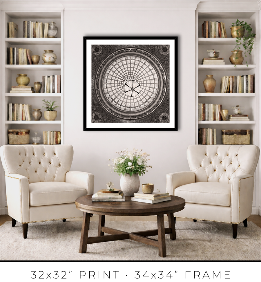
For 24x24” and 32x32” prints, I use the same style but a different profile frame. It is a wider 1 1/4" frame, which works for larger print sizes. And it is not as tall, only 7/8", which keeps the prints more grounded on the wall and less overpowering.


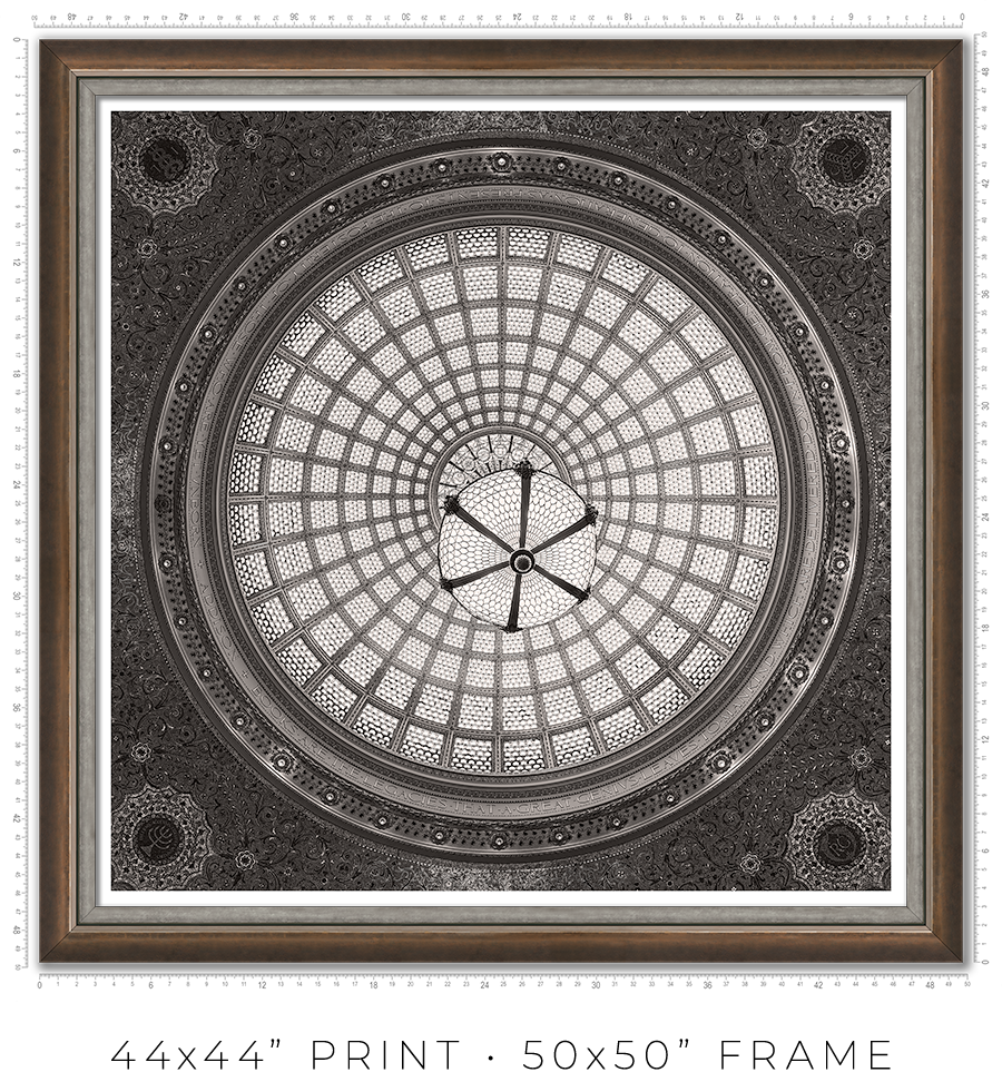
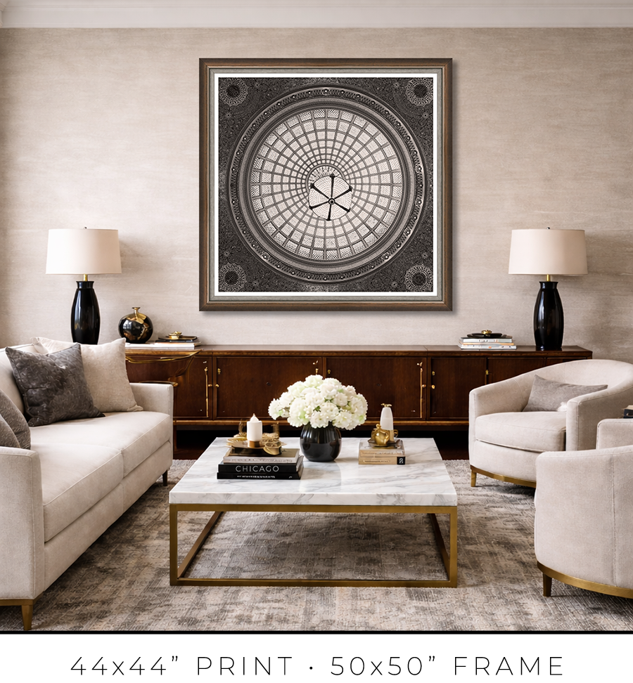
For large 44x44” prints, the frame design requires a totally different approach. Compared to smaller prints, the large print is a statement, it is a centerpiece of the room. It is a celebration, and the "little black dress" concept doesn’t work here. It needs a bit of exuberance. At the same time, it has to be constrained and confident. Like a Rolls-Royce brand identity.
To meet this challenge, I came up with a design of two different frames stacked together to form a unified frame for large prints.
The main frame is one of the most expensive frames I used, a custom frame made in Italy. It is 2” tall and 2” wide. It is a block, but it has a bevel on the inside. The beauty is in color, or to be precise, in color gradation. It is dark charcoal on the outer sides, which gradually transforms into a patina of silver leaf on the inner bevel through dark copper leaf on the front side. The beauty is that the gradation is not even, it looks painted by hand. It looks authentic, rustic, and antique.

The secondary frame is 1 1/8" wide, and it has a similar rustic, scratched, antique look, but it is pewter, which is almost the same color tonality as a photographic print it frames. It is more restrained than the primary frame and works well as a separator. Also, it has this chiseled, rough edge, another detail that adds authenticity to the whole frame.


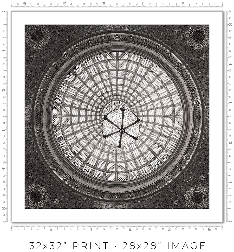
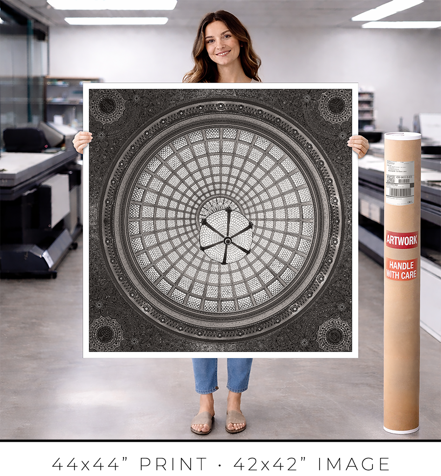
I owe you a clarification about print sizes. The framed print sizes listed on my website (16x16”, 24x24”, 32x32”, and 44x44”) refer to the sizes of prints mounted on the board before framing. But with the frame included, the outside dimensions will be obviously larger. Also, because of the white space (1” or 2”) around the image to separate it from the frame, the actual print size is smaller. Here is the table with all dimensions:
| Framed Print | Outside Dimensions | White Space | Actual Print |
| 16x16” | 17x17” | 2" | 12x12" |
| 24x24” | 26x26" | 2" | 20x20" |
| 32x32" | 34x34" | 2" | 28x28" |
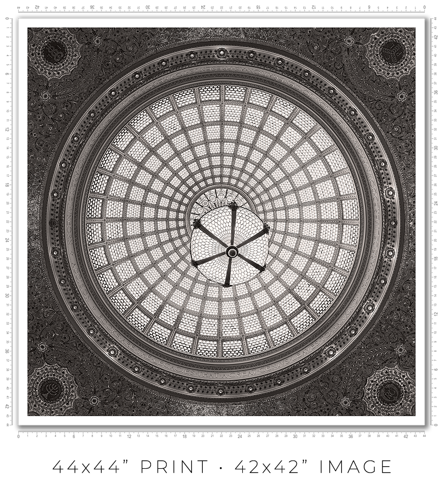
| 44x44" | 50x50" | 1" | 42x42" |
And here is the sample picture to explain the dimensions table:

These are the standard frame options I offer on my website. If you need a custom frame or print sizes, please reach out to me, and I would be happy to help.
A photo print is an option if you want to frame it yourself or have a frame shop you know and trust that will frame it for you.
A photo print is just a loose print that I will send to you in a shipping tube.
I make prints myself in my studio. I use glossy metallic photo paper almost exclusively. It is the perfect paper for black-and-white architectural photography. It adds a distinctive pearlescent, three-dimensional sheen to the print.
The prints are part of a limited edition. They are signed and numbered just below the print. The Certificate of Authenticity is enclosed with the print.
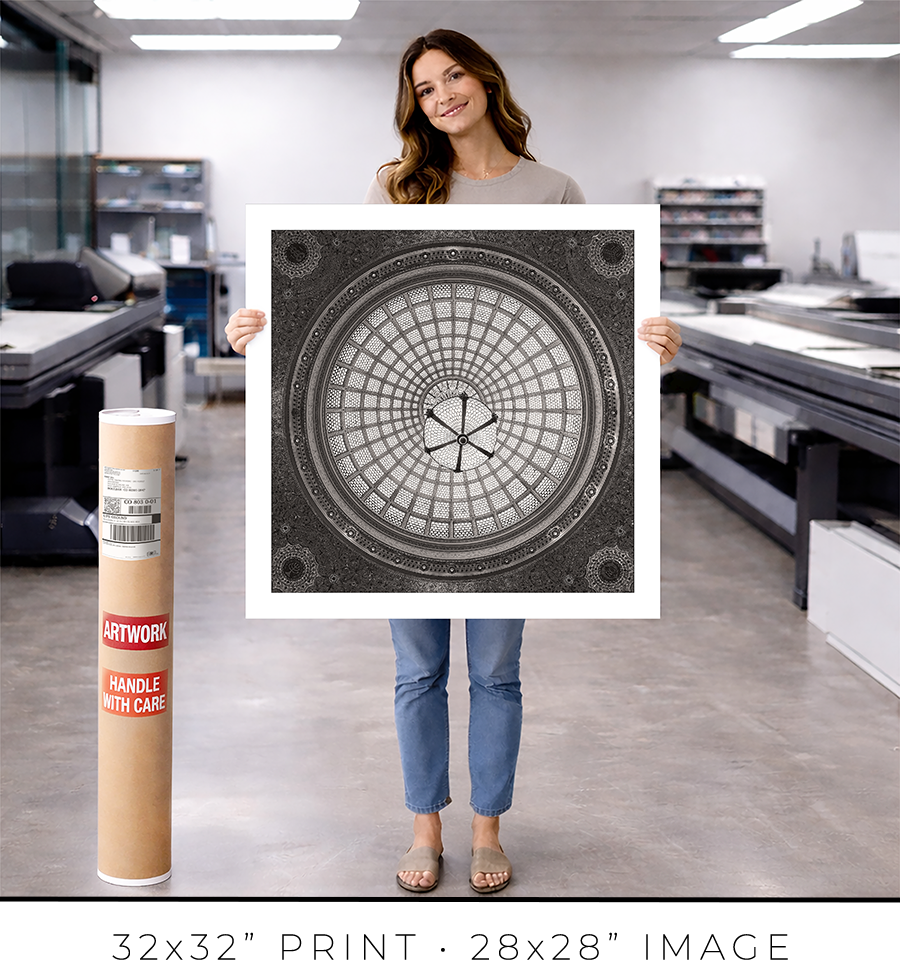
I offer on my website three different sizes for photo prints: 24x24”, 32x32”, and 44x44”. If you need a custom size print, please let me know.
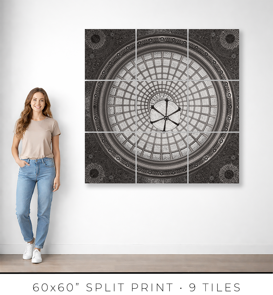
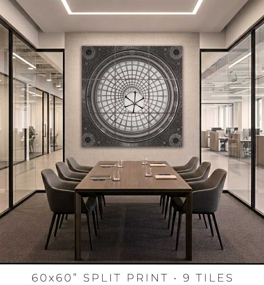
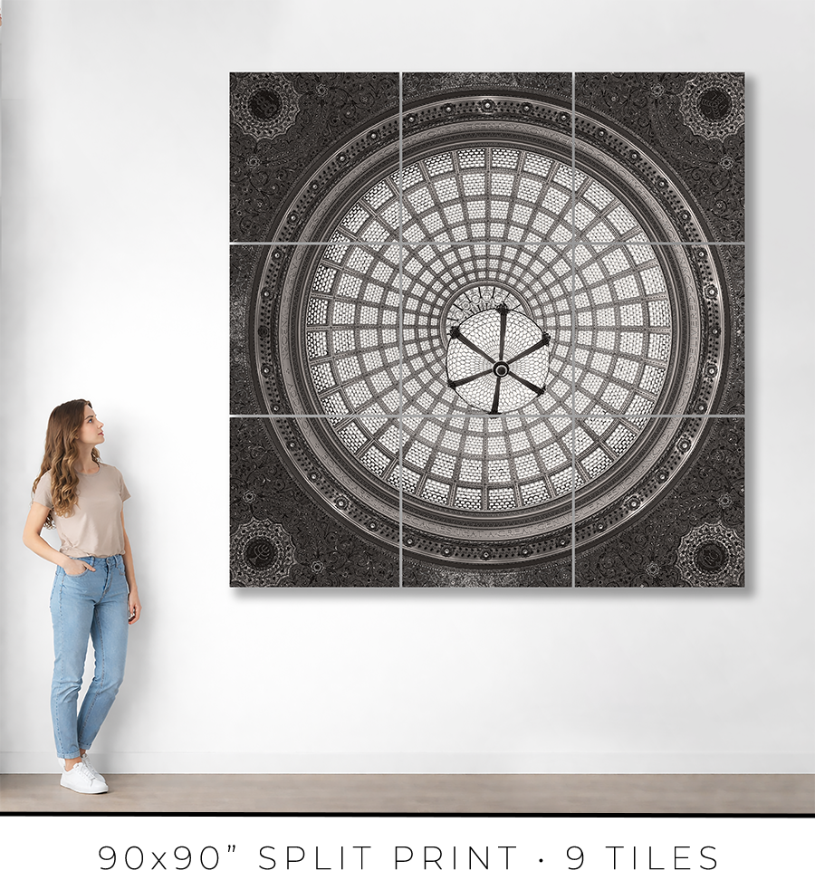
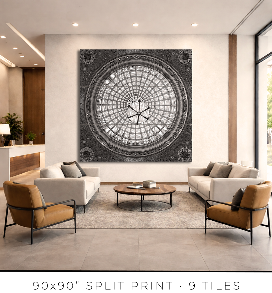
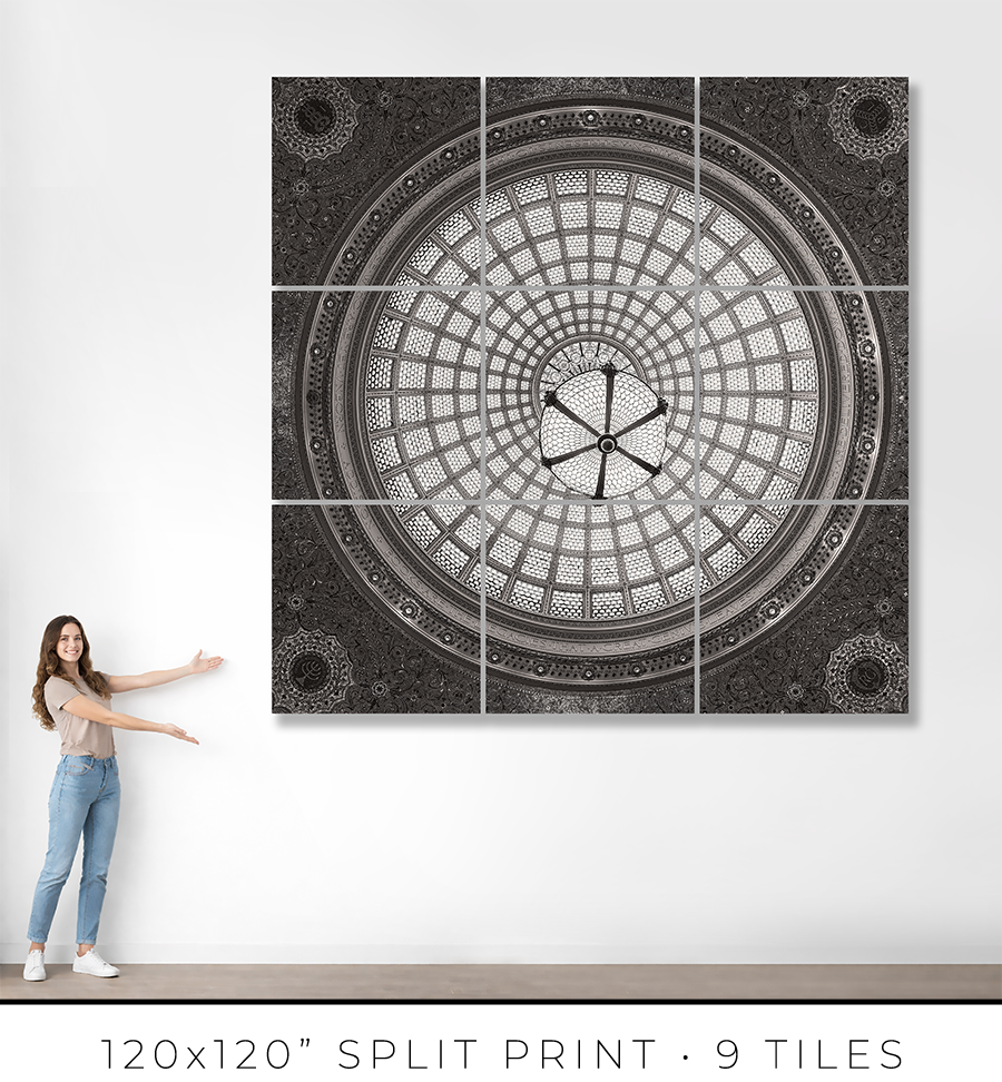
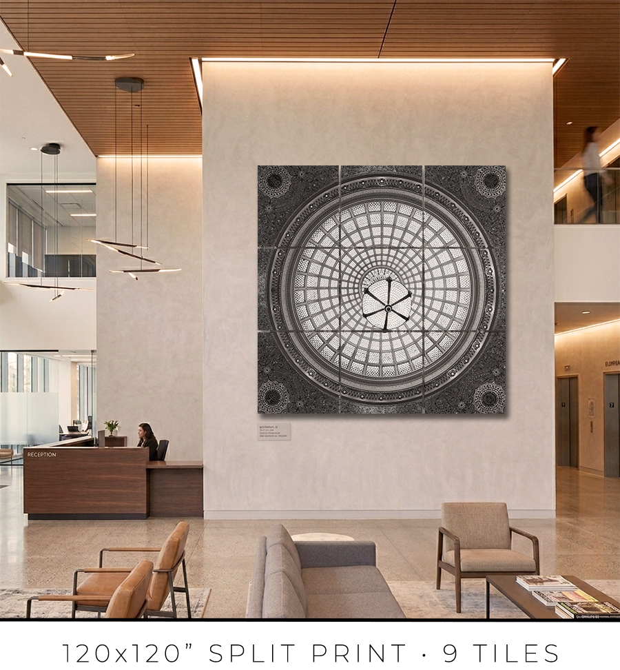
Split print is a great option if you want to go big, really big, up to 10 feet or maybe even bigger. It is a great option for office lobbies and for any place with large, tall walls.
There is a little “behind-the-scenes” story about split prints. I used to offer 60x60” on my website, but it was a mixed bag. First of all, that was the maximum print size I could make because all the materials (backing board, glass, etc.) do not come in sizes bigger than 60x60”. That was the ceiling I could not break. Second, the shipping of these prints was a nightmare. They are big and had to be shipped freight in a crate (not cheap), and every second print I shipped came back damaged, with big holes poked by careless forklift drivers at the sorting facilities.
There had to be a solution to these problems. And I found it in split prints.
Split print is a square print divided into nine (3 by 3) or more smaller squares. 60x60” print becomes a set of nine 20x20” prints, and 120x120” print is a set of nine 40x40” prints. No frame is required for this print presentation, as these are acrylic prints.

Acrylic print is a print on metallic photo paper face-mounted on a 1/4” thick sheet of acrylic (with polished edges) and sandwiched for strength with a sheet of aluminum Dibond. It is a modern, contemporary way to present a photographic print.
Because these are relatively small prints, compared to the final result, they can be shipped on a palette, which eliminates the shipping damage I had before. Plus, they are not heavy, and one person can easily put them on a wall using cleat hangers.
The best practice is to leave about a 1/4" or 1/2" gap between the acrylic print tiles. Since the edges of the acrylic prints are polished and the acrylic is quite thick at 1/4", it creates an interesting optical effect like looking through water.
If you are in the Chicagoland area, I will get you in touch with an installation guy I trust and have used for years, and he will help you install the split print in your home or office.
Each fine art print is produced specifically for you.
From the moment your order is confirmed, your print enters a deliberate production process: printing, inspection, drying, mounting, framing, final quality control, and secure packaging for shipping. Nothing is rushed. Every step is completed in-house to ensure consistency, precision, and permanence.
For matted prints and 16x16” framed prints, the production takes 1-2 days. For large framed prints, it takes 3-4 days.
If you are in the Chicagoland area, the shipping takes only one day. Large prints, I will deliver personally. I will contact you to schedule a delivery date and time that is convenient for you.
If you are outside of Chicago, the shipping takes 2-3 days, standard UPS Ground transit time. Large prints will be shipped in a crate built out of lumber and plywood. To open it, you might need a screwdriver, there will be many screws to remove.
You will receive an email with shipping tracking information once your order is ready for shipping.
Because most of the work is handmade in the studio, minor variations are part of the object's character. The result is not a mass-produced item, but a permanent piece crafted with attention.
Split prints are the only option I outsource to the photo lab. But I guarantee the quality of the prints because they are made under my supervision. Delivery time for split prints is about two weeks, but it can vary depending on the scope of the project.
If you have a specific deadline, please contact me before placing your order, and I will do my best to accommodate your timeline without compromising quality.
Each work is produced to order and crafted individually in my studio. Because of this, my payment and refund policies reflect the seriousness and permanence of the object.
Payments
Full payment is required at the time of purchase to secure your edition and initiate production.
I accept major credit cards and other secure payment methods at checkout. Production begins once payment is received.
There is an option at the checkout for “Payment in Person”. Please use it if you want to reserve your print but need to customize it and are unsure of the exact price. I will email you the invoice, which you can safely pay on my website later.
Refunds and Returns
All prints are made to order. As such, sales are considered final.
I do not offer refunds for change of mind, incorrect size selection, or personal preference. I encourage collectors to review dimensions, framing options, and placement carefully before purchasing.
If your work arrives damaged in transit, please contact me within 48 hours of delivery with photographs of the packaging and the piece. I will repair or replace the work as appropriate.
In the rare event of a production defect, I will make it right.
Cancellations
Orders may be cancelled within 24 hours of purchase, provided production has not yet begun. After production starts, cancellations are not possible.
I stand behind the quality, craftsmanship, and permanence of every piece. If you have questions before purchasing, I am always available to assist.
ADDRESS: 78 East Washington Street, Chicago, IL
ARCHITECTS: Shepley, Rutan & Coolidge
YEAR BUILT: 1897
You think you know Chicago. You know the steel and glass towers, the way the city reaches upward and doesn’t apologize. You have looked at the skyline and understood something true about this place: it builds without sentimentality, and it builds to last.
What you don’t know is what’s inside a limestone building on the corner of Michigan and Randolph. You’ve walked past it. Probably dozens of times. It doesn’t announce itself. It sits there, quiet and dignified, while the city rushes past.
Go in. Look up.
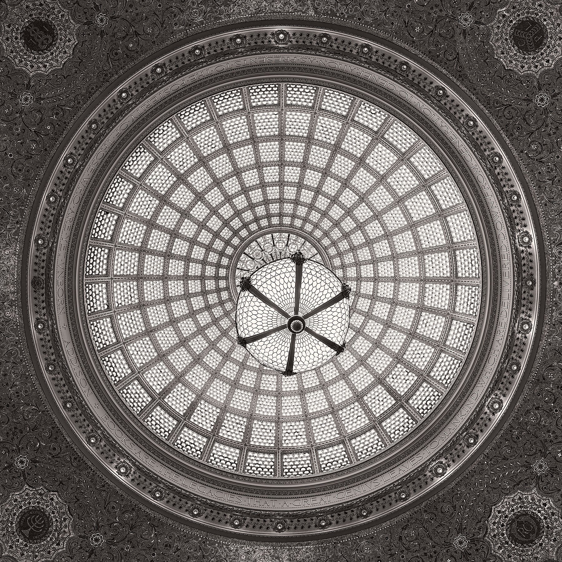
Thirty thousand pieces of glass wait for you above Preston Bradley Hall. A dome thirty-eight feet wide, rising sixty feet above the floor. The world’s largest Tiffany dome. It has been in this city since 1897, and most people in Chicago have never seen it.
This is not a complaint. It is a guide to action.
In 1871, Chicago burned. Twenty-three years later, it hosted the World’s Columbian Exposition and showed the world what a city looks like when it refuses to stay down. In between, it built.
In 1897, the public library was built. The architects were Shepley, Rutan and Coolidge, the same Boston firm that designed the Art Institute four blocks south. The commission was clear: build a people’s palace. Not a building for scholars and patrons. A building for everyone. For the stonemason who worked twelve hours and wanted to read at night. For the Lithuanian immigrant who needed a book in her mother tongue. For the child who didn’t know yet what she needed.
The city said this with marble. Tennessee pink. Vermont green. Italian Carrara white. African black. They imported stone from four continents for a public library and did not consider it extravagant. They considered it necessary. This was the argument Chicago was making about itself: we are not just an industrial city. We are a civilized one.
Every surface was treated as a surface worth caring about. The staircases were lined with thousands of glass mosaic tiles. The walls were faced with stone imported from three countries. The ironwork was gilded. And above the main hall, where the clerks stood behind their counters and handed books across to the people who had come to borrow them, the Tiffany Glass and Decorating Company of New York installed a dome thirty-eight feet across.
This was the delivery room. Not a reading room. Not a ceremonial hall. The place where working people stood in line and collected their books. The city put its greatest treasure directly above the heads of the people waiting for their turn at the counter.
That was the argument. That was the point.
In the nineteenth century, stained glass meant paint. Colors applied to the surface of the glass, fired on, darkened with age. European cathedrals were built for it: the darkness was part of the point.
Louis Comfort Tiffany rejected this entirely.
His method was different. He blended colors together while the glass was still molten. The color lived inside the glass itself. Not on the surface. Not painted on and waiting to peel. Embedded. Iridescent. Alive in a way painted glass can never be. He called it Favrile, from the Old English word for handcrafted. He had it patented in 1894. The patent mattered because the process was genuinely new: light moving through Favrile glass does not pass through a colored filter. It is transformed. The glass itself becomes the event.
Tiffany understood something about light that the cathedral tradition had missed. Light is not a backdrop. Light is the material. You are not making a picture and then lighting it. You are making an object that transforms light into color, and the transformation is the art.
The dome above Preston Bradley Hall was built on this principle. Clear glass, turquoise, amber, gold. Not the dark reds and blues of the cathedral tradition. Tones that breathe. A palette designed not to dominate a room but to fill it with something alive. The glass shifts character as the clouds move overhead. Tiffany designed it that way. He knew where the building was. He knew how Chicago light moves.
Stand in the center of Preston Bradley Hall and look toward the base of the dome. A band of text circles the room in classical Roman letters, large enough to read from across the floor. This is the inscription the library’s founders chose to place beneath thirty thousand pieces of glass in 1897:
Books are the legacies that a great genius leaves to mankind, which are delivered down from generation to generation as presents to the posterity of those who are yet unborn.
The words are Joseph Addison’s, from The Spectator, the daily periodical he published in London in 1711. Addison was the great essayist of the English Enlightenment: a man who believed that literature was not the property of the educated classes but the common inheritance of every person alive. The Spectator was written for the coffee house, not the university. He wanted ideas to circulate. He wanted arguments to reach people who had never been to Oxford.
The library board that chose this inscription in the 1890s knew what they were doing. Addison’s sentence contains a specific claim: books are not produced for the people alive when they are written. They are produced for the unborn. The writer who sits down to work is making a gift to someone she will never meet, in a time she cannot imagine. The building holding those books is the structure that makes the delivery possible.
Chicago was making a promise with that inscription. Every book in this building is a present addressed to you. Take it.
The walls reinforced the promise in six languages: Greek, Latin, Italian, French, German, and Spanish. The architects and the library board looked at the city they were building for, and they carved its languages into the marble. The Polish laborer, the German baker, the Italian stonecutter who had helped build the very room he was standing in: he could find his mother tongue in the walls. His heritage was not something to be left at the door. It was inscribed in stone.
This was not tolerance. This was architecture with a position.
In 1935, someone decided to protect the dome. The outer skylight above the stained glass was covered with concrete and copper. This was meant to shield the glass from Chicago's weather.
It destroyed the dome.
The concrete sealed the attic into what restorers would later describe as an intense heat zone. For decades, the lead that held thirty thousand pieces of glass in place was baked and cooled and baked again. The glass itself was obscured by soot and white paint. The Favrile iridescence, which required natural light to function, received almost none. The dome sat in artificial gloom for most of a century.
This is what protection can do when it doesn’t understand what it’s protecting.
The library itself was gone by then. The books had been moved out in the 1970s to a new building across the Loop. Preston Bradley Hall became an event space. The delivery room, the place where Chicago’s working people once stood in line for their books, was available for rent.
The 2008 restoration cost $2.2 million. Workers cleaned away the industrial grime of a century. They repaired 1,700 pieces of glass that were cracked. They stripped the white paint from the cast-iron frame to reveal its original bronze-green gilding.
Then they found something that stopped them.
Ninety percent of the glass panels had been installed upside-down. For one hundred and ten years, the textured ripple glass and the cut jewels that Tiffany designed to catch direct sunlight had been facing the wrong direction. The dome had been giving the wrong light since the day it opened. Nobody had noticed. Or if they had noticed, nobody had acted.
The restoration flipped the panels back to their intended position. When natural light returned through the restored skylight, restorers saw something the building had been holding for over a century: the sparkle Tiffany originally envisioned.
The gift had been there all along. It was just pointing the wrong way.
The building is free to visit. It has been free since 1897. The dome is valued at $35 million, and you can walk in off the street and stand under it at no cost. This was the intention. The Addison inscription was not a decoration. It was a policy statement: this building exists to deliver gifts to people who haven’t been born yet. You are one of those people. You are the posterity the founders were addressing.
Most people walk past. Most people who go in look up once, take a photograph, and leave. The inscription has been circling that room for 127 years. The dome was installed upside-down for 110 of those years. The gift was pointing the wrong way for most of its existence, and nobody complained because most people never looked long enough to notice what they were receiving.
Addison wrote his sentence in a London coffee house in 1711. He was thinking about Shakespeare and Milton, about the Greeks and the Romans, about every writer who had ever worked without knowing who would one day read what they made. He could not have imagined a Gilded Age Chicago library board choosing his words for a Tiffany dome above the heads of Polish, Italian, and German immigrants waiting to borrow books.
He did not need to imagine it. He had already described it. Books are delivered down from generation to generation, as presents to the posterity of those who are yet unborn.
You are twenty minutes from that hall right now. Less, probably.
Go in. Look up. Read the words. Stay as long as you need. This is what Chicago built for you, and it has been waiting.
Choose options