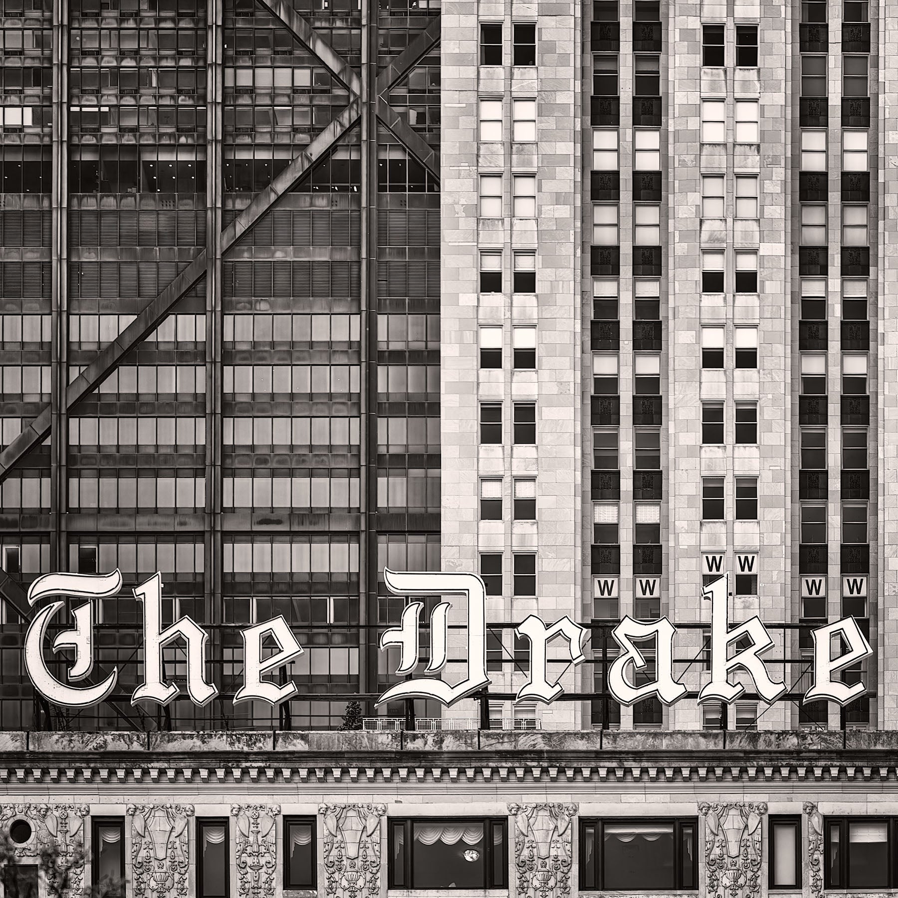
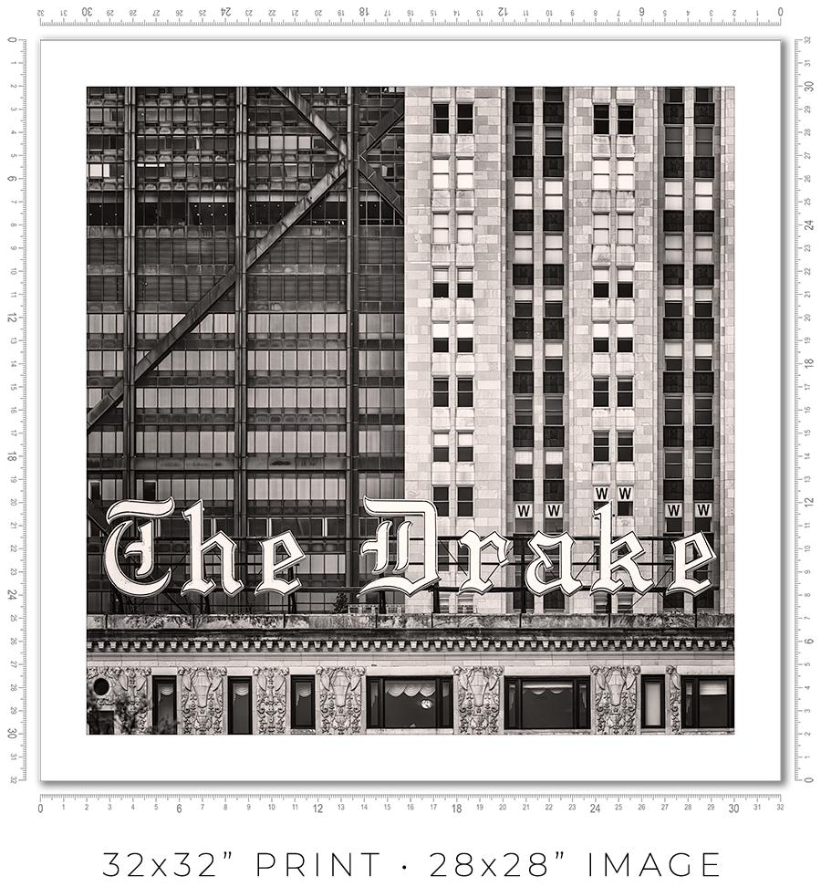
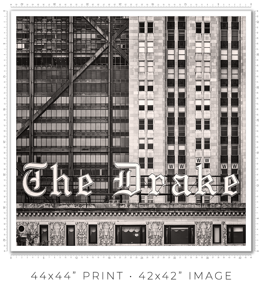
The Drake Hotel Neon Sign
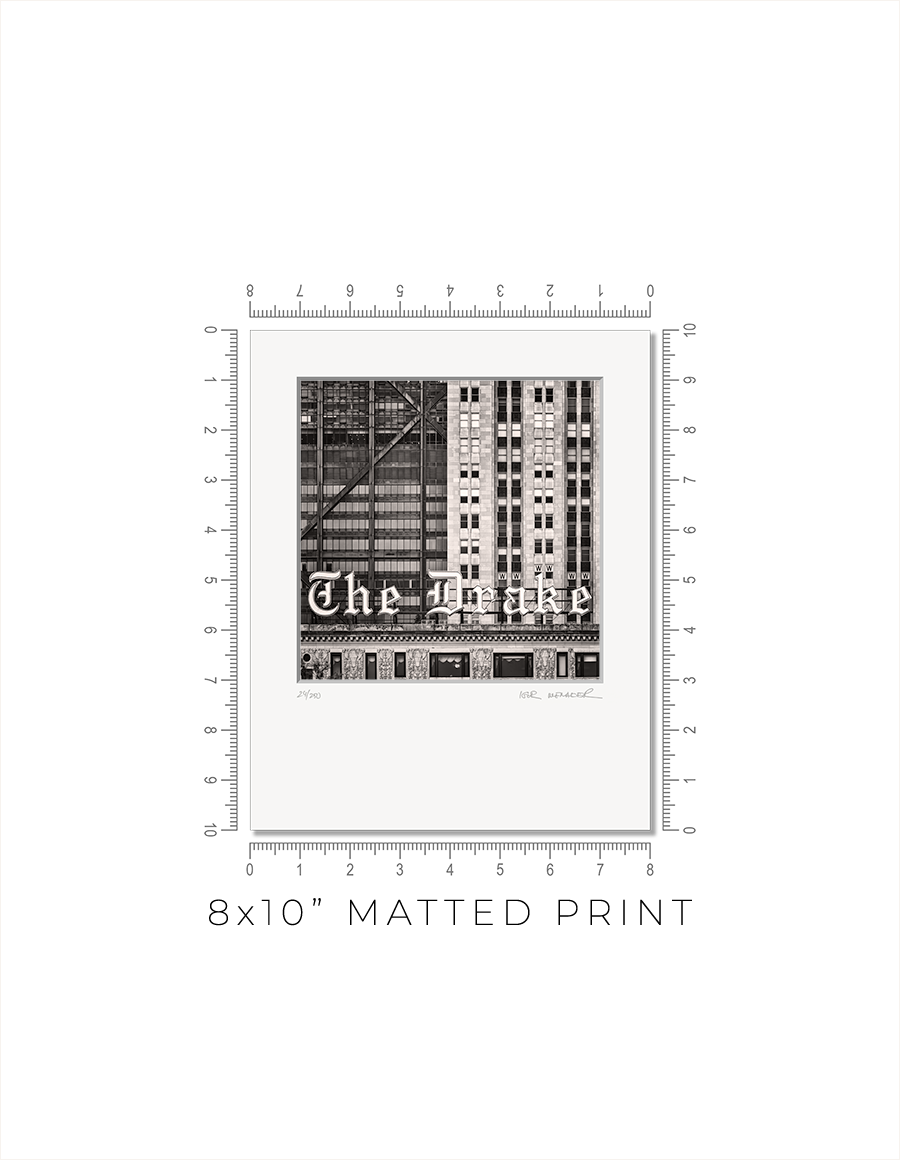
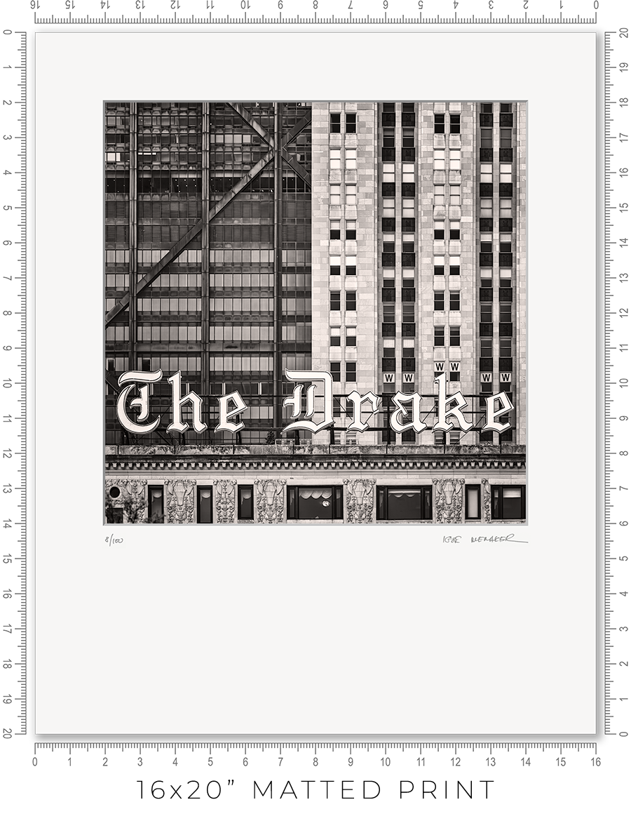
Matted prints are a great option if you want to choose your own frame. They come in two sizes: 8x10" and 16x20". These are standard frame sizes. You may easily find these frames at any retail shop.
One thing you need to know about frames. Those cheap, thin frames with swivel locks and kickstands will not work. They are designed for simple photo prints or diplomas. The matted print will be too thick for these frames. Find a decent frame that is at least 1" deep.
I make every print myself in my studio. No photo lab. No outsourcing. Every print is handmade.
I print on metallic photo paper. It is the perfect paper for black-and-white architectural photography. It adds a distinctive pearlescent, three-dimensional sheen to the prints.
For mats, I use 4-ply Crescent Arctic White matboard. It is off-white, traditional, and restrained. Not bright white, which is too bright and overwhelms the image. This matboard is the archival standard for conservation framing.
I mount prints on 3/16" Bainbridge foamcore. It is acid-free, clay-coated, rigid, and lightweight. It is ideal for archival print mounting.
The print is permanently sealed between the mat and the mounting board. It is intentional. A hinge mount leaves the print too loose. Also, it causes the print to bulge in the middle. A sealed mount keeps the print flat and tight. If you need a hinge mount or a matboard backing instead of foamcore, let me know.
Every print is signed and numbered (limited edition) on the mat in pencil. On the back, you will find a Certificate of Authenticity with all the details about the print and my contact information.
The actual photo print size for an 8x10” matted print is 6x6” with a 1” mat border, and for a 16x20” print, it is 12x12” with a 2” mat border. Since the photo prints are square and the matted prints are rectangular, the bottom mat border for 8x10” prints is 2” and for 16x20” prints it is 6”.
A framed print is a finished artwork. It is not just the image, it is a physical object that looks intentional, lasts decades, and feels complete.
The frame color, finish, and moulding profile. Print mounting, matting, and glazing. These are all deliberate decisions that elevate the image to the level of an artwork, which you can hold in your hands, put on the wall, and live with every day.
I am a professional framer, and I enjoy making frames for my prints. I put a lot of thought into what frame to use for my prints. And how to mat, glaze, and mount them. And after decades of frame-making, I acquired the skills to make my prints perfect, exactly the way I want them. I am proud of what I do.
I make every print myself in my studio. No photo lab. No outsourcing. Every print is personally crafted by me.
I start with printing the image on one of my large-format printers. I use glossy metallic photo paper almost exclusively. It is the perfect paper for black-and-white architectural photography. It adds a distinctive pearlescent, three-dimensional sheen to the print. In a bright spotlight, it looks like a hologram.
For glazing, I seal the print with archival 5-mil PET film, featuring a unique, high-gloss “mirror-like” finish. There is only one manufacturer of this glazing, the price has doubled in recent years, and it is issued in small batches that sell out instantly. But the result is worth the trouble. It gives the print that elusive look of a silver gelatin print from a traditional darkroom, which was treated with a vintage photo heat glossier.
I have been a photographer all my life, and I still have my traditional darkroom. I can produce small silver gelatin prints, but large 44x44” prints are obviously out of reach with this old technology. I am happy that I can replicate that look and feel for the prints on any scale with the new technology I developed.
But this is my choice. If you prefer to use museum anti-reflective glass sheets, please let me know. I can do that, but the print prices may double (since glass is expensive), and delivery will be limited to Chicagoland only (because it is glass and it breaks in shipping).
I permanently mount my prints to white aluminum Dibond sheets using archival pressure-sensitive high-tack acrylic adhesive. It is not a simple process. I use a heavy 750-pound, 60” wide large-format laminator to complete this task. And it is the most dangerous and nerve-racking stage in the whole printmaking process. A tiny misalignment or a speck of debris on the surface can ruin the almost-finished print.
Finally, the print is ready for framing. Frame-making is where a woodworker meets an artist. It is a totally different set of skills, materials, instruments, and studio space.
Over the years, I developed relationships with several suppliers, and I get my frame moulding delivered by truck in large, long boxes. I believe my studio stocks more frame moulding than your average frame shop down the street.
I cut the moulding at 45 degrees using my mitre saw mounted on a custom 10-foot-long, heavy-duty feed bench I built long ago. I then join the cut sticks with a pneumatic v-nailer to make a square frame. Now the finishing touches: I sand and paint the frame corners to make them even and smooth.
Now it is time to put the print and the frame together. I secure the print inside the frame with flexible points and install the hanging wire (or D-rings for the large prints). I sign the print, attach the Certificate of Authenticity, and the print is ready.
Now, let’s talk about the frames I use for my prints. In my opinion, black-and-white photography does not require elaborate framing. A simple but sophisticated matte black frame is all that is needed. It is like the famous Audrey Hepburn’s "little black dress" designed by Hubert de Givenchy for the movie “Breakfast at Tiffany's”. It became iconic and has been described as "perhaps the most famous little black dress of all time." Accordingly, a “little black frame” is all that is needed for my prints.
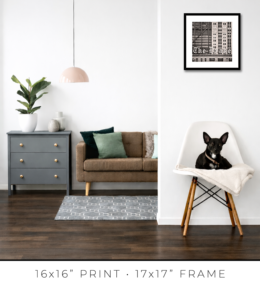
For 16x16” prints, I use a simple 3/4” matte black frame, but it is 1 1/8” tall, which adds a touch of sophistication. It looks proportional to the relatively small size of the 16x16” print.


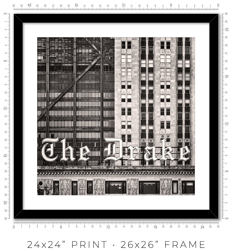
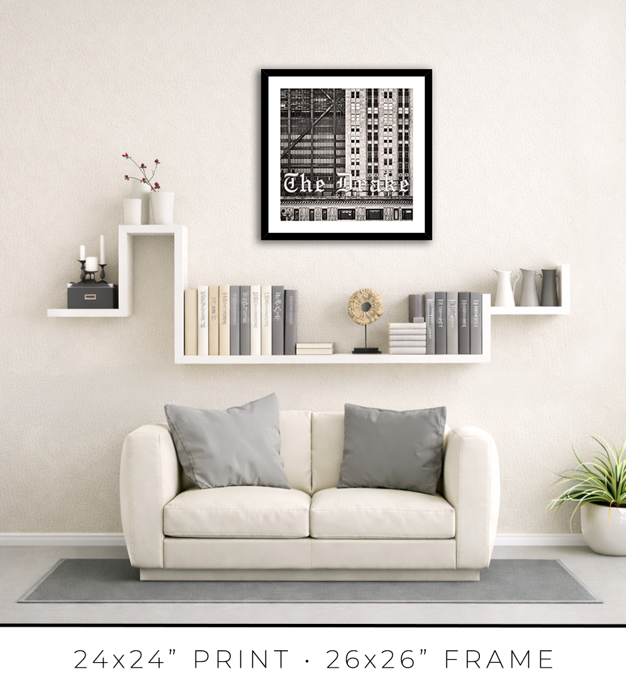
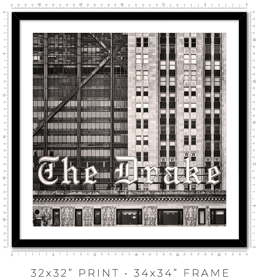
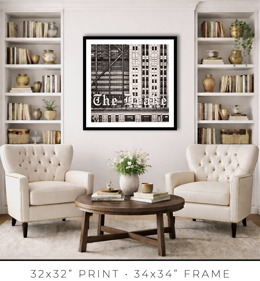
For 24x24” and 32x32” prints, I use the same style but a different profile frame. It is a wider 1 1/4" frame, which works for larger print sizes. And it is not as tall, only 7/8", which keeps the prints more grounded on the wall and less overpowering.


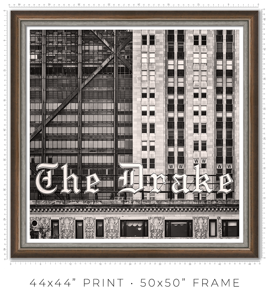
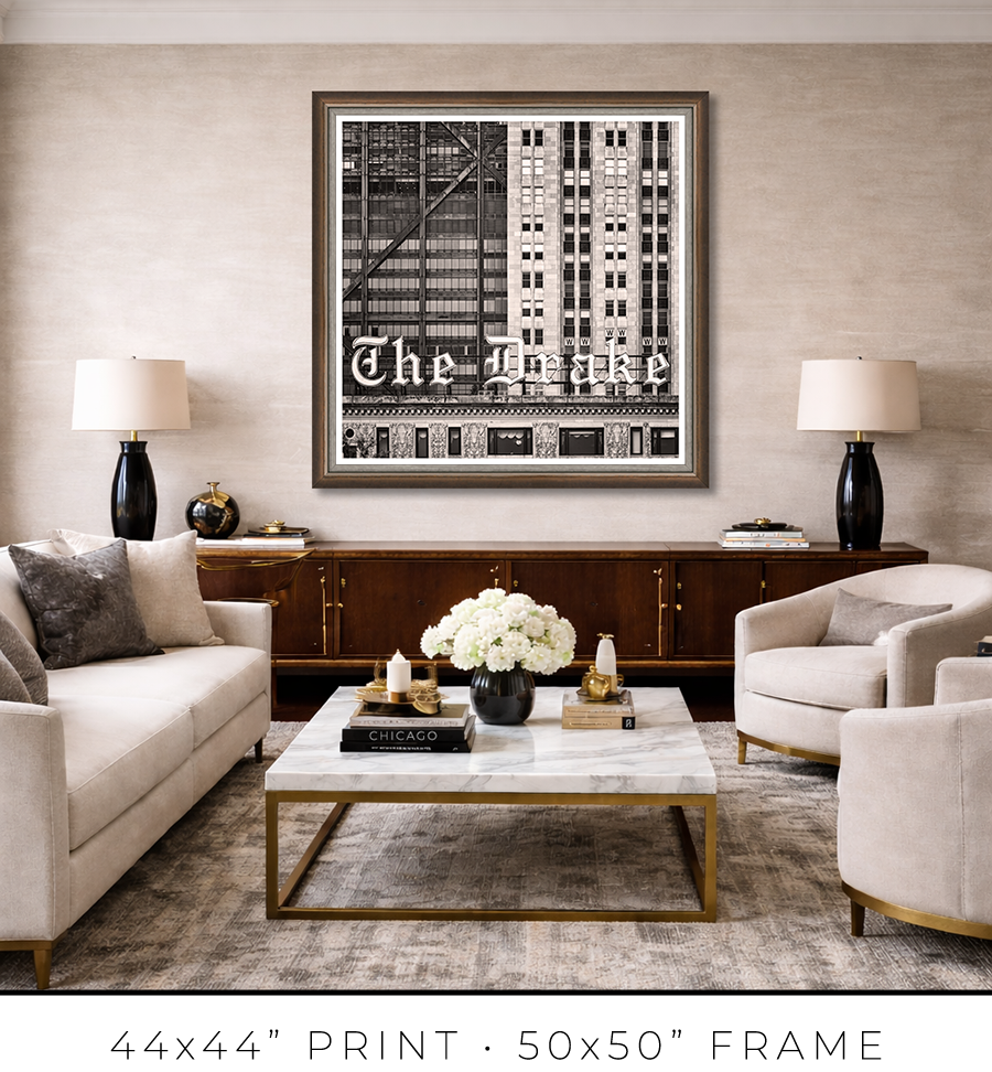
For large 44x44” prints, the frame design requires a totally different approach. Compared to smaller prints, the large print is a statement, it is a centerpiece of the room. It is a celebration, and the "little black dress" concept doesn’t work here. It needs a bit of exuberance. At the same time, it has to be constrained and confident. Like a Rolls-Royce brand identity.
To meet this challenge, I came up with a design of two different frames stacked together to form a unified frame for large prints.
The main frame is one of the most expensive frames I used, a custom frame made in Italy. It is 2” tall and 2” wide. It is a block, but it has a bevel on the inside. The beauty is in color, or to be precise, in color gradation. It is dark charcoal on the outer sides, which gradually transforms into a patina of silver leaf on the inner bevel through dark copper leaf on the front side. The beauty is that the gradation is not even, it looks painted by hand. It looks authentic, rustic, and antique.

The secondary frame is 1 1/8" wide, and it has a similar rustic, scratched, antique look, but it is pewter, which is almost the same color tonality as a photographic print it frames. It is more restrained than the primary frame and works well as a separator. Also, it has this chiseled, rough edge, another detail that adds authenticity to the whole frame.


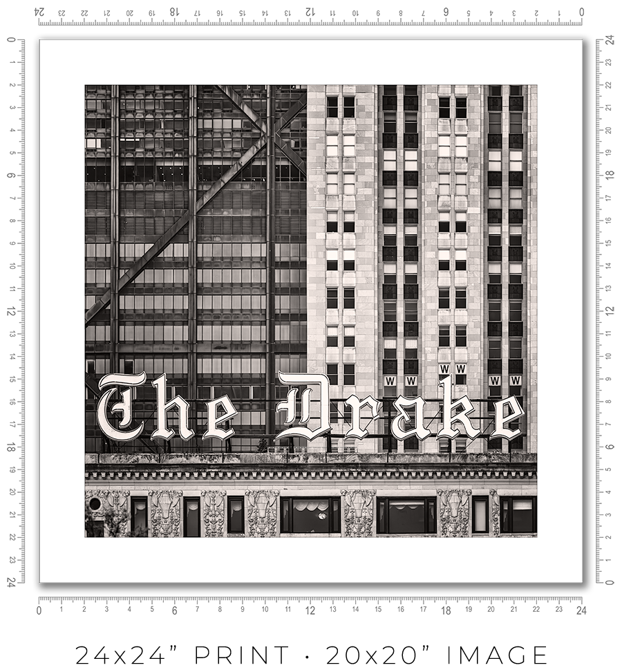
I owe you a clarification about print sizes. The framed print sizes listed on my website (16x16”, 24x24”, 32x32”, and 44x44”) refer to the sizes of prints mounted on the board before framing. But with the frame included, the outside dimensions will be obviously larger. Also, because of the white space (1” or 2”) around the image to separate it from the frame, the actual print size is smaller. Here is the table with all dimensions:
| Framed Print | Outside Dimensions | White Space | Actual Print |
| 16x16” | 17x17” | 2" | 12x12" |
| 24x24” | 26x26" | 2" | 20x20" |
| 32x32" | 34x34" | 2" | 28x28" |
| 44x44" | 50x50" | 1" | 42x42" |
And here is the sample picture to explain the dimensions table:

These are the standard frame options I offer on my website. If you need a custom frame or print sizes, please reach out to me, and I would be happy to help.
A photo print is an option if you want to frame it yourself or have a frame shop you know and trust that will frame it for you.
A photo print is just a loose print that I will send to you in a shipping tube.
I make prints myself in my studio. I use glossy metallic photo paper almost exclusively. It is the perfect paper for black-and-white architectural photography. It adds a distinctive pearlescent, three-dimensional sheen to the print.
The prints are part of a limited edition. They are signed and numbered just below the print. The Certificate of Authenticity is enclosed with the print.
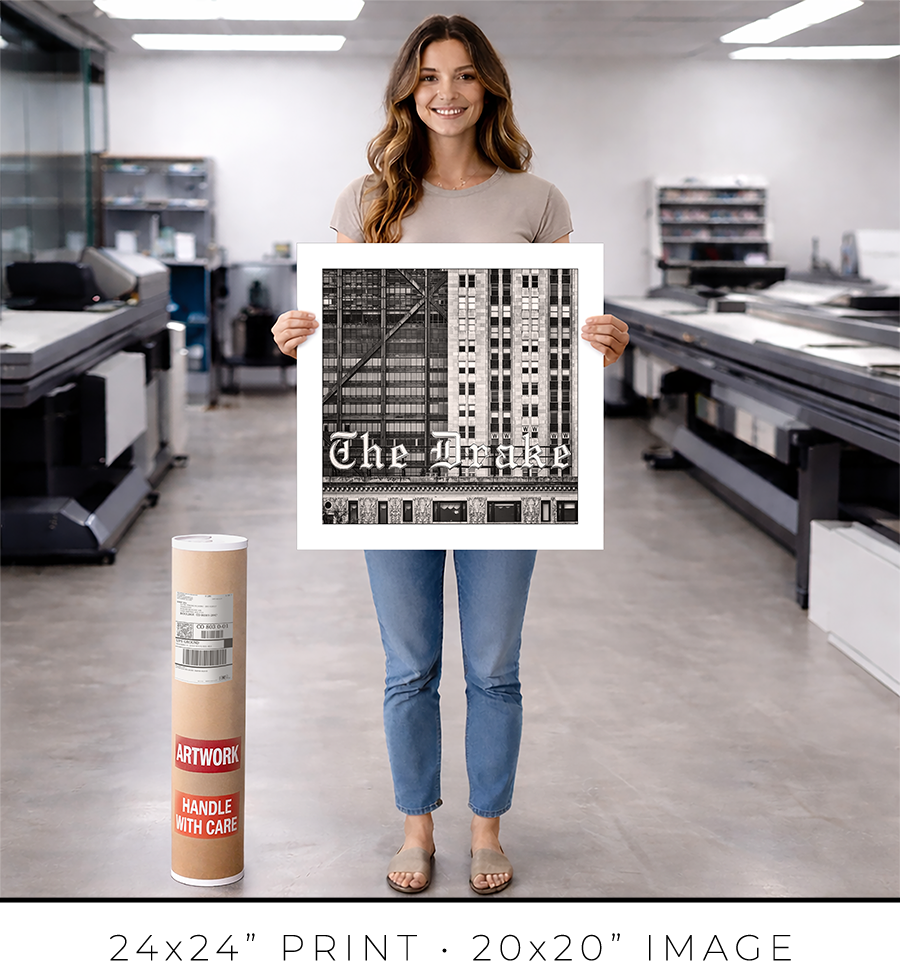
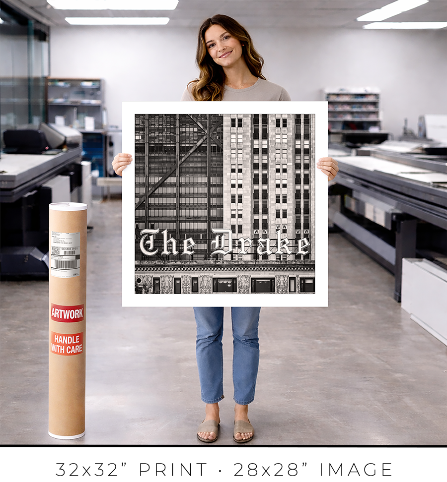
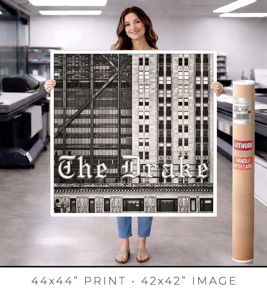
I offer on my website three different sizes for photo prints: 24x24”, 32x32”, and 44x44”. If you need a custom size print, please let me know.
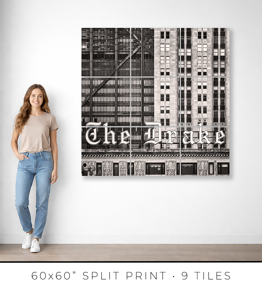
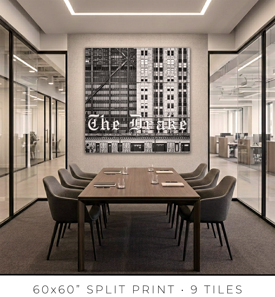
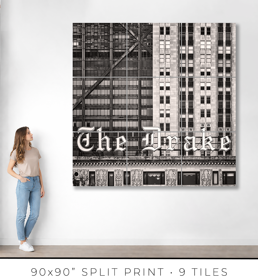
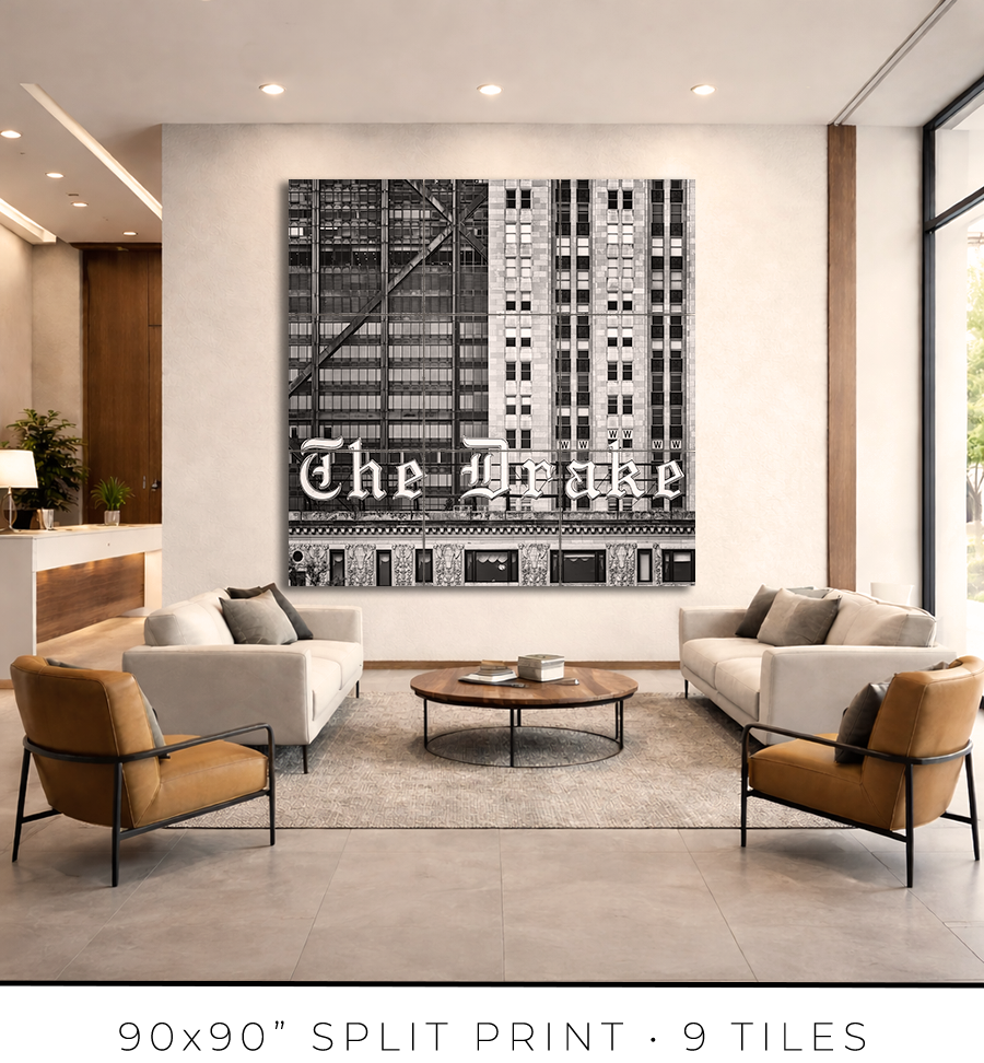
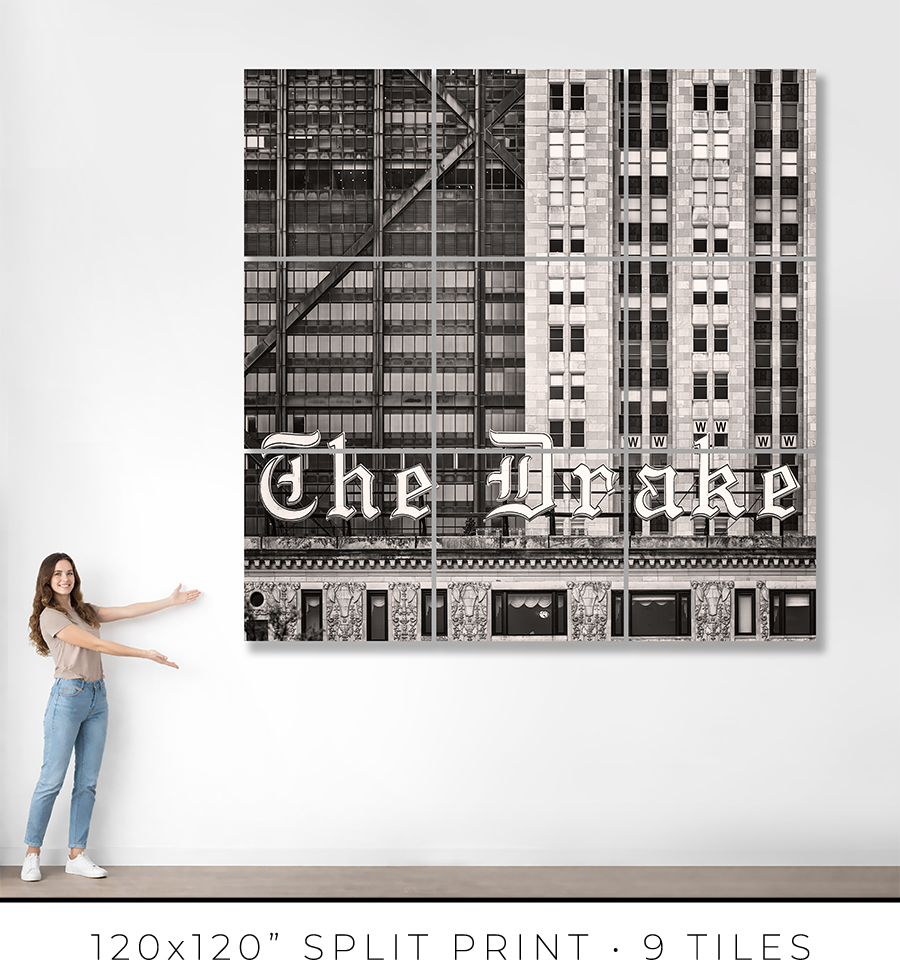
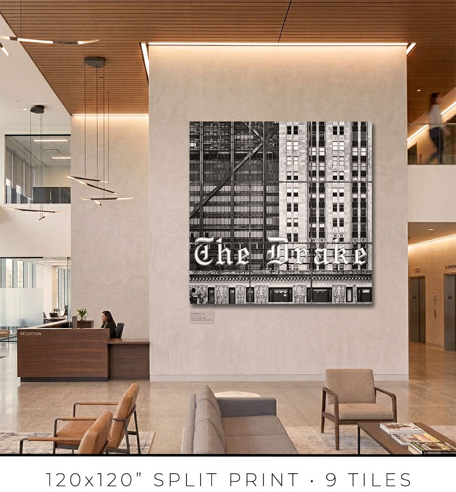
Split print is a great option if you want to go big, really big, up to 10 feet or maybe even bigger. It is a great option for office lobbies and for any place with large, tall walls.
There is a little “behind-the-scenes” story about split prints. I used to offer 60x60” on my website, but it was a mixed bag. First of all, that was the maximum print size I could make because all the materials (backing board, glass, etc.) do not come in sizes bigger than 60x60”. That was the ceiling I could not break. Second, the shipping of these prints was a nightmare. They are big and had to be shipped freight in a crate (not cheap), and every second print I shipped came back damaged, with big holes poked by careless forklift drivers at the sorting facilities.
There had to be a solution to these problems. And I found it in split prints.
Split print is a square print divided into nine (3 by 3) or more smaller squares. 60x60” print becomes a set of nine 20x20” prints, and 120x120” print is a set of nine 40x40” prints. No frame is required for this print presentation, as these are acrylic prints.

Acrylic print is a print on metallic photo paper face-mounted on a 1/4” thick sheet of acrylic (with polished edges) and sandwiched for strength with a sheet of aluminum Dibond. It is a modern, contemporary way to present a photographic print.
Because these are relatively small prints, compared to the final result, they can be shipped on a palette, which eliminates the shipping damage I had before. Plus, they are not heavy, and one person can easily put them on a wall using cleat hangers.
The best practice is to leave about a 1/4" or 1/2" gap between the acrylic print tiles. Since the edges of the acrylic prints are polished and the acrylic is quite thick at 1/4", it creates an interesting optical effect like looking through water.
If you are in the Chicagoland area, I will get you in touch with an installation guy I trust and have used for years, and he will help you install the split print in your home or office.
Each fine art print is produced specifically for you.
From the moment your order is confirmed, your print enters a deliberate production process: printing, inspection, drying, mounting, framing, final quality control, and secure packaging for shipping. Nothing is rushed. Every step is completed in-house to ensure consistency, precision, and permanence.
For matted prints and 16x16” framed prints, the production takes 1-2 days. For large framed prints, it takes 3-4 days.
If you are in the Chicagoland area, the shipping takes only one day. Large prints, I will deliver personally. I will contact you to schedule a delivery date and time that is convenient for you.
If you are outside of Chicago, the shipping takes 2-3 days, standard UPS Ground transit time. Large prints will be shipped in a crate built out of lumber and plywood. To open it, you might need a screwdriver, there will be many screws to remove.
You will receive an email with shipping tracking information once your order is ready for shipping.
Because most of the work is handmade in the studio, minor variations are part of the object's character. The result is not a mass-produced item, but a permanent piece crafted with attention.
Split prints are the only option I outsource to the photo lab. But I guarantee the quality of the prints because they are made under my supervision. Delivery time for split prints is about two weeks, but it can vary depending on the scope of the project.
If you have a specific deadline, please contact me before placing your order, and I will do my best to accommodate your timeline without compromising quality.
Each work is produced to order and crafted individually in my studio. Because of this, my payment and refund policies reflect the seriousness and permanence of the object.
Payments
Full payment is required at the time of purchase to secure your edition and initiate production.
I accept major credit cards and other secure payment methods at checkout. Production begins once payment is received.
There is an option at the checkout for “Payment in Person”. Please use it if you want to reserve your print but need to customize it and are unsure of the exact price. I will email you the invoice, which you can safely pay on my website later.
Refunds and Returns
All prints are made to order. As such, sales are considered final.
I do not offer refunds for change of mind, incorrect size selection, or personal preference. I encourage collectors to review dimensions, framing options, and placement carefully before purchasing.
If your work arrives damaged in transit, please contact me within 48 hours of delivery with photographs of the packaging and the piece. I will repair or replace the work as appropriate.
In the rare event of a production defect, I will make it right.
Cancellations
Orders may be cancelled within 24 hours of purchase, provided production has not yet begun. After production starts, cancellations are not possible.
I stand behind the quality, craftsmanship, and permanence of every piece. If you have questions before purchasing, I am always available to assist.
ADDRESS: 140 East Walton Place, Chicago, IL
ARCHITECTS: Benjamin Howard Marshall and Charles Eli Fox
YEAR BUILT: 1920
Most signs sell something. The Drake sign does something else. It claims the sky.
Take a drive on Lake Shore Drive at night. Past the Oak Street Beach darkness, past the trees still bare in winter, the letters appear above the roofline: THE DRAKE. Pink. Glowing. Floating against the black of the lake. No tagline. No price. No promise of anything except that this place exists, has always existed, and will exist tomorrow. That is the whole message. That is enough.
A sign that says this little and means this much is not an advertisement. It is a landmark. The difference matters.
The Drake Hotel opened on New Year's Eve, 1920. Architects Benjamin Marshall and Charles Fox designed it in Italian Renaissance style, a limestone palace at the exact hinge where the Gold Coast ends and the Magnificent Mile begins. The placement was deliberate. Brothers Tracy and John Drake positioned their hotel at the northern terminus of Michigan Avenue, bookending the city's grandest commercial street with their name. The Blackstone Hotel anchored the south end. The Drake anchored the north. Between them lay the whole ambition of the city.
The money behind it came from Chicago's dominant families: the Palmers, the Armours, the Swifts, the McCormicks. These were the people who fed the country, dressed it, and rebuilt it after fire. They financed a hotel that was supposed to feel like Europe felt before the two world wars broke Europe. White glove service. Palm Court afternoon tea. Ballroom chandeliers. Marshall & Fox placed the main entrance on Walton Place, away from the commercial noise of Michigan Avenue, so arriving felt like arriving somewhere private.
The building opened to acclaim. It also opened onto a city that still had a long memory of mud, stockyards, and barely controlled violence. The Gold Coast was never only elegant. During the 1930s and early 1940s, Frank "The Enforcer" Nitti, who ran the Chicago Outfit after Al Capone went to prison, maintained his office in a suite at the Drake. Champagne in the Palm Court. Gangsters in the suites. Chicago has always held both things without apology.
The sign came twenty years after the hotel. In 1940, the rooftop letters were lit for the first time. Pink neon. Twenty feet tall.
This timing was not accidental. Neon had by then become the visual language of the American city at night. The technology allowed designers to draw with light itself, to bend glass tubing into any letter or curve, to make a building speak after dark. Hotels, theaters, and department stores across Chicago used illuminated signage to claim attention from the growing streams of automobile traffic on the lakefront roads. The Drake sign was built for Lake Shore Drive. It was scaled to be legible from a moving car, from a ship on the lake, from a block away, and a mile away.
Each letter stands between ten and eleven feet tall. The scale sounds excessive until you see it and understand: from the water, from the drive, from across the trees, this is exactly the right size. Any smaller and it disappears. This size and it floats.
The font is the thing most people never consciously notice but never forget.
The letters are a calligraphic, gothic-inflected script. Not block letters. Not the clean sans-serif of modern commercial signage. The capital “D” opens with a looping entry stroke. The lowercase “r” descends with a tail that balances the word's visual weight. Every letterform carries the evidence of a hand: thick strokes where a pen would press, thin strokes where it would lift. The sign looks like a signature. Not the signature of a corporation. The signature of a person who built something and put their name on it.
This was a specific design choice from a specific moment. The 1930s and 1940s produced two competing visual instincts in American commercial design. One pointed toward European luxury: hand-lettered scripts, decorative serifs, the suggestion of old craftsmanship. The other pointed toward the automobile future: bright neon, high contrast, legibility at speed. The Drake sign fused both. The letterforms said old money. The medium said modern city. The combination said something neither tradition could say alone.
The technical solution was the face-and-halo-lit effect. Light came from both the front face of the letters and from behind them, creating a glow that extended past the letter edges into the air around them. This is why the letters appear to float. They do not sit solidly on the roof. They hover. At night, with the lake behind them, they seem to belong to neither the building nor the sky. They belong to the darkness between.
The color was pink. Not red. Not white. Pink.
Against Lake Shore Drive's golden streetlights and the dark blue of Lake Michigan at night, pink neon did something that no other color would do: it announced luxury without aggression. Red neon meant nightclub, diner, or emergency. White neon meant pharmacy, office, or utility. Pink neon meant somewhere you wanted to be. It suggested warmth without fire. It suggested pleasure without excess. For seventy years, that specific pink told drivers heading north on Lake Shore Drive the same thing: you are almost home.
And there is a ghost.
The story goes like this. Christmas Eve, 1920, one week before the hotel's opening gala. A woman accepts a marriage proposal. New Year's Eve arrives. She comes to the party. Somewhere in the ballroom or the hallways, she finds her fiance with another guest. The rest varies depending on who tells it: the tenth floor, the rooftop, the exact location of the fall. What remains constant is this: she died that night, and she never left. Hotel staff reports her near the Gold Coast Room. Guests report her in the hallways. She is always described the same way: dressed in red, wandering, waiting for something that will not come.
Whether you believe the story or not is beside the point. The point is that the Drake Hotel is the kind of place where this story gets told and kept. A sign that glows pink above a haunted ballroom is a different sign from one that glows above a conference center. The color means more because of what it hovers over.
In 1952, Marilyn Monroe and Joe DiMaggio honeymooned at the Drake. They carved their initials into the wooden bar of the Cape Cod Room. The bar is gone now. The initials are gone. What remains is the fact that this happened here, that the sign was glowing the same pink that night as it glows tonight.
In 2013, the neon died.
Not all at once. Seventy years of Chicago winters had done their work: ice cracking the tubing, wind stressing the frames, freezing rain working into every gap. Sections failed. Repair became increasingly difficult. The original neon system ran twelve circuits. Olympic Signs, the company brought in for the restoration, replaced it with an LED system running two. They removed seventy years of piping. They restored the original background metal.
The letters stayed. The scale stayed. The script stayed. The halo effect stayed. The color changed.
Chicagoans noticed immediately. The new LED color reads as lavender. Not pink. The hotel spent months testing options with multiple sign companies, trying to match what neon had produced for seven decades. They did not fully succeed. Hotel managers acknowledged the difference. The color is off, they said. It looks crisper and brighter. The warmth is gone.
This is the central fact of the 2013 restoration: they saved the sign by changing the one thing that defined it. The letterforms are intact. The size is intact. The pink is almost right. Almost.
There is a lesson in that almost. Not about LED technology or historic preservation policy. About what makes a landmark a landmark.
The Drake sign worked for 70 years because it was made of light with warmth. Neon is a gas sealed in glass tubing that glows when electricity runs through it. The glow is physical. It has color temperature, depth, slight variation across the tube length. It breathes. LED is a different kind of light: precise, consistent, efficient, cool. LEDs can match neon's hue closely enough that most people do not notice the difference. Chicagoans who grew up with the original noticed.
They noticed because the sign was never just a sign. It was a recurring presence in the specific darkness of Lake Shore Drive at night. A thing you saw on the way home from a late dinner, from a long drive, from the airport. A thing that told you where you were. Landmarks do not work by being correct. They work by being there, being themselves, being the same thing year after year until the city grows around them and they become part of what the city means.
The Drake sign is still that. The lavender has not undone what seventy years of pink built. The letters still float above the roofline. They are still the right size. The script is still a signature. Frank Nitti is still dead in those rooms. The Woman in Red is still wandering. Marilyn Monroe's initials are still gone, but still remembered. And on Lake Shore Drive tonight, the sign appears above the trees exactly when you need it to.
You see the sign, and you know: you are home.
Choose options